# Basics
The **<svg>** component is used as the root node of the SVG canvas and can be nested in the SVG. For details, see [svg](../reference/arkui-js/js-components-svg.md).
> **NOTE**
> - The APIs of this component are supported since API version 7.
>
> - The width and height must be defined for the **<svg>** parent component or **<svg>** component. Otherwise, the component is not drawn.
## Creating an <svg> Component
Create a **<svg>** component in the .hml file under **pages/index**.
```html
```
```css
/* xxx.css */
.container{
width: 100%;
height: 100%;
flex-direction: column;
align-items: center;
justify-content: center;
background-color: #F1F3F5;
}
svg{
background-color: blue;
}
```

## Setting Attributes
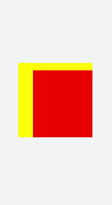
Set the **width**, **height**, **x**, **y**, and **viewBox** attributes to define the width, height, X coordinate, Y coordinate, and SVG viewport of the **<svg>** component.
```html
```
```css
/* xxx.css */
.container{
width: 100%;
height: 100%;
flex-direction: column;
align-items: center;
justify-content: center;
background-color: #F1F3F5;
}
svg{
background-color: yellow;
}
.rect{
background-color: red;
}
```

> **NOTE**
>
> - If the **<svg>** component is the root node, the X-axis and Y-axis attributes are invalid.
>
> - If the width and height of **viewBox** are inconsistent with those of the **<svg>** component, the view box will be scaled in center-aligned mode.