# Border Image
You can draw an image around a component.
> **NOTE**
>
> The APIs of this module are supported since API version 9. Updates will be marked with a superscript to indicate their earliest API version.
## Attributes
| Name | Type | Description |
| ---------- | ---------------------------------------- | --------------------------------------- |
| borderImage | [BorderImageOption](#borderimageoption) | Border image or border gradient.
This API is supported in ArkTS widgets.|
## BorderImageOption
This API is supported in ArkTS widgets.
| Name | Type | Description |
| ---------- | ---------------------------------------- | --------------------------------------- |
| source | string \| [Resource](ts-types.md#resource) \| [linearGradient](ts-universal-attributes-gradient-color.md) | Source or gradient color of the border image.
**NOTE**
The border image source applies only to container components, such as **\**, **\**, and **\**.|
| slice | [Length](ts-types.md#length) \| [EdgeWidths](ts-types.md#edgewidths9) | Slice width of the border image.
Default value: **0** |
| width | [Length](ts-types.md#length) \| [EdgeWidths](ts-types.md#edgewidths9) | Width of the border image.
Default value: **0** |
| outset | [Length](ts-types.md#length) \| [EdgeWidths](ts-types.md#edgewidths9) | Amount by which the border image is extended beyond the border box.
Default value: **0** |
| repeat | [RepeatMode](#repeatmode) | Repeat mode of the border image.
Default value: **RepeatMode.Stretch**|
| fill | boolean | Whether to fill the center of the border image.
Default value: **false** |
## RepeatMode
This API is supported in ArkTS widgets.
| Name | Description |
| ------- | ----------------------------------- |
| Repeat | The source image's slices are tiled. Tiles beyond the border box will be clipped. |
| Stretch | The source image's slices stretched to fill the border box. |
| Round | The source image's slices are tiled to fill the border box. Tiles may be compressed when needed.|
| Space | The source image's slices are tiled to fill the border box. Extra space will be filled in between tiles. |
## Example
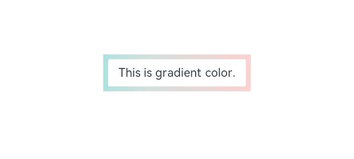
### Example 1
```ts
// xxx.ets
@Entry
@Component
struct Index {
build() {
Row() {
Column() {
Text('This is gradient color.').textAlign(TextAlign.Center).height(50).width(200)
.borderImage({
source: {
angle: 90,
direction: GradientDirection.Left,
colors: [[0xAEE1E1, 0.0], [0xD3E0DC, 0.3], [0xFCD1D1, 1.0]]
},
slice: { top: 10, bottom: 10, left: 10, right: 10 },
width: { top: "10px", bottom: "10px", left: "10px", right: "10px" },
repeat: RepeatMode.Stretch,
fill: false
})
}
.width('100%')
}
.height('100%')
}
}
```
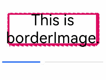
### Example 2
```ts
// xxx.ets
@Entry
@Component
struct Index {
@State outSetValue: number = 40
build() {
Row() {
Column() {
Row() {
Text('This is borderImage.').textAlign(TextAlign.Center).fontSize(50)
}
.borderImage({
source: $r('app.media.icon'),
slice: `${this.outSetValue}%`,
width: `${this.outSetValue}px`,
outset: '5px',
repeat: RepeatMode.Repeat,
fill: false
})
Slider({
value: this.outSetValue,
min: 0,
max: 100,
style: SliderStyle.OutSet
})
.margin({ top: 30 })
.onChange((value: number, mode: SliderChangeMode) => {
this.outSetValue = value
console.info('value:' + value + 'mode:' + mode.toString())
})
}
.width('100%')
}
.height('100%')
}
}
```