# Gradient Color
Create a more gorgeous look for a component by applying a gradient color effect to it.
> **NOTE**
>
> The APIs of this module are supported since API version 7. Updates will be marked with a superscript to indicate their earliest API version.
## Attributes
| Name | Type | Description |
| -------------- | -------------------------------------------- | ----------------------------------- |
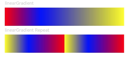
| linearGradient | {
angle?: number \| string,
direction?: [GradientDirection](ts-appendix-enums.md#gradientdirection),
colors: Array<[ColorStop](ts-basic-components-gauge.md#colorstop)>,
repeating?: boolean
} | Linear gradient.
- **angle**: start angle of the linear gradient. A positive value indicates a clockwise rotation from the origin, (0, 0).
Default value: **180**
- **direction**: direction of the linear gradient. It does not take effect when **angle** is set.
Default value: **GradientDirection.Bottom**
- **colors**: colors of the linear gradient.
- **repeating**: whether the colors are repeated.
Default value: **false**
Since API version 9, this API is supported in ArkTS widgets.|
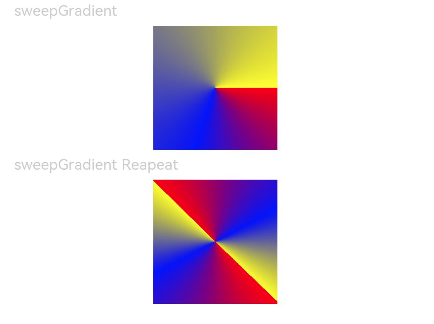
| sweepGradient | {
center: [Point](./ts-drawing-components-polygon.md#point),
start?: number \| string,
end?: number \| string,
rotation?: number\|string,
colors: Array<[ColorStop](ts-basic-components-gauge.md#colorstop)>,
repeating?: boolean
} | Sweep gradient, which can sweep around the specified center point in the 0–360 degree range. If the rotation angle exceeds the range, a monochrome color instead of a gradient will be drawn.
- **center**: center point of the sweep gradient, that is, the coordinates relative to the upper left corner of the current component.
- **start**: start point of the sweep gradient.
Default value: **0**
- **end**: end point of the sweep gradient.
Default value: **0**
- **rotation**: rotation angle of the sweep gradient.
Default value: **0**
- **colors**: colors of the sweep gradient.
- **repeating**: whether the colors are repeated.
Default value: **false**
Since API version 9, this API is supported in ArkTS widgets.
**NOTE**
A value less than 0 evaluates to the value **0**. A value greater than 360 evaluates to the value **1**.
When the data type of **start**, **end**, and **rotation** is string, the value **"90"** or **"90%"** is equivalent to **90**.|
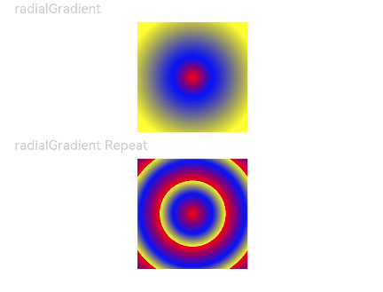
| radialGradient | {
center: [Point](./ts-drawing-components-polygon.md#point),
radius: number \| string,
colors: Array<[ColorStop](ts-basic-components-gauge.md#colorstop)>,
repeating?: boolean
} | Radial gradient.
- **center**: center point of the radial gradient, that is, the coordinates relative to the upper left corner of the current component.
- **radius**: radius of the radial gradient.
Value range: [0, +∞)
**NOTE**
A value less than 0 evaluates to the value **0**.
- **colors**: colors of the radial gradient.
- **repeating**: whether the colors are repeated.
Default value: **false**
Since API version 9, this API is supported in ArkTS widgets.|
## Example
```ts
// xxx.ets
@Entry
@Component
struct ColorGradientExample {
build() {
Column({ space: 5 }) {
Text('linearGradient').fontSize(12).width('90%').fontColor(0xCCCCCC)
Row()
.width('90%')
.height(50)
.linearGradient({
angle: 90,
colors: [[0xff0000, 0.0], [0x0000ff, 0.3], [0xffff00, 1.0]]
})
Text('linearGradient Repeat').fontSize(12).width('90%').fontColor(0xCCCCCC)
Row()
.width('90%')
.height(50)
.linearGradient({
direction: GradientDirection.Left, // Gradient direction.
repeating: true, // Whether the gradient colors are repeated.
colors: [[0xff0000, 0.0], [0x0000ff, 0.3], [0xffff00, 0.5]] // The gradient colors are repeated because the last color stop is less than 1.
})
}
.width('100%')
.padding({ top: 5 })
}
}
```
```ts
@Entry
@Component
struct ColorGradientExample {
build() {
Column({ space: 5 }) {
Text('sweepGradient').fontSize(12).width('90%').fontColor(0xCCCCCC)
Row()
.width(100)
.height(100)
.sweepGradient({
center: [50, 50],
start: 0,
end: 359,
colors: [[0xff0000, 0.0], [0x0000ff, 0.3], [0xffff00, 1.0]]
})
Text('sweepGradient Reapeat').fontSize(12).width('90%').fontColor(0xCCCCCC)
Row()
.width(100)
.height(100)
.sweepGradient({
center: [50, 50],
start: 0,
end: 359,
rotation: 45, // Rotation angle.
repeating: true, // Whether the gradient colors are repeated.
colors: [[0xff0000, 0.0], [0x0000ff, 0.3], [0xffff00, 0.5]] // The gradient colors are repeated because the last color stop is less than 1.
})
}
.width('100%')
.padding({ top: 5 })
}
}
```
```ts
// xxx.ets
@Entry
@Component
struct ColorGradientExample {
build() {
Column({ space: 5 }) {
Text('radialGradient').fontSize(12).width('90%').fontColor(0xCCCCCC)
Row()
.width(100)
.height(100)
.radialGradient({
center: [50, 50],
radius: 60,
colors: [[0xff0000, 0.0], [0x0000ff, 0.3], [0xffff00, 1.0]]
})
Text('radialGradient Repeat').fontSize(12).width('90%').fontColor(0xCCCCCC)
Row()
.width(100)
.height(100)
.radialGradient({
center: [50, 50],
radius: 60,
repeating: true,
colors: [[0xff0000, 0.0], [0x0000ff, 0.3], [0xffff00, 0.5]] // The gradient colors are repeated because the last color stop is less than 1.
})
}
.width('100%')
.padding({ top: 5 })
}
}
```