# Opacity
You can set the opacity of a component.
> **NOTE**
>
> The APIs of this module are supported since API version 7. Updates will be marked with a superscript to indicate their earliest API version.
## Attributes
| Name | Type | Description |
| ------- | ---------------------------------------------------- | ------------------------------------------------------------ |
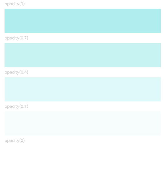
| opacity | number \| [Resource](ts-types.md#resource) | Opacity of the component. The value ranges from 0 to 1. The value **1** means opaque, and **0** means completely transparent. When being completely transparent, the component is hidden, but still takes up space in the layout.
**NOTE**
A component can inherit the opacity setting from its parent component.
Default value: **1**
Since API version 9, this API is supported in ArkTS widgets. |
## Example
```ts
// xxx.ets
@Entry
@Component
struct OpacityExample {
build() {
Column({ space: 5 }) {
Text('opacity(1)').fontSize(9).width('90%').fontColor(0xCCCCCC)
Text().width('90%').height(50).opacity(1).backgroundColor(0xAFEEEE)
Text('opacity(0.7)').fontSize(9).width('90%').fontColor(0xCCCCCC)
Text().width('90%').height(50).opacity(0.7).backgroundColor(0xAFEEEE)
Text('opacity(0.4)').fontSize(9).width('90%').fontColor(0xCCCCCC)
Text().width('90%').height(50).opacity(0.4).backgroundColor(0xAFEEEE)
Text('opacity(0.1)').fontSize(9).width('90%').fontColor(0xCCCCCC)
Text().width('90%').height(50).opacity(0.1).backgroundColor(0xAFEEEE)
Text('opacity(0)').fontSize(9).width('90%').fontColor(0xCCCCCC)
Text().width('90%').height(50).opacity(0).backgroundColor(0xAFEEEE)
}
.width('100%')
.padding({ top: 5 })
}
}
```