# @ohos.arkui.advanced.ComposeListItem (List)
The list component is a container that presents a series of items arranged in a column with the same width. You can use it to present data of the same type in a multiple and coherent row style, for example, images or text.
> **NOTE**
>
> This component is supported since API version 10. Updates will be marked with a superscript to indicate their earliest API version.
## Modules to Import
```
import { ComposeListItem } from "@ohos.arkui.advanced.ComposeListItem"
```
## Child Components
Not supported
## Attributes
The [universal attributes](ts-universal-attributes-size.md) are supported.
## ComposeListItem
ComposeListItem({contentItem?: ContentItem, operateItem?: OperateItem})
**Decorator**: @Component
**System capability**: SystemCapability.ArkUI.ArkUI.Full
**Parameters**
| Name| Type| Mandatory| Decorator| Description|
| -------- | -------- | -------- | -------- | -------- |
| contentItem | [ContentItem](#contentitem) | No| \@Prop | Elements on the left and in the center.|
| operateItem | [OperateItem](#operateitem) | No| \@Prop | Element on the right.|
## ContentItem
| Name| Type| Mandatory| Description|
| -------- | -------- | -------- | -------- |
| iconStyle | [IconType](#icontype) | No| Icon style of the element on the left.|
| icon | [ResourceStr](ts-types.md#resourcestr) | No| Icon resource of the element on the left.|
| primaryText | [ResourceStr](ts-types.md#resourcestr) | No| Title of the element in the center. If the length limit is reached, an ellipsis (...) is displayed to represent clipped text.|
| secondaryText | [ResourceStr](ts-types.md#resourcestr) | No| Subtitle of the element in the center. If the length limit is reached, an ellipsis (...) is displayed to represent clipped text.|
| description | [ResourceStr](ts-types.md#resourcestr) | No| Description of the element in the center. If the length limit is reached, an ellipsis (...) is displayed to represent clipped text.|
## IconType
| Name| Value| Description|
| -------- | -------- | -------- |
| BADGE | 1 | The icon on the left is a badge, in the size of 8 x 8 dp.|
| NORMAL_ICON | 2 | The icon on the left is a small icon, in the size of 16 x 16 dp.|
| SYSTEM_ICON | 3 | The icon on the left is a system icon, in the size of 24 x 24 dp.|
| HEAD_SCULPTURE | 4 | The icon on the left is a profile picture, in the size of 40 x 40 dp.|
| APP_ICON | 5 | The icon on the left is an application icon, in the size of 64 x 64 dp.|
| PREVIEW | 6 | The icon on the left is a preview image, in the size of 96 x 96 dp.|
| LONGITUDINAL | 7 | The icon on the left uses an aspect ratio where width is greater than height, with the longest edge being 96 dp.|
| VERTICAL | 8 | The icon on the left uses an aspect ratio where height is greater than width, with the longest edge being 96 dp.|
## OperateItem
| Name| Type| Mandatory| Description|
| -------- | -------- | -------- | -------- |
| arrow | [OperateIcon](#operateicon) | No| The element on the right is an arrow, in the size of 12 x 24 dp.|
| icon | [OperateIcon](#operateicon) | No| First icon of the element on the right, in the size of 24 x 24 dp.|
| subIcon | [OperateIcon](#operateicon) | No| Second icon of the element on the right, in the size of 24 x 24 dp.|
| button | [OperateButton](#operatebutton) | No| The element on the right is a button.|
| switch | [OperateCheck](#operatecheck) | No| The element on the right is a switch.|
| checkbox | [OperateCheck](#operatecheck) | No| The element on the right is a check box, in the size of 24 x 24 dp.|
| radio | [OperateCheck](#operatecheck) | No| The element on the right is a radio button, in the size of 24 x 24 dp.|
| image | [ResourceStr](ts-types.md#resourcestr) | No| The element on the right is an image, in the size of 48 x 48 dp.|
| text | [ResourceStr](ts-types.md#resourcestr) | No| The element on the right is text.|
## OperateIcon
| Name| Type| Mandatory| Description|
| -------- | -------- | -------- | -------- |
| value | [ResourceStr](ts-types.md#resourcestr) | Yes| Resource of the icon or arrow on the right.|
| action | ()=>void | No| Click event of the icon or arrow on the right.|
## OperateButton
| Name| Type| Mandatory| Description|
| -------- | -------- | -------- | -------- |
| text | [ResourceStr](ts-types.md#resourcestr) | No| Button text on the right.|
## OperateCheck
| Name| Type| Mandatory| Description|
| -------- | -------- | -------- | -------- |
| isCheck | boolean | No| Whether the switch, check box, or radio button on the right is selected.
Default value: **false**
**true**: selected
**false**: not selected|
| onChange | (value: boolean)=>void | No| Callback invoked when the selected state of the switch, check box, or radio button on the right is changed.
**true**: from not selected to selected
**false**: from selected to not selected|
## Events
The [universal events](ts-universal-events-click.md) are supported.
## Example
```ts
import { IconType, ComposeListItem } from '@ohos.arkui.advanced.ComposeListItem';
import promptAction from '@ohos.promptAction'
@Entry
@Component
struct ComposeListItemExample {
build() {
Column() {
List() {
ListItem() {
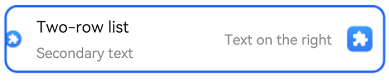
ComposeListItem({
contentItem: ({
iconStyle: IconType.NORMAL_ICON,
icon: $r('sys.media.ohos_app_icon'),
primaryText: 'Two-row list',
secondaryText:'Secondary text'
}),
operateItem: ({
icon: {
value: $r('sys.media.ohos_app_icon'),
action: () => {
promptAction.showToast({ message: 'icon' })
} },
text:'Text on the right'
})
})
}
}
}
}
}
```