# @ohos.promptAction (Prompt)
The **PromptAction** module provides APIs for creating and showing toasts, dialog boxes, and action menus.
> **NOTE**
>
> The initial APIs of this module are supported since API version 9. Newly added APIs will be marked with a superscript to indicate their earliest API version.
>
> This module cannot be used in the file declaration of the [UIAbility](./js-apis-app-ability-uiAbility.md). In other words, the APIs of this module can be used only after a component instance is created; they cannot be called in the lifecycle of the UIAbility.
>
> The functionality of this module depends on UI context. This means that the APIs of this module cannot be used where the UI context is unclear. For details, see [UIContext](./js-apis-arkui-UIContext.md#uicontext).
>
> Since API version 10, you can use the [getPromptAction](./js-apis-arkui-UIContext.md#getpromptaction) API in [UIContext](./js-apis-arkui-UIContext.md#uicontext) to obtain the [PromptAction](./js-apis-arkui-UIContext.md#promptaction) object associated with the current UI context.
## Modules to Import
```ts
import promptAction from '@ohos.promptAction';
```
## promptAction.showToast
showToast(options: ShowToastOptions): void
Shows a toast.
**System capability**: SystemCapability.ArkUI.ArkUI.Full
**Parameters**
| Name | Type | Mandatory | Description |
| ------- | ------------------------------------- | ---- | ------- |
| options | [ShowToastOptions](#showtoastoptions) | Yes | Toast options.|
**Error codes**
For details about the error codes, see [promptAction Error Codes](../errorcodes/errorcode-promptAction.md).
| ID | Error Message|
| --------- | ------- |
| 100001 | if UI execution context not found. |
**Example**
```ts
import promptAction from '@ohos.promptAction'
import { BusinessError } from '@ohos.base';
try {
promptAction.showToast({
message: 'Message Info',
duration: 2000
});
} catch (error) {
let message = (error as BusinessError).message
let code = (error as BusinessError).code
console.error(`showToast args error code is ${code}, message is ${message}`);
};
```

## ShowToastOptions
Describes the options for showing the toast.
**System capability**: SystemCapability.ArkUI.ArkUI.Full
| Name | Type | Mandatory| Description |
| -------- | ------------------------------------------------------------ | ---- | ------------------------------------------------------------ |
| message | string\| [Resource](../arkui-ts/ts-types.md#resource)9+| Yes | Text to display.
**NOTE**
The default font is **'Harmony Sans'**. Other fonts are not supported.|
| duration | number | No | Duration that the toast will remain on the screen. The default value is 1500 ms. The value range is 1500 ms to 10000 ms. If a value less than 1500 ms is set, the default value is used. If the value greater than 10000 ms is set, the upper limit 10000 ms is used.|
| bottom | string\| number | No | Distance between the toast border and the bottom of the screen.
Default value: **80vp** |
| showMode11+ | [ToastShowMode](#toastshowmode11) | No | Whether to show the toast above the application.
Default value: **ToastShowMode.DEFAULT**, which means to show the toast within the application |
### ToastShowMode11+
Describes the mode in which the toast is shown.
**System capability**: SystemCapability.ArkUI.ArkUI.Full
| Name | Value| Description |
| -------- | ---- | ------------------------------------------------------------ |
| DEFAULT | 0 | The toast is shown within the application.|
| TOP_MOST | 1 | The toast is shown above the application.|
## promptAction.showDialog
showDialog(options: ShowDialogOptions): Promise<ShowDialogSuccessResponse>
Shows a dialog box. This API uses a promise to return the result asynchronously.
**System capability**: SystemCapability.ArkUI.ArkUI.Full
**Parameters**
| Name | Type | Mandatory | Description |
| ------- | --------------------------------------- | ---- | ------ |
| options | [ShowDialogOptions](#showdialogoptions) | Yes | Dialog box options.|
**Return value**
| Type | Description |
| ---------------------------------------- | -------- |
| Promise<[ShowDialogSuccessResponse](#showdialogsuccessresponse)> | Promise used to return the dialog box response result.|
**Error codes**
For details about the error codes, see [promptAction Error Codes](../errorcodes/errorcode-promptAction.md).
| ID | Error Message|
| --------- | ------- |
| 100001 | if UI execution context not found. |
**Example**
```ts
import promptAction from '@ohos.promptAction'
import { BusinessError } from '@ohos.base';
try {
promptAction.showDialog({
title: 'Title Info',
message: 'Message Info',
buttons: [
{
text: 'button1',
color: '#000000'
},
{
text: 'button2',
color: '#000000'
}
],
})
.then(data => {
console.info('showDialog success, click button: ' + data.index);
})
.catch((err:Error) => {
console.info('showDialog error: ' + err);
})
} catch (error) {
let message = (error as BusinessError).message
let code = (error as BusinessError).code
console.error(`showDialog args error code is ${code}, message is ${message}`);
};
```
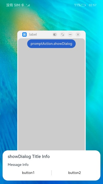
## promptAction.showDialog
showDialog(options: ShowDialogOptions, callback: AsyncCallback<ShowDialogSuccessResponse>):void
Shows a dialog box. This API uses an asynchronous callback to return the result.
**System capability**: SystemCapability.ArkUI.ArkUI.Full
**Parameters**
| Name | Type | Mandatory | Description |
| -------- | ---------------------------------------- | ---- | ------------ |
| options | [ShowDialogOptions](#showdialogoptions) | Yes | Dialog box options.|
| callback | AsyncCallback<[ShowDialogSuccessResponse](#showdialogsuccessresponse)> | Yes | Callback used to return the dialog box response result. |
**Error codes**
For details about the error codes, see [promptAction Error Codes](../errorcodes/errorcode-promptAction.md).
| ID | Error Message|
| --------- | ------- |
| 100001 | if UI execution context not found. |
**Example**
```ts
import promptAction from '@ohos.promptAction';
import { BusinessError } from '@ohos.base';
try {
promptAction.showDialog({
title: 'showDialog Title Info',
message: 'Message Info',
buttons: [
{
text: 'button1',
color: '#000000'
},
{
text: 'button2',
color: '#000000'
}
]
}, (err, data) => {
if (err) {
console.info('showDialog err: ' + err);
return;
}
console.info('showDialog success callback, click button: ' + data.index);
});
} catch (error) {
let message = (error as BusinessError).message
let code = (error as BusinessError).code
console.error(`showDialog args error code is ${code}, message is ${message}`);
};
```

When the **showInSubWindow** attribute is set to **true**, the toast can be displayed outside the window.
```ts
import promptAction from '@ohos.promptAction';
import { BusinessError } from '@ohos.base';
try {
promptAction.showDialog({
title: 'showDialog Title Info',
message: 'Message Info',
isModal: true,
showInSubWindow: true,
buttons: [
{
text: 'button1',
color: '#000000'
},
{
text: 'button2',
color: '#000000'
}
]
}, (err, data) => {
if (err) {
console.info('showDialog err: ' + err);
return;
}
console.info('showDialog success callback, click button: ' + data.index);
});
} catch (error) {
let message = (error as BusinessError).message
let code = (error as BusinessError).code
console.error(`showDialog args error code is ${code}, message is ${message}`);
};
```
## ShowDialogOptions
Describes the options for showing the dialog box.
**System capability**: SystemCapability.ArkUI.ArkUI.Full
| Name | Type | Mandatory| Description |
| ------- | ------------------------------------------------------------ | ---- | ------------------------------------------------------------ |
| title | string\| [Resource](../arkui-ts/ts-types.md#resource)9+| No | Title of the dialog box. |
| message | string\| [Resource](../arkui-ts/ts-types.md#resource)9+| No | Text body. |
| buttons | Array<[Button](#button)> | No | Array of buttons in the dialog box. The array structure is {text:'button', color: '\#666666'}. More than one button is supported.
| alignment10+ | [DialogAlignment](../arkui-ts/ts-methods-alert-dialog-box.md#dialogalignment) | No | Alignment mode of the dialog box in the vertical direction.
Default value: **DialogAlignment.Default**|
| offset10+ | [Offset](../arkui-ts/ts-types.md#offset) | No | Offset of the dialog box based on the **alignment** settings.
Default value: **{ dx: 0 , dy: 0 }**|
| maskRect10+| [Rectangle](../arkui-ts/ts-methods-alert-dialog-box.md#rectangle8) | No | Mask area of the dialog box. Events outside the mask area are transparently transmitted, and events within the mask area are not.
Default value: **{ x: 0, y: 0, width: '100%', height: '100%' }**|
| showInSubWindow11+ | boolean | No| Whether to show the dialog box in a sub-window.
Default value: **false**
**NOTE**
A dialog box whose **showInSubWindow** attribute is **true** cannot trigger the display of another dialog box whose **showInSubWindow** attribute is also **true**.|
| isModal11+ | boolean | No| Whether the dialog box is a modal. A modal dialog box has a mask applied, while a non-modal dialog box does not.
Default value: **true**|
## ShowDialogSuccessResponse
Describes the dialog box response result.
**System capability**: SystemCapability.ArkUI.ArkUI.Full
| Name | Type | Mandatory| Description |
| ----- | ------ | ---- | ------------------------------- |
| index | number | No | Index of the selected button in the **buttons** array.|
## promptAction.showActionMenu
showActionMenu(options: ActionMenuOptions, callback: AsyncCallback<ActionMenuSuccessResponse>):void
Shows an action menu. This API uses a callback to return the result asynchronously.
**System capability**: SystemCapability.ArkUI.ArkUI.Full
**Parameters**
| Name | Type | Mandatory | Description |
| -------- | ---------------------------------------- | ---- | --------- |
| options | [ActionMenuOptions](#actionmenuoptions) | Yes | Action menu options. |
| callback | AsyncCallback<[ActionMenuSuccessResponse](#actionmenusuccessresponse)> | Yes | Callback used to return the action menu response result.|
**Error codes**
For details about the error codes, see [promptAction Error Codes](../errorcodes/errorcode-promptAction.md).
| ID | Error Message|
| --------- | ------- |
| 100001 | if UI execution context not found. |
**Example**
```ts
import promptAction from '@ohos.promptAction';
import { BusinessError } from '@ohos.base';
try {
promptAction.showActionMenu({
title: 'Title Info',
buttons: [
{
text: 'item1',
color: '#666666'
},
{
text: 'item2',
color: '#000000'
},
]
}, (err, data) => {
if (err) {
console.info('showActionMenu err: ' + err);
return;
}
console.info('showActionMenu success callback, click button: ' + data.index);
})
} catch (error) {
let message = (error as BusinessError).message
let code = (error as BusinessError).code
console.error(`showActionMenu args error code is ${code}, message is ${message}`);
};
```
## promptAction.showActionMenu
showActionMenu(options: ActionMenuOptions): Promise<ActionMenuSuccessResponse>
Shows an action menu. This API uses a promise to return the result asynchronously.
**System capability**: SystemCapability.ArkUI.ArkUI.Full
**Parameters**
| Name | Type | Mandatory | Description |
| ------- | --------------------------------------- | ---- | ------- |
| options | [ActionMenuOptions](#actionmenuoptions) | Yes | Action menu options.|
**Return value**
| Type | Description |
| ---------------------------------------- | ------- |
| Promise<[ActionMenuSuccessResponse](#actionmenusuccessresponse)> | Promise used to return the action menu response result.|
**Error codes**
For details about the error codes, see [promptAction Error Codes](../errorcodes/errorcode-promptAction.md).
| ID | Error Message|
| --------- | ------- |
| 100001 | if UI execution context not found. |
**Example**
```ts
import promptAction from '@ohos.promptAction';
import { BusinessError } from '@ohos.base';
try {
promptAction.showActionMenu({
title: 'showActionMenu Title Info',
buttons: [
{
text: 'item1',
color: '#666666'
},
{
text: 'item2',
color: '#000000'
},
]
})
.then(data => {
console.info('showActionMenu success, click button: ' + data.index);
})
.catch((err:Error) => {
console.info('showActionMenu error: ' + err);
})
} catch (error) {
let message = (error as BusinessError).message
let code = (error as BusinessError).code
console.error(`showActionMenu args error code is ${code}, message is ${message}`);
};
```

## promptAction.openCustomDialog11+
openCustomDialog(options: CustomDialogOptions): Promise<number>
Opens a custom dialog box.
This API cannot be used in [ServiceExtension](../../../application-dev/application-models/serviceextensionability.md).
**isModal = true** and **showInSubWindow = true** cannot be used at the same time.
By default, the width of the dialog box is four columns in portrait mode and five columns in landscape mode.
**System capability**: SystemCapability.ArkUI.ArkUI.Full
**Parameters**
| Name | Type | Mandatory| Description |
| ------- | --------------------------------------------- | ---- | ------------------ |
| options | [CustomDialogOptions](#customdialogoptions11) | Yes | Content of the custom dialog box.|
**Return value**
| Type | Description |
| --------------------- | ------------------------------------- |
| Promise<number> | ID of the custom dialog box, which can be used in **closeCustomDialog**.|
**Error codes**
For details about the error codes, see [promptAction Error Codes](../errorcodes/errorcode-promptAction.md).
| ID| Error Message |
| -------- | ---------------------------------- |
| 100001 | if UI execution context not found. |
**Example**
```ts
import promptAction from '@ohos.promptAction'
let customDialogId: number = 0
@Builder
function customDialogBuilder() {
Column() {
Text('Custom dialog Message').fontSize(10)
Row() {
Button ("OK").onClick () => {
promptAction.closeCustomDialog(customDialogId)
})
Blank().width(50)
Button ("Cancel").onClick () => {
promptAction.closeCustomDialog(customDialogId)
})
}
}.height(200).padding(5)
}
@Entry
@Component
struct Index {
@State message: string = 'Hello World'
build() {
Row() {
Column() {
Text(this.message)
.fontSize(50)
.fontWeight(FontWeight.Bold)
.onClick(() => {
promptAction.openCustomDialog({
builder: customDialogBuilder.bind(this)
}).then((dialogId: number) => {
customDialogId = dialogId
})
})
}
.width('100%')
}
.height('100%')
}
}
```
## promptAction.closeCustomDialog11+
closeCustomDialog(dialogId: number): void
Closes the specified custom dialog box.
**System capability**: SystemCapability.ArkUI.ArkUI.Full
**Parameters**
| Name | Type | Mandatory| Description |
| -------- | ------ | ---- | -------------------------------- |
| dialogId | number | Yes | ID of the custom dialog box to close. It is returned from **openCustomDialog**.|
**Error codes**
For details about the error codes, see [promptAction Error Codes](../errorcodes/errorcode-promptAction.md).
| ID| Error Message |
| -------- | ---------------------------------- |
| 100001 | if UI execution context not found. |
**Example**
See the example of [promptAction.openCustomDialog](#promptactionopencustomdialog11).
## ActionMenuOptions
Describes the options for showing the action menu.
**System capability**: SystemCapability.ArkUI.ArkUI.Full
| Name | Type | Mandatory| Description |
| ----------------------------- | ------------------------------------------------------------ | ---- | ------------------------------------------------------------ |
| title | string\| [Resource](../arkui-ts/ts-types.md#resource)9+| No | Title of the dialog box. |
| buttons | [[Button](#button),[Button](#button)?,[Button](#button)?,[Button](#button)?,[Button](#button)?,[Button](#button)?] | Yes | Array of menu item buttons. The array structure is **{text:'button', color: '\#666666'}**. Up to six buttons are supported. If there are more than six buttons, only the first six buttons will be displayed.|
| showInSubWindow11+ | boolean | No | Whether to show the dialog box in a sub-window when the dialog box needs to be displayed outside the main window.
Default value: **false**, indicating that the dialog box is not displayed in the subwindow
**NOTE**
A dialog box whose **showInSubWindow** attribute is **true** cannot trigger the display of another dialog box whose **showInSubWindow** attribute is also **true**.|
| isModal11+ | boolean | No | Whether the dialog box is a modal. A modal dialog box has a mask applied, while a non-modal dialog box does not.
Default value: **true**|
## CustomDialogOptions11+
Defines the options of the custom dialog box. This API extends [BaseDialogOptions](#basedialogoptions11).
**System capability**: SystemCapability.ArkUI.ArkUI.Full
| Name | Type | Mandatory| Description |
| ------- | ------------------------------------------------------- | ---- | ------------------------------------------------------------ |
| builder | [CustomBuilder](../arkui-ts/ts-types.md#custombuilder8) | No | Content of the custom dialog box.
**NOTE**
**bind(this)** must be used for the builder.
The aspect ratio of the root node is relative to the size of the dialog box container.
The aspect ratio of a non-root node is relative to the size of the parent node.|
## BaseDialogOptions11+
Defines the options of the dialog box.
**System capability**: SystemCapability.ArkUI.ArkUI.Full
| Name | Type | Mandatory| Description |
| --------------- | ------------------------------------------------------------ | ---- | ------------------------------------------------------------ |
| maskRect | [Rectangle](../arkui-ts/ts-methods-alert-dialog-box.md#rectangle8) | No | Mask area. |
| alignment | [DialogAlignment](../arkui-ts/ts-methods-alert-dialog-box.md#dialogalignment) | No | Alignment mode of the dialog box in the vertical direction. |
| offset | [Offset](../arkui-ts/ts-types.md#offset) | No | Offset of the dialog box based on the **alignment** settings. |
| isModal | boolean | No | Whether the dialog box is a modal. A modal dialog box has a mask applied, while a non-modal dialog box does not.
Default value: **true**|
| showInSubWindow | boolean | No | Whether to show the dialog box in a sub-window.
Default value: **false**|
## ActionMenuSuccessResponse
Describes the action menu response result.
**System capability**: SystemCapability.ArkUI.ArkUI.Full
| Name | Type | Mandatory | Description |
| ----- | ------ | ---- | ------------------------ |
| index | number | No | Index of the selected button in the **buttons** array, starting from **0**.|
## Button
Describes the menu item button in the action menu.
**System capability**: SystemCapability.ArkUI.ArkUI.Full
| Name | Type | Mandatory | Description |
| ----- | ---------------------------------------- | ---- | ------- |
| text | string\| [Resource](../arkui-ts/ts-types.md#resource)9+| Yes | Button text.|
| color | string\| [Resource](../arkui-ts/ts-types.md#resource)9+| Yes | Text color of the button.|