# 动画
动画分为[é™æ€åŠ¨ç”»](#é™æ€åŠ¨ç”»)å’Œ[è¿žç»åŠ¨ç”»](#è¿žç»åŠ¨ç”»)。
## é™æ€åŠ¨ç”»
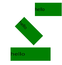
é™æ€åŠ¨ç”»çš„æ ¸å¿ƒæ˜¯transformæ ·å¼ï¼Œä¸»è¦å¯ä»¥å®žçŽ°ä»¥ä¸‹ä¸‰ç§å˜æ¢ç±»åž‹ï¼Œä¸€æ¬¡æ ·å¼è®¾ç½®åªèƒ½å®žçŽ°ä¸€ç§ç±»åž‹å˜æ¢ã€‚
- **translate**:沿水平或垂直方å‘将指定组件移动所需è·ç¦»ã€‚
- **scale**:横å‘或纵å‘将指定组件缩å°æˆ–放大到所需比例。
- **rotate**:将指定组件沿横轴或纵轴或ä¸å¿ƒç‚¹æ—‹è½¬æŒ‡å®šçš„角度。
具体的使用示例如下,更多信æ¯è¯·å‚考[组件方法](../reference/apis-arkui/arkui-js/js-components-common-methods.md)。
```html
<!-- xxx.hml -->
<div class="container">
<text class="translate">hello</text>
<text class="rotate">hello</text>
<text class="scale">hello</text>
</div>
```
```css
/* xxx.css */
.container {
width: 100%;
flex-direction: column;
align-items: center;
}
.translate {
height: 150px;
width: 300px;
margin: 50px;
font-size: 50px;
background-color: #008000;
transform: translate(200px);
}
.rotate {
height: 150px;
width: 300px;
margin: 50px;
font-size: 50px;
background-color: #008000;
transform-origin: 200px 100px;
transform: rotate(45deg);
}
.scale {
height: 150px;
width: 300px;
margin: 50px;
font-size: 50px;
background-color: #008000;
transform: scaleX(1.5);
}
```
**图1** é™æ€åŠ¨ç”»æ•ˆæžœå›¾
## è¿žç»åŠ¨ç”»
é™æ€åŠ¨ç”»åªæœ‰å¼€å§‹çŠ¶æ€å’Œç»“æŸçŠ¶æ€ï¼Œæ²¡æœ‰ä¸é—´çŠ¶æ€ï¼Œå¦‚果需è¦è®¾ç½®ä¸é—´çš„过渡状æ€å’Œè½¬æ¢æ•ˆæžœï¼Œéœ€è¦ä½¿ç”¨è¿žç»åŠ¨ç”»å®žçŽ°ã€‚
è¿žç»åŠ¨ç”»çš„æ ¸å¿ƒæ˜¯animationæ ·å¼ï¼Œå®ƒå®šä¹‰äº†åŠ¨ç”»çš„开始状æ€ã€ç»“æŸçŠ¶æ€ä»¥åŠæ—¶é—´å’Œé€Ÿåº¦çš„å˜åŒ–曲线。通过animationæ ·å¼å¯ä»¥å®žçŽ°çš„效果有:
- **animation-name**:设置动画执行åŽåº”用到组件上的背景颜色ã€é€æ˜Žåº¦ã€å®½é«˜å’Œå˜æ¢ç±»åž‹ã€‚
- **animation-delay**å’Œ**animation-duration**:分别设置动画执行åŽå…ƒç´ 延迟和æŒç»çš„时间。
- **animation-timing-function**:æè¿°åŠ¨ç”»æ‰§è¡Œçš„é€Ÿåº¦æ›²çº¿ï¼Œä½¿åŠ¨ç”»æ›´åŠ å¹³æ»‘ã€‚
- **animation-iteration-count**:定义动画æ’放的次数。
- **animation-fill-mode**:指定动画执行结æŸåŽæ˜¯å¦æ¢å¤åˆå§‹çŠ¶æ€ã€‚
animationæ ·å¼éœ€è¦åœ¨css文件ä¸å…ˆå®šä¹‰keyframe,在keyframeä¸è®¾ç½®åŠ¨ç”»çš„è¿‡æ¸¡æ•ˆæžœï¼Œå¹¶é€šè¿‡ä¸€ä¸ªæ ·å¼ç±»åž‹åœ¨hml文件ä¸è°ƒç”¨ã€‚animation-name的使用示例如下:
```html
<!-- xxx.hml -->
<div class="item-container">
<div class="item {{colorParam}}">
<text class="txt">color</text>
</div>
<div class="item {{opacityParam}}">
<text class="txt">opacity</text>
</div>
<input class="button" type="button" name="" value="show" onclick="showAnimation"/>
</div>
```
```css
/* xxx.css */
.item-container {
margin: 60px;
flex-direction: column;
}
.item {
width: 80%;
background-color: #f76160;
}
.txt {
text-align: center;
width: 200px;
height: 100px;
}
.button {
width: 200px;
margin: 10px;
font-size: 30px;
background-color: #09ba07;
}
.color {
animation-name: Color;
animation-duration: 8000ms;
}
.opacity {
animation-name: Opacity;
animation-duration: 8000ms;
}
@keyframes Color {
from {
background-color: #f76160;
}
to {
background-color: #09ba07;
}
}
@keyframes Opacity {
from {
opacity: 0.9;
}
to {
opacity: 0.1;
}
}
```
```js
// xxx.js
export default {
data: {
colorParam: '',
opacityParam: '',
},
showAnimation: function () {
this.colorParam = '';
this.opacityParam = '';
this.colorParam = 'color';
this.opacityParam = 'opacity';
}
}
```
**图2** è¿žç»åŠ¨ç”»æ•ˆæžœå›¾
