# Checkbox
**Checkbox** is a component that is used to enable or disable an option.
> **NOTE**
>
> Since API version 11, the default style of the **Checkbox** component is changed from rounded square to circle.
>
> This component is supported since API version 8. Updates will be marked with a superscript to indicate their earliest API version.
## Child Components
Not supported
## APIs
Checkbox(options?: CheckboxOptions)
Creates a check box.
**Widget capability**: This API can be used in ArkTS widgets since API version 9.
**Atomic service API**: This API can be used in atomic services since API version 11.
**System capability**: SystemCapability.ArkUI.ArkUI.Full
**Parameters**
| Name | Type | Mandatory| Description |
| ------- | ------------------------------------------- | ---- | ------------------ |
| options | [CheckboxOptions](#checkboxoptions)| No | Check box parameters.|
## CheckboxOptions
**System capability**: SystemCapability.ArkUI.ArkUI.Full
| Name | Type| Mandatory | Description|
| --------| --------| ------ | -------- |
| name | string | No| Name of the check box.
**Widget capability**: This API can be used in ArkTS widgets since API version 9.
**Atomic service API**: This API can be used in atomic services since API version 11.|
| group | string | No| Group name of the check box (that is, the name of the check box group to which the check box belongs).
**NOTE**
For the settings to take effect, this parameter must be used with the [CheckboxGroup](ts-basic-components-checkboxgroup.md) component.
**Widget capability**: This API can be used in ArkTS widgets since API version 9.
**Atomic service API**: This API can be used in atomic services since API version 11.|
| indicatorBuilder12+ | [CustomBuilder](ts-types.md#custombuilder8) | No| Custom component to indicate that the check box is selected. This custom component is center aligned with the check box. When **indicatorBuilder** is set to **undefined** or **null**, it defaults to the state where it is not set.
**Atomic service API**: This API can be used in atomic services since API version 12.|
## Attributes
In addition to the [universal attributes](ts-component-general-attributes.md), the following attributes are supported.
### select
select(value: boolean)
Sets whether the check box is selected.
Since API version 10, this attribute supports two-way binding through [$$](../../../ui/state-management/arkts-two-way-sync.md).
Since API version 18, this attribute supports two-way binding through [!!](../../../ui/state-management/arkts-new-binding.md#two-way-binding-between-built-in-component-parameters).
**Widget capability**: This API can be used in ArkTS widgets since API version 9.
**Atomic service API**: This API can be used in atomic services since API version 11.
**System capability**: SystemCapability.ArkUI.ArkUI.Full
**Parameters**
| Name| Type | Mandatory| Description |
| ------ | ------- | ---- | ------------------------------------------------------------ |
| value | boolean | Yes | Whether the check box is selected.
Default value: **false**
**true**: The check box is selected. **false**: The check box is not selected.|
### select18+
select(isSelected: Optional\)
Sets whether the check box is selected. Compared with [select](#select), this API supports the **undefined** type for the **isSelected** parameter.
This attribute supports two-way binding through [$$](../../../ui/state-management/arkts-two-way-sync.md). This attribute supports two-way binding through [!!](../../../ui/state-management/arkts-new-binding.md).
**Widget capability**: This API can be used in ArkTS widgets since API version 18.
**Atomic service API**: This API can be used in atomic services since API version 18.
**System capability**: SystemCapability.ArkUI.ArkUI.Full
**Parameters**
| Name | Type | Mandatory| Description |
| ---------- | ------------------------------------------------------------ | ---- | ------------------------------------------------------------ |
| isSelected | [Optional](ts-universal-attributes-custom-property.md#optional12)\ | Yes | Whether the check box is selected.
If **isSelected** is set to **undefined**, the default value **false** is used.
**true**: The check box is selected. **false**: The check box is not selected.|
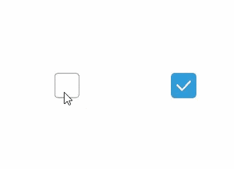
### selectedColor
selectedColor(value: ResourceColor)
Sets the color of the check box when it is selected.
**Widget capability**: This API can be used in ArkTS widgets since API version 9.
**Atomic service API**: This API can be used in atomic services since API version 11.
**System capability**: SystemCapability.ArkUI.ArkUI.Full
**Parameters**
| Name| Type | Mandatory| Description |
| ------ | ------------------------------------------ | ---- | ------------------------------------------------------------ |
| value | [ResourceColor](ts-types.md#resourcecolor) | Yes | Color of the check box when it is selected.
Default value: **$r('sys.color.ohos_id_color_text_primary_activated')**
An invalid value is handled as the default value.|
### selectedColor18+
selectedColor(resColor: Optional\)
Sets the color of the check box when it is selected. Compared with [selectedColor](#selectedcolor), this API supports the **undefined** type for the **resColor** parameter.
**Widget capability**: This API can be used in ArkTS widgets since API version 18.
**Atomic service API**: This API can be used in atomic services since API version 18.
**System capability**: SystemCapability.ArkUI.ArkUI.Full
**Parameters**
| Name | Type | Mandatory| Description |
| -------- | ------------------------------------------------------------ | ---- | ------------------------------------------------------------ |
| resColor | [Optional](ts-universal-attributes-custom-property.md#optional12)\<[ResourceColor](ts-types.md#resourcecolor)> | Yes | Color of the check box when it is selected.
If **resColor** is set to **undefined**, the default value **$r('sys.color.ohos_id_color_text_primary_activated')** is used.
An invalid value is handled as the default value.|
### unselectedColor10+
unselectedColor(value: ResourceColor)
Sets the border color of the check box when it is not selected.
**Atomic service API**: This API can be used in atomic services since API version 11.
**System capability**: SystemCapability.ArkUI.ArkUI.Full
**Parameters**
| Name| Type | Mandatory| Description |
| ------ | ------------------------------------------ | ---- | -------------------------- |
| value | [ResourceColor](ts-types.md#resourcecolor) | Yes | Border color of the check box when it is not selected.
Default value: **$r('sys.color.ohos_id_color_switch_outline_off')**|
### unselectedColor18+
unselectedColor(resColor: Optional\)
Sets the border color of the check box when it is not selected. Compared with [unselectedColor](#unselectedcolor10)10+, this API supports the **undefined** type for the **resColor** parameter.
**Atomic service API**: This API can be used in atomic services since API version 18.
**System capability**: SystemCapability.ArkUI.ArkUI.Full
**Parameters**
| Name | Type | Mandatory| Description |
| -------- | ------------------------------------------------------------ | ---- | ------------------------------------------------------------ |
| resColor | [Optional](ts-universal-attributes-custom-property.md#optional12)\<[ResourceColor](ts-types.md#resourcecolor)> | Yes | Border color of the check box when it is not selected.
If **resColor** is set to **undefined**, the default value **$r('sys.color.ohos_id_color_switch_outline_off')** is used.|
### mark10+
mark(value: MarkStyle)
Sets the check mark style of the check box.
**Atomic service API**: This API can be used in atomic services since API version 11.
**System capability**: SystemCapability.ArkUI.ArkUI.Full
**Parameters**
| Name| Type | Mandatory| Description |
| ------ | -------------------------------------------- | ---- | ------------------------------------------------------------ |
| value | [MarkStyle](ts-types.md#markstyle10) | Yes | Check mark style of the check box. Since API version 12, if **indicatorBuilder** is set, the style is determined by **indicatorBuilder**.
Default value: {
strokeColor : `$r('sys.color.ohos_id_color_foreground_contrary')`,
strokeWidth: `$r('sys.float.ohos_id_checkbox_stroke_width')`,
size: '20vp'
} |
### mark18+
mark(style: Optional\)
Sets the check mark style of the check box. Compared with [mark](#mark10)10+, this API supports the **undefined** type for the **style** parameter.
**Atomic service API**: This API can be used in atomic services since API version 18.
**System capability**: SystemCapability.ArkUI.ArkUI.Full
**Parameters**
| Name| Type | Mandatory| Description |
| ------ | ------------------------------------------------------------ | ---- | ------------------------------------------------------------ |
| style | [Optional](ts-universal-attributes-custom-property.md#optional12)\<[MarkStyle](ts-types.md#markstyle10)> | Yes | Check mark style of the check box. If **indicatorBuilder** is set, the style is determined by **indicatorBuilder**.
If **style** is set to **undefined**, the default value is used: {
strokeColor : `$r('sys.color.ohos_id_color_foreground_contrary')`,
strokeWidth: `$r('sys.float.ohos_id_checkbox_stroke_width')`,
size: '20vp'
} |
### shape11+
shape(value: CheckBoxShape)
Sets the shape of the check box.
**Widget capability**: This API can be used in ArkTS widgets since API version 11.
**Atomic service API**: This API can be used in atomic services since API version 12.
**System capability**: SystemCapability.ArkUI.ArkUI.Full
**Parameters**
| Name| Type | Mandatory| Description |
| ------ | ----------------------------------------------------- | ---- | ------------------------------------------------------------ |
| value | [CheckBoxShape](ts-appendix-enums.md#checkboxshape11) | Yes | Shape of the check box.
Default value: **CheckBoxShape.CIRCLE**|
### shape18+
shape(shape: Optional\)
Sets the shape of the check box. Compared with [shape](#shape11)11+, this API supports the **undefined** type for the **shape** parameter.
**Widget capability**: This API can be used in ArkTS widgets since API version 18.
**Atomic service API**: This API can be used in atomic services since API version 18.
**System capability**: SystemCapability.ArkUI.ArkUI.Full
**Parameters**
| Name| Type | Mandatory| Description |
| ------ | ------------------------------------------------------------ | ---- | ------------------------------------------------------------ |
| shape | [Optional](ts-universal-attributes-custom-property.md#optional12)\<[CheckBoxShape](ts-appendix-enums.md#checkboxshape11)> | Yes | Shape of the check box.
If **shape** is set to **undefined**, the default value **CheckBoxShape.CIRCLE** is used.|
### contentModifier12+
contentModifier(modifier: ContentModifier\)
Creates a content modifier.
**Atomic service API**: This API can be used in atomic services since API version 12.
**System capability**: SystemCapability.ArkUI.ArkUI.Full
**Parameters**
| Name| Type | Mandatory| Description |
| ------ | --------------------------------------------- | ---- | ------------------------------------------------ |
| modifier | [ContentModifier\](#checkboxconfiguration12) | Yes | Content modifier to apply to the check box.
**modifier**: content modifier. You need a custom class to implement the **ContentModifier** API.|
### contentModifier18+
contentModifier(modifier: Optional>)
Creates a content modifier. Compared with [contentModifier](#contentmodifier12)12+, this API supports the **undefined** type for the **modifier** parameter.
**Atomic service API**: This API can be used in atomic services since API version 18.
**System capability**: SystemCapability.ArkUI.ArkUI.Full
**Parameters**
| Name | Type | Mandatory| Description |
| -------- | ------------------------------------------------------------ | ---- | ------------------------------------------------------------ |
| modifier | [Optional](ts-universal-attributes-custom-property.md#optional12)\<[ContentModifier\](#checkboxconfiguration12)> | Yes | Content modifier to apply to the check box.
**modifier**: content modifier. You need a custom class to implement the **ContentModifier** API.
If **modifier** is set to **undefined**, no content modifier is used.|
## Events
In addition to the [universal events](ts-component-general-events.md), the following events are supported.
### onChange
onChange(callback: OnCheckboxChangeCallback)
Invoked when the selected state of the check box changes.
**Widget capability**: This API can be used in ArkTS widgets since API version 9.
**Atomic service API**: This API can be used in atomic services since API version 11.
**System capability**: SystemCapability.ArkUI.ArkUI.Full
**Parameters**
| Name | Type | Mandatory| Description |
| -------- | ------------------------------------------------------- | ---- | ---------------- |
| callback | [OnCheckboxChangeCallback](#oncheckboxchangecallback18) | Yes | Callback used to return the selected state.|
### onChange18+
onChange(callback: Optional\)
Invoked when the selected state of the check box changes. Compared with [onChange](#onchange), this API supports the **undefined** type for the **callback** parameter.
**Widget capability**: This API can be used in ArkTS widgets since API version 18.
**Atomic service API**: This API can be used in atomic services since API version 18.
**System capability**: SystemCapability.ArkUI.ArkUI.Full
**Parameters**
| Name | Type | Mandatory| Description |
| -------- | ------------------------------------------------------------ | ---- | ------------------------------------------------------------ |
| callback | [Optional](ts-universal-attributes-custom-property.md#optional12)\<[OnCheckboxChangeCallback](#oncheckboxchangecallback18)> | Yes | Callback used to return the selected state.
If **callback** is set to **undefined**, the callback function is not used.|
## OnCheckboxChangeCallback18+
type OnCheckboxChangeCallback = (value: boolean) => void
Represents the callback invoked when the selected state of the check box changes.
**Widget capability**: This API can be used in ArkTS widgets since API version 18.
**Atomic service API**: This API can be used in atomic services since API version 18.
**System capability**: SystemCapability.ArkUI.ArkUI.Full
**Parameters**
| Name| Type | Mandatory| Description |
| ------ | ------- | ---- | ------------------------------------------------- |
| value | boolean | Yes | Whether the check box is selected. The value **true** means that the check box is selected, and **false** means the opposite.|
## CheckBoxConfiguration12+
You need a custom class to implement the **ContentModifier** API.
**Atomic service API**: This API can be used in atomic services since API version 12.
**System capability**: SystemCapability.ArkUI.ArkUI.Full
| Name| Type | Read Only | Optional | Description |
| ------ | ------ | ------ |-------------------------------- |-------------------------------- |
| name | string | No| No|Name of the check box.|
| selected | boolean| No| No| Whether the check box is selected.
If the **select** attribute is not set, the default value **false** is used.
If the **select** attribute is set, the attribute value is used here.|
| triggerChange |Callback\| No| No|Changes the selected state of the check box.
The value **true** means that the check box changes from unselected to selected, and **false** means that the check box changes from selected to unselected.|
## Example
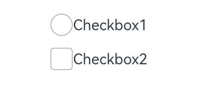
### Example 1: Setting the Check Box Shape
This example shows how to set **CheckBoxShape** to implement check boxes in circle and rounded square shapes.
```ts
// xxx.ets
@Entry
@Component
struct CheckboxExample {
build() {
Flex({ justifyContent: FlexAlign.SpaceEvenly }) {
Checkbox({ name: 'checkbox1', group: 'checkboxGroup' })
.select(true)
.selectedColor(0xed6f21)
.shape(CheckBoxShape.CIRCLE)
.onChange((value: boolean) => {
console.info('Checkbox1 change is' + value)
})
Checkbox({ name: 'checkbox2', group: 'checkboxGroup' })
.select(false)
.selectedColor(0x39a2db)
.shape(CheckBoxShape.ROUNDED_SQUARE)
.onChange((value: boolean) => {
console.info('Checkbox2 change is' + value)
})
}
}
}
```
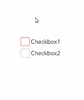
### Example 2: Setting the Check Box Color
This example demonstrates how to set **mark** to customize the color of a check box.
```ts
// xxx.ets
@Entry
@Component
struct Index {
build() {
Row() {
Column() {
Flex({ justifyContent: FlexAlign.Center, alignItems: ItemAlign.Center }) {
Checkbox({ name: 'checkbox1', group: 'checkboxGroup' })
.selectedColor(0x39a2db)
.shape(CheckBoxShape.ROUNDED_SQUARE)
.onChange((value: boolean) => {
console.info('Checkbox1 change is'+ value)
})
.mark({
strokeColor:Color.Black,
size: 50,
strokeWidth: 5
})
.unselectedColor(Color.Red)
.width(30)
.height(30)
Text('Checkbox1').fontSize(20)
}
Flex({ justifyContent: FlexAlign.Center, alignItems: ItemAlign.Center }) {
Checkbox({ name: 'checkbox2', group: 'checkboxGroup' })
.selectedColor(0x39a2db)
.shape(CheckBoxShape.ROUNDED_SQUARE)
.onChange((value: boolean) => {
console.info('Checkbox2 change is' + value)
})
.width(30)
.height(30)
Text('Checkbox2').fontSize(20)
}
}
.width('100%')
}
.height('100%')
}
}
```
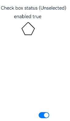
### Example 3: Customizing the Check Box Style
This example implements a custom check box. This check box comes in the custom pentagon style. When selected, the check box shows a red triangle pattern inside, and the title displays the word "Selected;" when deselected, the check box hides the red triangle pattern inside, and the title displays the word "Unselected."
```ts
// xxx.ets
class MyCheckboxStyle implements ContentModifier {
selectedColor: Color = Color.White
constructor(selectedColor: Color) {
this.selectedColor = selectedColor;
}
applyContent() : WrappedBuilder<[CheckBoxConfiguration]>
{
return wrapBuilder(buildCheckbox)
}
}
@Builder function buildCheckbox(config: CheckBoxConfiguration) {
Column({space:10}) {
Text(config.name + (config.selected ? "(Selected)" : " (Unselected)")).margin({right : 70, top : 50})
Text(config.enabled ? "enabled true" : "enabled false").margin({right : 110})
Shape() {
Path().width(100).height(100).commands('M100 0 L0 100 L50 200 L150 200 L200 100 Z').fillOpacity(0).strokeWidth(3).onClick(()=>{
if (config.selected) {
config.triggerChange(false)
} else {
config.triggerChange(true)
}
}).opacity(config.enabled ? 1 : 0.1)
Path().width(10).height(10).commands('M50 0 L100 100 L0 100 Z')
.visibility(config.selected ? Visibility.Visible : Visibility.Hidden)
.fill(config.selected ? (config.contentModifier as MyCheckboxStyle).selectedColor : Color.Black)
.stroke((config.contentModifier as MyCheckboxStyle).selectedColor)
.margin({left:10,top:10})
.opacity(config.enabled ? 1 : 0.1)
}
.width(300)
.height(200)
.viewPort({ x: 0, y: 0, width: 310, height: 310 })
.strokeLineJoin(LineJoinStyle.Miter)
.strokeMiterLimit(5)
.margin({left:50})
}
}
@Entry
@Component
struct Index {
@State checkboxEnabled: boolean = true;
build() {
Column({ space: 100 }) {
Checkbox({ name: 'Check box status', group: 'checkboxGroup' })
.contentModifier(new MyCheckboxStyle(Color.Red))
.onChange((value: boolean) => {
console.info('Checkbox change is' + value)
}).enabled(this.checkboxEnabled)
Row() {
Toggle({ type: ToggleType.Switch, isOn: true }).onChange((value: boolean) => {
if (value) {
this.checkboxEnabled = true
} else {
this.checkboxEnabled = false
}
})
}.position({ x: 50, y: 130 })
}.margin({top : 30})
}
}
```
### Example 4: Setting the Text Check Box Style
This example configures the selected style of a check box to display as text using the **indicatorBuilder** property.
```ts
// xxx.ets
@Entry
@Component
struct CheckboxExample {
@Builder
indicatorBuilder(value: number) {
Column(){
Text(value > 99 ? '99+': value.toString())
.textAlign(TextAlign.Center)
.fontSize(value > 99 ? '16vp': '20vp')
.fontWeight(FontWeight.Medium)
.fontColor('#ffffffff')
}
}
build() {
Row() {
Column() {
Flex({ justifyContent: FlexAlign.Center, alignItems: ItemAlign.Center}) {
Checkbox({ name: 'checkbox1', group: 'checkboxGroup', indicatorBuilder:()=>{this.indicatorBuilder(9)}})
.shape(CheckBoxShape.CIRCLE)
.onChange((value: boolean) => {
console.info('Checkbox1 change is'+ value)
})
.mark({
strokeColor:Color.Black,
size: 50,
strokeWidth: 5
})
.width(30)
.height(30)
Text('Checkbox1').fontSize(20)
}.padding(15)
Flex({ justifyContent: FlexAlign.Center, alignItems: ItemAlign.Center }) {
Checkbox({ name: 'checkbox2', group: 'checkboxGroup', indicatorBuilder:()=>{this.indicatorBuilder(100)}})
.shape(CheckBoxShape.ROUNDED_SQUARE)
.onChange((value: boolean) => {
console.info('Checkbox2 change is' + value)
})
.width(30)
.height(30)
Text('Checkbox2').fontSize(20)
}
}
.width('100%')
}
.height('100%')
}
}
```