# Swiper
The **Swiper** component is able to display child components in a carousel-like manner.
> **NOTE**
>
> - This component is supported since API version 7. Updates will be marked with a superscript to indicate their earliest API version.
>
> - The **Swiper** component incorporates a [PanGesture](ts-basic-gestures-pangesture.md) event that facilitates the swiping action to cycle through its child components. Setting [disableSwipe](#disableswipe8) to **true** will cancel the internal listening for the **PanGesture** event, disabling the swiping interaction.
>
> - When [NodeContainer](./ts-basic-components-nodecontainer.md) is reused in the **Swiper** component, recursive updates of parent component state variables by child nodes are prohibited.
## Child Components
Supported
> **NOTE**
>
> - Allowed child component types: built-in and custom components, including rendering control types ([if/else](../../../ui/state-management/arkts-rendering-control-ifelse.md), [ForEach](../../../ui/state-management/arkts-rendering-control-foreach.md), [LazyForEach](../../../ui/state-management/arkts-rendering-control-lazyforeach.md), and [Repeat](../../../ui/state-management/arkts-new-rendering-control-repeat.md)). To maximize the benefits of lazy loading, avoid mixing lazy loading components (including **LazyForEach** and **Repeat**) and non-lazy loading components, and exercise caution when using multiple lazy loading components. Avoid modifying the data source while an animation is in progress, as doing so can lead to layout issues.
>
> - If a child component has its [visibility](ts-universal-attributes-visibility.md#visibility) attribute set to **Visibility.None** and the **Swiper** component has its **displayCount** attribute set to **'auto'**, the child component does not take up space in the viewport, but does not affect the number of navigation points. If a child component has its **visibility** attribute set to **Visibility.None** or **Visibility.Hidden**, it takes up space in the viewport, but is not displayed.
>
> - Child components of the **Swiper** component are drawn based on their level if they have the [offset](ts-universal-attributes-location.md#offset) attribute set. A child component with a higher level overwrites one with a lower level. For example, if the **Swiper** contains three child components and **offset({ x: 100 })** is set for the third child component, the third child component overwrites the first child component during horizontal loop playback. To prevent the first child component from being overwritten, set its [zIndex](ts-universal-attributes-z-order.md) attribute to a value greater than that of the third child component.
>
> - When focus is moved to a custom child node, navigation indicators and arrows may be obscured by [focus styles](../../../ui/arkts-common-events-focus-event.md#focus-style) modifications that change **zIndex**.
>
> - For a **Swiper** components with many child components, you can optimize the performance and reduce memory consumption by using lazy loading, data caching, preloading, and component reuse techniques. For best practices, see [Optimizing Frame Loss During Swiper Component Loading](https://developer.huawei.com/consumer/en/doc/best-practices/bpta-swiper_high_performance_development_guide).
## APIs
Swiper(controller?: SwiperController)
Creates a **Swiper** component.
**Widget capability**: This API can be used in ArkTS widgets since API version 10.
**Atomic service API**: This API can be used in atomic services since API version 11.
**System capability**: SystemCapability.ArkUI.ArkUI.Full
**Parameters**
| Name | Type | Mandatory | Description |
| ---------- | ------------------------------------- | ---- | -------------------- |
| controller | [SwiperController](#swipercontroller) | No | Controller to bind to the component to manage page switching and preload specific child components.|
## Attributes
In addition to the [universal attributes](ts-component-general-attributes.md), the following attributes are supported.
> **NOTE**
>
> The default value of the universal attribute [clip](ts-universal-attributes-sharp-clipping.md) is **true** for the **Swiper** component.
### index
index(value: number)
Sets the index of the child component currently displayed in the container. If the value is less than 0 or greater than or equal to the number of child components, the default value **0** is used.
Since API version 10, this attribute supports two-way binding through [$$](../../../ui/state-management/arkts-two-way-sync.md).
**Widget capability**: This API can be used in ArkTS widgets since API version 10.
**Atomic service API**: This API can be used in atomic services since API version 11.
**System capability**: SystemCapability.ArkUI.ArkUI.Full
**Parameters**
| Name| Type | Mandatory| Description |
| ------ | ------ | ---- | ------------------------------------------------ |
| value | number | Yes | Index of the child component currently displayed in the container.
Default value: **0**
**NOTE**
If the value specified is less than 0 or greater than the maximum page index, the value **0** is used.|
### autoPlay
autoPlay(value: boolean)
Sets whether to enable automatic playback for child components, with the direction from the smallest to largest index.
If [loop](#loop) is set to **false**, the automatic playback stops at the last page and resumes after navigated away from the last page using gestures. If the **Swiper** component becomes invisible, the playback stops.
**Widget capability**: This API can be used in ArkTS widgets since API version 10.
**Atomic service API**: This API can be used in atomic services since API version 11.
**System capability**: SystemCapability.ArkUI.ArkUI.Full
**Parameters**
| Name| Type | Mandatory| Description |
| ------ | ------- | ---- | -------------------------------------- |
| value | boolean | Yes | Whether to enable automatic playback for child components.
Default value: **false** (automatic playback is disabled for child components).|
### autoPlay18+
autoPlay(autoPlay: boolean, options: AutoPlayOptions)
Sets whether to enable automatic playback for child components, with **options** controlling whether child components stop automatic playback when the screen is pressed by fingers, a mouse device, or other input devices.
If [loop](#loop) is set to **false**, automatic playback stops at the last page and resumes after navigated away from the last page using gestures. Automatic playback also stops when the **Swiper** component is not visible.
**Widget capability**: This API can be used in ArkTS widgets since API version 18.
**Atomic service API**: This API can be used in atomic services since API version 18.
**System capability**: SystemCapability.ArkUI.ArkUI.Full
**Parameters**
| Name| Type | Mandatory| Description |
| ------ | ------- | ---- | -------------------------------------- |
| autoPlay | boolean | Yes | Whether to enable automatic playback for child components.
Default value: **false** (automatic playback is disabled for child components).|
| options | [AutoPlayOptions](#autoplayoptions18) | Yes | Whether child components stop automatic playback when the screen is pressed by fingers, a mouse device, or other input devices. If **stopWhenTouched** is set to **true**, automatic playback resumes after any finger lifts in multi-touch scenarios.
Default value: **{ stopWhenTouched: true }**.|
### interval
interval(value: number)
Sets the interval for automatic playback.
**Widget capability**: This API can be used in ArkTS widgets since API version 10.
**Atomic service API**: This API can be used in atomic services since API version 11.
**System capability**: SystemCapability.ArkUI.ArkUI.Full
**Parameters**
| Name| Type | Mandatory| Description |
| ------ | ------ | ---- | ---------------------------------------------------------- |
| value | number | Yes | Interval for automatic playback. If the value is smaller than the value of [duration](#duration), the next carousel starts immediately after page switching completes.
Default value: **3000**.
Unit: ms
Value range: [0, +∞). If a value less than 0 is set, the default value is used.|
### indicator
indicator(value: DotIndicator | DigitIndicator | boolean)
Sets the style of the navigation indicator.
**Widget capability**: This API can be used in ArkTS widgets since API version 10.
**Atomic service API**: This API can be used in atomic services since API version 11.
**System capability**: SystemCapability.ArkUI.ArkUI.Full
**Parameters**
| Name| Type | Mandatory| Description |
| ------ | ------------------------------------------------------------ | ---- | ------------------------------------------------------------ |
| value | [DotIndicator](#dotindicator10)10+ \| [DigitIndicator](#digitindicator10)10+ \| boolean | Yes | Style of the navigation indicator.
\- **DotIndicator**: dot style.
\- **DigitIndicator**: digit style.
\- **boolean**: whether to enable the navigation indicator. The value **true** means to enable the feature, and **false** means the opposite.
Default value: **true**
Default style: **DotIndicator**|
### indicator15+
indicator(indicator: IndicatorComponentController | DotIndicator | DigitIndicator | boolean)
Sets the navigation indicator for the component.
**Widget capability**: This API can be used in ArkTS widgets since API version 15.
**Atomic service API**: This API can be used in atomic services since API version 15.
**System capability**: SystemCapability.ArkUI.ArkUI.Full
**Parameters**
| Name| Type | Mandatory| Description |
| ------ | ------------------------------------------------------------ | ---- | ------------------------------------------------------------ |
| indicator | [IndicatorComponentController](ts-swiper-components-indicator.md#indicatorcomponentcontroller)15+ \| [DotIndicator](#dotindicator10) \| [DigitIndicator](#digitindicator10) \| boolean| Yes | Style of the navigation indicator.
\- **IndicatorComponentController**: separate navigation indicator controller. This controller can be bound to an external navigation indicator, but the external and internal indicators cannot coexist.
\- **DotIndicator**: dot style.
\- **DigitIndicator**: digit style.
\- **boolean**: whether to enable the navigation indicator. The value **true** means to enable the feature, and **false** means the opposite.
Default value: **true**
Default style: **DotIndicator**|
### loop
loop(value: boolean)
Sets whether to enable loop playback. The value **true** means to enable loop playback. When LazyForEach is used, it is recommended that the number of the components to load exceed 5.
**Widget capability**: This API can be used in ArkTS widgets since API version 10.
**Atomic service API**: This API can be used in atomic services since API version 11.
**System capability**: SystemCapability.ArkUI.ArkUI.Full
**Parameters**
| Name| Type | Mandatory| Description |
| ------ | ------- | ---- | ------------------------------- |
| value | boolean | Yes | Whether to enable loop playback. The value **true** means to enable loop playback, and **false** means the opposite.
Default value: **true**.|
### duration
duration(value: number)
Sets the duration of the animation for child component switching.
**duration** must be used in conjunction with [curve](#curve8).
The default curve for the animation is [interpolatingSpring](../js-apis-curve.md#curvesinterpolatingspring10). When this curve is applied, the duration of the animation is determined solely by the parameters of the curve itself and is no longer governed by the **duration** setting. For curves that are not governed by the **duration** setting, see [Interpolation Calculation](../js-apis-curve.md). Among others, [springMotion](../js-apis-curve.md#curvesspringmotion9) and [responsiveSpringMotion](../js-apis-curve.md#curvesresponsivespringmotion9) do not respect the **duration** setting. To have the animation duration managed by **duration**, you should select a different curve for the **curve** attribute.
**Atomic service API**: This API can be used in atomic services since API version 11.
**System capability**: SystemCapability.ArkUI.ArkUI.Full
**Parameters**
| Name| Type | Mandatory| Description |
| ------ | ------ | ---- | ----------------------------------------------------- |
| value | number | Yes | Duration of the autoplay for child component switching.
Default value: **400**
Unit: ms
Value range: [0, +∞). If a value less than 0 is set, the default value is used.|
### vertical
vertical(value: boolean)
Sets whether vertical swiping is used.
**Widget capability**: This API can be used in ArkTS widgets since API version 10.
**Atomic service API**: This API can be used in atomic services since API version 11.
**System capability**: SystemCapability.ArkUI.ArkUI.Full
**Parameters**
| Name| Type | Mandatory| Description |
| ------ | ------- | ---- | ---------------------------------- |
| value | boolean | Yes | Whether vertical swiping is used. The value **true** means vertical swiping, and **false** means horizontal swiping.
Default value: **false**.|
### itemSpace
itemSpace(value: number | string)
Sets the space between child components. Percentage values are not supported.
If the type is number, the default unit is vp. If the type is string, the pixel unit must be explicitly specified, for example, **'10px'**; if the unit is not specified, for example, **'10'**, the default unit vp is used.
**Widget capability**: This API can be used in ArkTS widgets since API version 10.
**Atomic service API**: This API can be used in atomic services since API version 11.
**System capability**: SystemCapability.ArkUI.ArkUI.Full
**Parameters**
| Name| Type | Mandatory| Description |
| ------ | -------------------------- | ---- | -------------------------------------- |
| value | number \| string | Yes | Space between child components.
Default value: **0**
Value range: [0, +∞). Values less than 0 or exceeding the **Swiper** component width are treated as the default value.|
### displayMode
displayMode(value: SwiperDisplayMode)
Sets the mode in which elements are displayed along the main axis. This API takes effect only when **displayCount** is not set.
**Widget capability**: This API can be used in ArkTS widgets since API version 10.
**Atomic service API**: This API can be used in atomic services since API version 11.
**System capability**: SystemCapability.ArkUI.ArkUI.Full
**Parameters**
| Name| Type | Mandatory| Description |
| ------ | ----------------------------------------------- | ---- | ------------------------------------------------------------ |
| value | [SwiperDisplayMode](#swiperdisplaymode) | Yes | Mode in which elements are displayed along the main axis.
Default value: **SwiperDisplayMode.STRETCH**|
### cachedCount8+
cachedCount(value: number)
Sets the number of child components to be preloaded (cached), which are needed for the specific number of pages immediately before and after the current page. If a preceding item is deleted, the succeeding items will shift forward. For example, if **cachedCount** is set to **1**, the child components on the previous page and the next page are cached. If **swipeByGroup** in **displayCount** is set to **true**, child components are cached by group. For example, if **cachedCount** is set to **1** and **swipeByGroup** is set to **true**, the child components in the previous and next groups are cached.
> **NOTE**
>
> - In continuous scrolling scenarios where one **Swiper** child component is displayed per screen, setting **cachedCount** to **1** or **2** is typically sufficient. For best practices, see [Optimizing Frame Loss During Swiper Component Loading – Caching Data Items](https://developer.huawei.com/consumer/en/doc/best-practices/bpta-swiper_high_performance_development_guide#section143504547145).
**Widget capability**: This API can be used in ArkTS widgets since API version 10.
**Atomic service API**: This API can be used in atomic services since API version 11.
**System capability**: SystemCapability.ArkUI.ArkUI.Full
**Parameters**
| Name| Type | Mandatory| Description |
| ------ | ------ | ---- | -------------------------------- |
| value | number | Yes | Number of child components to be preloaded (cached).
Default value: **1**
Value range: [0, +∞). If a value less than 0 is set, the default value is used.|
### cachedCount15+
cachedCount(count: number, isShown: boolean)
Sets the number of child components to be cached.
**Widget capability**: This API can be used in ArkTS widgets since API version 15.
**Atomic service API**: This API can be used in atomic services since API version 15.
**System capability**: SystemCapability.ArkUI.ArkUI.Full
**Parameters**
| Name| Type | Mandatory| Description |
| ------ | ------ | ---- | -------------------------------- |
| count | number | Yes | Number of child components to be preloaded (cached).
Default value: **1**
Value range: [0, +∞). If a value less than 0 is set, the default value is used.|
| isShown | boolean | Yes | Whether the cached nodes within the range rendered without being added to the render tree.
Default value: **false**, indicating that cached nodes within the range are rendered.|
### disableSwipe8+
disableSwipe(value: boolean)
Sets whether to disable the swipe feature.
**Widget capability**: This API can be used in ArkTS widgets since API version 10.
**Atomic service API**: This API can be used in atomic services since API version 11.
**System capability**: SystemCapability.ArkUI.ArkUI.Full
**Parameters**
| Name| Type | Mandatory| Description |
| ------ | ------- | ---- | ---------------------------------------- |
| value | boolean | Yes | Whether to disable the swipe feature. The value **true** means to disable the feature, and **false** means the opposite.
Default value: **false**.|
### curve8+
curve(value: Curve | string | ICurve)
Sets the animation curve. The interpolating spring curve is used by default. For details about common curves, see [Curve](ts-appendix-enums.md#curve). You can also create custom curves (interpolation curve objects) by using the API provided by the [interpolation calculation](../js-apis-curve.md) module.
**Widget capability**: This API can be used in ArkTS widgets since API version 10.
**Atomic service API**: This API can be used in atomic services since API version 11.
**System capability**: SystemCapability.ArkUI.ArkUI.Full
**Parameters**
| Name| Type | Mandatory| Description |
| ------ | ------------------------------------------------------------ | ---- | ------------------------------------------- |
| value | [Curve](ts-appendix-enums.md#curve) \| string \| [ICurve](../js-apis-curve.md#icurve9)10+ | Yes | Animation curve.
The **string** type is deprecated since API version 9 (see [curves.init](../js-apis-curve.md#curvesinitdeprecated), [curves.steps](../js-apis-curve.md#curvesstepsdeprecated), [curves.cubicBezier](../js-apis-curve.md#curvescubicbezierdeprecated), and [curves.spring](../js-apis-curve.md#curvesspringdeprecated)). Use **Curve** or **ICurve** instead.
Default value: **[interpolatingSpring](../js-apis-curve.md#curvesinterpolatingspring10)(-1, 1, 328, 34)**.|
### indicatorStyle(deprecated)
indicatorStyle(value?: IndicatorStyle)
Sets the style of the navigation indicator.
This API is supported since API version 8 and is deprecated since API version 10. You are advised to use [indicator](#indicator10) instead.
**System capability**: SystemCapability.ArkUI.ArkUI.Full
**Parameters**
| Name| Type | Mandatory| Description |
| ------ | --------------------------------------------------- | ---- | ------------ |
| value | [IndicatorStyle](#indicatorstyledeprecated) | No | Style of the navigation indicator.|
### displayCount8+
displayCount(value: number | string | [SwiperAutoFill](#swiperautofill10), swipeByGroup?: boolean)
Sets the number of elements to display per page.
**number** type: Child elements' main-axis width adapts to the **Swiper** component's main-axis width. The child elements are stretched or shrunk to equally divide the **Swiper** component's width (minus **displayCount-1** times **itemSpace**). Values less than or equal to 0 are treated as the default value **1**.
**string** type: Only **'auto'** is supported. Child elements are laid out linearly based on their main-axis width without adapting to the **Swiper** component's width. [customContentTransition](#customcontenttransition12) and [onContentDidScroll](#oncontentdidscroll12) events are disabled.
**SwiperAutoFill** type: Child elements' main-axis width adapts to the **Swiper** component's main-axis width. The system automatically works out the number of elements per page based on the width and **minSize** settings of the **Swiper** component. If **minSize** is left empty or set to a value less than or equal to 0, the **Swiper** component displays one column.
> **NOTE**
>
>1. When turning pages by group is used, the drag distance threshold for turning pages is half of the width of the **Swiper** component (50% of the child elements width if turning pages by child element is used). If the number of child elements in the last group is less than the value of **displayCount**, placeholders are used, but they show the **Swiper** background style directly and do not display any content.
>
>2. When **displayCount** is set to **'auto'** and looping is disabled, the position of the selected navigation indicator aligns with the first page in the viewport. If the first page is only partially displayed in the viewport after switching, the selected navigation indicator remains aligned with the page's position, between two unselected indicators. In this case, you are advised to hide the navigation indicators.
>
>3. If the navigation indicator is in dot style, the number of displayed navigation dots equals the number of child elements when the number of child elements displayed in the viewport is 1 (single-page scenario) or **displayCount** is set to **'auto'**.
When the navigation dot is set to dot style and the number of child elements displayed in the viewport is greater than 1 (multi-page scenario), the number of displayed navigation dots follows the rules below.
| Total Children Count > Visible Children Count| Swiping by Group Enabled| Loop Status | Number of Navigation Dots Displayed | Description |
| ------------------------------------------ | ------------ | --------------- | ------------------------------------------------------------ | ---------------------------------------- |
| Yes | Yes | **loop** set to **true** | Equals the number of groups (calculated by dividing the total number of child elements by the number of visible child elements, with rounding up if there is a remainder).| Not effective when **displayCount** is set to **'auto'**.|
| Yes | Yes | **loop** set to **false**| Equals the number of groups (calculated by dividing the total number of child elements by the number of visible child elements, with rounding up if there is a remainder).| Not effective when **displayCount** is set to **'auto'**.|
| Yes | No | **loop** set to **true** | Equals the actual number of page turns available (that is, the total number of child elements).| —— |
| Yes | No | **loop** set to **false**| Equals the actual number of page turns available (calculated as total number of child elements minus the number of visible child elements, plus 1).| Not effective when **displayCount** is set to **'auto'**.|
| No (while the total number of child elements is greater than 0) | —— | —— | 1 | Not effective when **displayCount** is set to **'auto'**.|
| No (while the total number of child elements is 0)| —— | —— | 0| —— |
**Widget capability**: This API can be used in ArkTS widgets since API version 10.
**Atomic service API**: This API can be used in atomic services since API version 11.
**System capability**: SystemCapability.ArkUI.ArkUI.Full
**Parameters**
| Name | Type | Mandatory| Description |
| -------------------------- | ------------------------------------------------------------ | ---- | ------------------------------------------------------------ |
| value | number \| string \| [SwiperAutoFill](#swiperautofill10)10+ | Yes | Number of elements to display per page.
Default value: **1**
Value range: (0, +∞). If this parameter is set to a value less than or equal to 0, the default value is used.|
| swipeByGroup11+ | boolean | No | Whether to turn pages by group. The value **true** means to turn pages by group, and **false** means to turn pages by child element. When turning pages by group is used, the number of child elements per group is the value of **displayCount**.
Default value: **false**.|
> **NOTE**
>
> When the number of child components is less than or equal to the total number of allowed nodes in the content area (totalDisplayCount = displayCount + prevMargin? (1 : 0 ) + nextMargin? (1 : 0 )), the **Swiper** component generally uses the non-looping mode for layout. In this case, the child components specified by **nextMargin** and **prevMargin** take up space in the viewport, but are not displayed. The specifications of the **Swiper** component are calculated based on the value of **totalDisplayCount**. The exceptions are as follows:
>
> - When the number of child components is equal to the total number of allowed nodes in the content area and both **prevMargin** and **nextMargin** take effect, set **loop** to **true** to enable loop playback.
>
> - When the number of child components is equal to the value of **displayCount** plus 1 and at least one of **prevMargin** and **nextMargin** takes effect, set **loop** to **true** to enable loop playback. When loop playback is enabled, a snapshot is generated as the placeholder image. (The snapshot may not be correctly generated for those components that take a long time to display, such as those that use asynchronous image loading. Avoid enabling loop playback under this scenario.)
>
### effectMode8+
effectMode(value: EdgeEffect)
Sets the effect used when the component is at one of the edges, which is effective only when [loop](#loop) is set to **false**. This effect does not apply when **SwiperController.changeIndex()**, **SwiperController.showNext()**, or **SwiperController.showPrevious()** is used to navigate to the first or last page.
**Widget capability**: This API can be used in ArkTS widgets since API version 10.
**Atomic service API**: This API can be used in atomic services since API version 11.
**System capability**: SystemCapability.ArkUI.ArkUI.Full
**Parameters**
| Name| Type | Mandatory| Description |
| ------ | --------------------------------------------- | ---- | -------------------------------------------- |
| value | [EdgeEffect](ts-appendix-enums.md#edgeeffect) | Yes | Effect used when the component is at one of the edges.
Default value: **EdgeEffect.Spring**|
### displayArrow10+
displayArrow(value: ArrowStyle | boolean, isHoverShow?: boolean)
Sets the arrow style of the navigation indicator.
**Atomic service API**: This API can be used in atomic services since API version 11.
**System capability**: SystemCapability.ArkUI.ArkUI.Full
**Parameters**
| Name | Type | Mandatory| Description |
| -------------------------- | ------------------------------------------------ | ---- | ------------------------------------------------------------ |
| value | [ArrowStyle](#arrowstyle10) \| boolean | Yes | Arrow and background to set. In cases of exceptions, the default values in the **ArrowStyle** object are used. The value **true** means to show the arrow and background in the default styles, and **false** means to hide the arrow and background.
Default value: **false**.|
| isHoverShow | boolean | No | Whether to show the arrow on mouse hover.
Default value: **false**.
**NOTE**
1. **false**: The arrow is always displayed.
2. **true**: The arrow is displayed only mouse over.
With navigation dots, the arrow is displayed when mouse pointer hovers over the dots or arrows area.
Without navigation dots, the arrow is displayed when mouse pointer hovers over the **Swiper** display area.
3. When the arrow is displayed, clicking the arrow turns pages.|
> **NOTE**
>
> When all child nodes fit within the viewport, resulting in only one screen's worth of content being visible, the **Swiper** component displays only that screen without any left or right page-turning arrows.
### nextMargin10+
nextMargin(value: Length, ignoreBlank?:boolean)
Sets the trailing margin to reveal a portion of the next item. For the implementation example, see [Example 1: Setting the Navigation Indicator Interaction and Page Turning Effect](#example-1-setting-the-navigation-indicator-interaction-and-page-turning-effect). This attribute is effective only when the layout mode of the child components in **Swiper** is set to stretch, which mainly includes two scenarios: 1. **displayMode** is set to **SwiperDisplayMode.STRETCH**; 2. **displayCount** is assigned a numeric value.
When the main axis runs horizontally and either **nextMargin** or **prevMargin** is greater than the measured width of the child component, both margins are hidden.
When the main axis runs vertically and either **nextMargin** or **prevMargin** is greater than the measured height of the child component, both margins are hidden.
**Atomic service API**: This API can be used in atomic services since API version 11.
**System capability**: SystemCapability.ArkUI.ArkUI.Full
**Parameters**
| Name| Type | Mandatory| Description |
| ------ | ---------------------------- | ---- | ---------------------- |
| value | [Length](ts-types.md#length) | Yes | Trailing margin. Percentage values are not supported.
Default value: **0**.|
| ignoreBlank12+ | boolean | No | Whether to hide the trailing margin for the last page in non-loop scenarios.
**true**: Hide the trailing margin, in which case, the right edge of the last page is aligned with that of the **Swiper** component's viewable area.
**false**: Show the trailing margin, in which case, the last page has a **nextMargin**-specified gap from the **Swiper** component's right edge.
Default value: **false**.
**NOTE**
On the last page, the values of **prevMargin** and **nextMargin** are added to create a left margin that allows the previous page to be displayed partially.|
### prevMargin10+
prevMargin(value: Length, ignoreBlank?:boolean)
Sets the leading margin to reveal a portion of the previous item. For the implementation example, see [Example 1: Setting the Navigation Indicator Interaction and Page Turning Effect](#example-1-setting-the-navigation-indicator-interaction-and-page-turning-effect). This attribute is effective only when the layout mode of the child components in **Swiper** is set to stretch, which mainly includes two scenarios: 1. **displayMode** is set to **SwiperDisplayMode.STRETCH**; 2. **displayCount** is assigned a numeric value.
When the main axis runs horizontally and either **nextMargin** or **prevMargin** is greater than the measured width of the child component, both margins are hidden.
When the main axis runs vertically and either **nextMargin** or **prevMargin** is greater than the measured height of the child component, both margins are hidden.
**Atomic service API**: This API can be used in atomic services since API version 11.
**System capability**: SystemCapability.ArkUI.ArkUI.Full
**Parameters**
| Name| Type | Mandatory| Description |
| ------ | ---------------------------- | ---- | ---------------------- |
| value | [Length](ts-types.md#length) | Yes | Leading margin. Percentage values are not supported.
Default value: **0**.|
| ignoreBlank12+ | boolean | No | Whether to hide the leading margin for the first page in non-loop scenarios.
**true**: Hide the leading margin, in which case, the left edge of the first page is aligned with that of the **Swiper** component's viewable area.
**false**: Show the leading margin, in which case, the first page has a **prevMargin**-specified gap from the **Swiper** component's left edge.
Default value: **false**.
**NOTE**
On the first page, the values of **prevMargin** and **nextMargin** are added to create a right margin that allows the next page to be displayed partially.|
### nestedScroll11+
nestedScroll(value: SwiperNestedScrollMode)
Sets the nested scrolling mode of the **Swiper** component and its parent container. When **loop** is set to **true**, the **Swiper** component has no edge effect and does not trigger nested scrolling of its parent container.
**Atomic service API**: This API can be used in atomic services since API version 11.
**System capability**: SystemCapability.ArkUI.ArkUI.Full
**Parameters**
| Name| Type | Mandatory| Description |
| ------ | ----------------------------------------------------------- | ---- | ------------------------------------------------------------ |
| value | [SwiperNestedScrollMode](#swipernestedscrollmode11) | Yes | Nested scrolling mode of the **Swiper** component and its parent container.
Default value: **SwiperNestedScrollMode.SELF_ONLY**|
> **NOTE**
>
> The **Swiper** component's flick animation logic differs from other scrollable components, as **Swiper** can only slide one page at a time and performs a page-flip animation during a flick. When a **Swiper** component is nested with other scrollable components, it will not accept the scroll offset values transmitted by its child nodes after its page-turning animation has already started. At this point, the page-turning animation of the **Swiper** and the edge effect animation of the child node will be executed simultaneously.
### indicatorInteractive12+
indicatorInteractive(value: boolean)
Sets whether the navigation indicator is interactive. The value **true** means that the navigation indicator is interactive.
**Atomic service API**: This API can be used in atomic services since API version 12.
**System capability**: SystemCapability.ArkUI.ArkUI.Full
**Parameters**
| Name| Type | Mandatory| Description |
| ------ | ----------------------------------------------------------- | ---- | ------------------------------------------------------------ |
| value | boolean | Yes | Whether the navigation indicator is interactive. The value **true** means that the navigation indicator is interactive, and **false** means the opposite.
Default value: **true**.|
### pageFlipMode15+
pageFlipMode(mode: Optional\)
Sets the mode for flipping pages using the mouse wheel.
**Widget capability**: This API can be used in ArkTS widgets since API version 15.
**Atomic service API**: This API can be used in atomic services since API version 15.
**System capability**: SystemCapability.ArkUI.ArkUI.Full
**Parameters**
| Name| Type | Mandatory| Description |
| ------ | ----------------------------------------------------------- | ---- | ------------------------------------------------------------ |
| mode | Optional\<[PageFlipMode](ts-appendix-enums.md#pageflipmode15)> | Yes | Mode for flipping pages using the mouse wheel.
Default value: **PageFlipMode.CONTINUOUS**|
### maintainVisibleContentPosition20+
maintainVisibleContentPosition(enabled: boolean)
Sets whether to maintain the visible content position when data is inserted or deleted above or ahead of the viewport. This applies to **Swiper** components using a single [LazyForEach](../../../ui/state-management/arkts-rendering-control-lazyforeach.md) as the child node, where the data source is modified using **LazyForEach** API such as [onDateAdd](ts-rendering-control-lazyforeach.md#ondataadd8) or [onDataDelete](ts-rendering-control-lazyforeach.md#ondatadelete8).
When **swipeByGroup** in [displayCount](#displaycount8) is set to **true**, the visible content position remains unchanged only if the inserted or deleted data quantity is a multiple of the group size. Otherwise, the visible content position may change during group recalculation.
**Widget capability**: This API can be used in ArkTS widgets since API version 20.
**Atomic service API**: This API can be used in atomic services since API version 20.
**System capability**: SystemCapability.ArkUI.ArkUI.Full
**Parameters**
| Name| Type | Mandatory| Description |
| ------ | ----------------------------------------------------------- | ---- | ------------------------------------------------------------ |
| enabled | boolean | Yes | Whether to maintain the visible content position when data is inserted or deleted above or ahead of the viewport.
Default value: **false**.
**false**: The visible content position will change when data is inserted or deleted. **true**: The visible content position remains unchanged when data is inserted or deleted. Animations stop if the data source is modified during an animation due to target index changes.|
## IndicatorStyle(deprecated)
This API is supported since API version 8 and is deprecated since API version 10. You are advised to use [indicator](#indicator10) instead.
**System capability**: SystemCapability.ArkUI.ArkUI.Full
| Name | Type | Mandatory| Description |
| ------------- | ------------------------------------------ | ---- | ---------------------------------------------------- |
| left | [Length](ts-types.md#length) | No | Position of the navigation indicator relative to the left edge of the **Swiper** component.
If neither **left** nor **right** is set, the navigation indicator is centered along the main axis based on its own size and the size of the **Swiper** component.
If the value specified is **0**, the navigation indicator is placed at the position 0.
Priority: higher than the **right** property
Value range: [0, Swiper width - Navigation indicator area width]. Values outside this range are adjusted to the nearest boundary. |
| top | [Length](ts-types.md#length) | No | Position of the navigation indicator relative to the top edge of the **Swiper** component.
If neither **top** nor **bottom** is set, the navigation indicator is aligned at the bottom along the cross axis based on its own size and the size of the **Swiper** component, which is the same effect as setting **bottom=0**.
If the value specified is **0**, the navigation indicator is placed at the position 0.
Priority: higher than the **bottom** property
Value range: [0, Swiper height - Navigation indicator area height]. Values outside this range are adjusted to the nearest boundary. |
| right | [Length](ts-types.md#length) | No | Position of the navigation indicator relative to the right edge of the **Swiper** component.
If neither **left** nor **right** is set, the navigation indicator is centered along the main axis based on its own size and the size of the **Swiper** component.
If the value specified is **0**, the navigation indicator is placed at the position 0.
Priority: lower than the **left** property.
Value range: [0, Swiper width - Navigation indicator area width]. Values outside this range are adjusted to the nearest boundary. |
| bottom | [Length](ts-types.md#length) | No | Position of the navigation indicator relative to the bottom edge of the **Swiper** component.
If neither **top** nor **bottom** is set, the navigation indicator is aligned at the bottom along the cross axis based on its own size and the size of the **Swiper** component, which is the same effect as setting **bottom=0**.
If the value specified is **0**, the navigation indicator is placed at the position 0.
Priority: lower than the **top** property
Value range: [0, Swiper height - Navigation indicator area height]. Values outside this range are adjusted to the nearest boundary. |
| size | [Length](ts-types.md#length) | No | Diameter of the navigation indicator. Percentage values are not supported.
Default value: **6vp**|
| mask | boolean | No | Whether to enable the mask for the navigation indicator.
The value **true** means to enable the mask for the navigation indicator, and **false** means the opposite. |
| color | [ResourceColor](ts-types.md#resourcecolor) | No | Color of the navigation indicator. |
| selectedColor | [ResourceColor](ts-types.md#resourcecolor) | No | Color of the selected navigation indicator. |
## SwiperDisplayMode
Enumerates the modes in which elements are displayed along the main axis.
**System capability**: SystemCapability.ArkUI.ArkUI.Full
| Name | Description |
| ---------------------------------- | ------------------------------------------------------------ |
| Stretch(deprecated) | The width of each page in the **Swiper** component equals the component's own width.
This API is deprecated since API version 10. You are advised to use **STRETCH** instead.
**Widget capability**: This API can be used in ArkTS widgets since API version 7.|
| AutoLinear(deprecated) | The width of each page in the **Swiper** component equals the maximum width of child components. This enumerated value behaves the same as setting [displayCount](#displaycount8) to **'auto'** (string type). For details, see [displayCount](#displaycount8).
This API is deprecated since API version 10. You are advised to use [Scroller.scrollTo](ts-container-scroll.md#scrollto) instead.
**Widget capability**: This API can be used in ArkTS widgets since API version 7.|
| STRETCH10+ | The width of each page in the **Swiper** component equals the component's own width.
**Widget capability**: This API can be used in ArkTS widgets since API version 10.
**Atomic service API**: This API can be used in atomic services since API version 11.|
| AUTO_LINEAR(deprecated) | The width of each page in the **Swiper** component equals the width of the leftmost child component in the viewport. This enumerated value behaves the same as setting [displayCount](#displaycount8) to **'auto'** (string type). For details, see [displayCount](#displaycount8).
This API is supported since API version 10 and is deprecated since API version 12. You are advised to use [Scroller.scrollTo](ts-container-scroll.md#scrollto) instead.
**Widget capability**: This API can be used in ArkTS widgets since API version 10.
**Atomic service API**: This API can be used in atomic services since API version 11.|
## SwiperNestedScrollMode11+
Enumerates the nested scrolling modes of the **Swiper** component and its parent container.
**Atomic service API**: This API can be used in atomic services since API version 11.
**System capability**: SystemCapability.ArkUI.ArkUI.Full
| Name | Value| Description |
| ------------ | -- | ---------------------------------------- |
| SELF_ONLY | 0 | The scrolling is contained within the **Swiper** component, and no scroll chaining occurs, that is, the parent container does not scroll when the component scrolling reaches the boundary.|
| SELF_FIRST | 1 | The **Swiper** component scrolls first, and when it hits the boundary, the parent container scrolls. When the parent container hits the boundary, its edge effect is displayed. If no edge effect is specified for the parent container, the edge effect of the **Swiper** component is displayed instead.|
## SwiperController
Implements the controller for the **Swiper** component. Bind this object to a **Swiper** component to control page turning and other functionalities.
**Widget capability**: This API can be used in ArkTS widgets since API version 10.
**Atomic service API**: This API can be used in atomic services since API version 11.
**System capability**: SystemCapability.ArkUI.ArkUI.Full
### constructor
constructor()
A constructor used to create a **SwiperController** object.
**Widget capability**: This API can be used in ArkTS widgets since API version 10.
**Atomic service API**: This API can be used in atomic services since API version 11.
**System capability**: SystemCapability.ArkUI.ArkUI.Full
### showNext
showNext()
Turns to the next page. The page turning includes a transition animation, with the duration set by the [duration](#duration) attribute of the **Swiper** component.
**Widget capability**: This API can be used in ArkTS widgets since API version 10.
**Atomic service API**: This API can be used in atomic services since API version 11.
**System capability**: SystemCapability.ArkUI.ArkUI.Full
### showPrevious
showPrevious()
Turns to the previous page. The page turning includes a transition animation, with the duration set by the [duration](#duration) attribute of the **Swiper** component.
**Widget capability**: This API can be used in ArkTS widgets since API version 10.
**Atomic service API**: This API can be used in atomic services since API version 11.
**System capability**: SystemCapability.ArkUI.ArkUI.Full
### changeIndex12+
changeIndex(index: number, useAnimation?: boolean)
Goes to a specified page.
**Widget capability**: This API can be used in ArkTS widgets since API version 12.
**Atomic service API**: This API can be used in atomic services since API version 12.
**System capability**: SystemCapability.ArkUI.ArkUI.Full
**Parameters**
| Name | Type | Mandatory | Description |
| -------- | ---------- | ---- | -------- |
| index| number | Yes | Index of the target page in the **Swiper** component.
**NOTE**
If the value specified is less than 0 or greater than the maximum page index, the value **0** is used.|
| useAnimation| boolean | No | Whether to use an animation for when the target page is reached. The value **true** means to use an animation, and **false** means the opposite.
Default value: **false**|
### changeIndex15+
changeIndex(index: number, animationMode?: SwiperAnimationMode | boolean)
Moves to a specific page.
>**NOTE**
>
>This API itself supports jumping without animation (set **animationMode** to **false** or **SwiperAnimationMode.NO_ANIMATION**). Avoid starting an animation with **changeIndex** and then interrupt it with **finishAnimation** to achieve animation-free jumping.
**Widget capability**: This API can be used in ArkTS widgets since API version 15.
**Atomic service API**: This API can be used in atomic services since API version 15.
**System capability**: SystemCapability.ArkUI.ArkUI.Full
**Parameters**
| Name | Type | Mandatory | Description |
| -------- | ---------- | ---- | -------- |
| index| number | Yes | Index of the target page in the **Swiper** component.
**NOTE**
If the value specified is less than 0 or greater than the maximum page index, the value **0** is used.|
| animationMode| [SwiperAnimationMode](#swiperanimationmode15) \| boolean | No | Animation mode for moving to the specified page.
Default value: **SwiperAnimationMode.NO_ANIMATION**
**NOTE**
The value **true** is equivalent to **SwiperAnimationMode.DEFAULT_ANIMATION**, which means to use the default animation. The value **false** is equivalent to **SwiperAnimationMode.NO_ANIMATION**, which means to use no animation.|
### finishAnimation
finishAnimation(callback?: VoidCallback)
Stops an animation.
**Widget capability**: This API can be used in ArkTS widgets since API version 10.
**Atomic service API**: This API can be used in atomic services since API version 11.
**System capability**: SystemCapability.ArkUI.ArkUI.Full
**Parameters**
| Name | Type | Mandatory | Description |
| -------- | ---------- | ---- | -------- |
| callback | [VoidCallback](./ts-types.md#voidcallback12) | No | Callback invoked when the animation stops.|
### preloadItems18+
preloadItems(indices: Optional\>): Promise\
Preloads child nodes. After this API is called, all specified child nodes will be loaded at once. Therefore, for performance considerations, it is recommended that you load child nodes in batches.
If the **SwiperController** object is not bound to any **Swiper** component, any attempt to call APIs on it will result in a JavaScript exception, together with the error code 100004. Therefore, you are advised to use **try-catch** to handle potential exceptions when calling APIs on **SwiperController**.
When combining **SwiperController** with [LazyForEach](../../../ui/state-management/arkts-rendering-control-lazyforeach.md) and custom components, be aware that **LazyForEach** only retains custom components within the cache range. Components outside this range are removed. Therefore, make sure the nodes to preload are within the cache range of **LazyForEach** to avoid issues.
**Widget capability**: This API can be used in ArkTS widgets since API version 18.
**Atomic service API**: This API can be used in atomic services since API version 18.
**System capability**: SystemCapability.ArkUI.ArkUI.Full
**Parameters**
| Name | Type | Mandatory | Description |
| ----- | ------ | ---- | ---------------------------------------- |
| indices | Optional\> | Yes| Array of indexes of the child nodes to preload.
The default value is an empty array.|
**Return value**
| Type | Description |
| ------------------------------------------------------------ | ------------------------ |
| Promise\ | Promise used to return the value.|
**Error codes**
For details about the error codes, see [Universal Error Codes](../../errorcode-universal.md) and [Scrollable Component Error Codes](../../apis-arkui/errorcode-scroll.md).
| ID | Error Message |
| -------- | -------------------------------------------- |
| 401 | Parameter invalid. Possible causes: 1. The parameter type is not Array\; 2. The parameter is an empty array; 3. The parameter contains an invalid index. |
| 100004 | Controller not bound to component. |
## SwiperAnimationMode15+
Enumerates the animation mode for moving to a specific page in the **Swiper** component.
**Widget capability**: This API can be used in ArkTS widgets since API version 15.
**Atomic service API**: This API can be used in atomic services since API version 15.
**System capability**: SystemCapability.ArkUI.ArkUI.Full
| Name | Value | Description |
| ------------- | ---- | ------------------------------------------------------------ |
| NO_ANIMATION | 0 | Move to the specified page without any animation. |
| DEFAULT_ANIMATION | 1 | Move to the specified page with the default animation. |
| FAST_ANIMATION | 2 | Move to a page near the specified page without animation, and then navigate to the specified page with the default animation.|
## Indicator10+
Sets the distance between the navigation indicator and the **Swiper** component. Note that due to its default interaction area height of 32 vp, the navigation indicator cannot be placed flush against the bottom edge.
**Widget capability**: This API can be used in ArkTS widgets since API version 10.
**Atomic service API**: This API can be used in atomic services since API version 11.
**System capability**: SystemCapability.ArkUI.ArkUI.Full
### left
left(value: Length): T
Sets the position of the navigation indicator relative to the left edge of the **Swiper** component.
**Widget capability**: This API can be used in ArkTS widgets since API version 10.
**Atomic service API**: This API can be used in atomic services since API version 11.
**System capability**: SystemCapability.ArkUI.ArkUI.Full
**Parameters**
| Name| Type | Mandatory| Description |
| ------ | ---------------------------- | ---- | ------------------------------------------------------------ |
| value | [Length](ts-types.md#length) | Yes | Position of the navigation indicator relative to the left edge of the **Swiper** component.
If neither **left** nor **right** is set, the navigation indicator is centered along the main axis based on its own size and the size of the **Swiper** component.
If the value specified is **0**, the navigation indicator is placed at the position 0.
Priority: higher than the **right** property
Value range: [0, Swiper width - Navigation indicator area width]. Values outside this range are adjusted to the nearest boundary.|
**Return value**
| Type| Description |
| --- | ------------------ |
| T | Current navigation indicator.|
### top
top(value: Length): T
Sets the position of the navigation indicator relative to the top edge of the **Swiper** component.
**Widget capability**: This API can be used in ArkTS widgets since API version 10.
**Atomic service API**: This API can be used in atomic services since API version 11.
**System capability**: SystemCapability.ArkUI.ArkUI.Full
**Parameters**
| Name| Type | Mandatory| Description |
| ------ | ---------------------------- | ---- | ------------------------------------------------------------ |
| value | [Length](ts-types.md#length) | Yes | Position of the navigation indicator relative to the top edge of the **Swiper** component.
If neither **top** nor **bottom** is set, the navigation indicator is aligned at the bottom along the cross axis based on its own size and the size of the **Swiper** component, which is the same effect as setting **bottom=0**.
If the value specified is **0**, the navigation indicator is placed at the position 0.
Priority: higher than the **bottom** property
Value range: [0, Swiper height - Navigation indicator area height]. Values outside this range are adjusted to the nearest boundary.|
**Return value**
| Type| Description |
| --- | ------------------ |
| T | Current navigation indicator.|
### right
right(value: Length): T
Sets the position of the navigation indicator relative to the right edge of the **Swiper** component.
**Widget capability**: This API can be used in ArkTS widgets since API version 10.
**Atomic service API**: This API can be used in atomic services since API version 11.
**System capability**: SystemCapability.ArkUI.ArkUI.Full
**Parameters**
| Name| Type | Mandatory| Description |
| ------ | ---------------------------- | ---- | ------------------------------------------------------------ |
| value | [Length](ts-types.md#length) | Yes | Sets the position of the navigation indicator relative to the right edge of the **Swiper** component.
If neither **left** nor **right** is set, the navigation indicator is centered along the main axis based on its own size and the size of the **Swiper** component.
If the value specified is **0**, the navigation indicator is placed at the position 0.
Priority: lower than the **left** property.
Value range: [0, Swiper width - Navigation indicator area width]. Values outside this range are adjusted to the nearest boundary.|
**Return value**
| Type| Description |
| --- | ------------------ |
| T | Current navigation indicator.|
### bottom
bottom(value: Length): T
Sets the position of the navigation indicator relative to the bottom edge of the **Swiper** component.
**Widget capability**: This API can be used in ArkTS widgets since API version 10.
**Atomic service API**: This API can be used in atomic services since API version 11.
**System capability**: SystemCapability.ArkUI.ArkUI.Full
**Parameters**
| Name| Type | Mandatory| Description |
| ------ | ---------------------------- | ---- | ------------------------------------------------------------ |
| value | [Length](ts-types.md#length) | Yes | Position of the navigation indicator relative to the bottom edge of the **Swiper** component.
If neither **top** nor **bottom** is set, the navigation indicator is aligned at the bottom along the cross axis based on its own size and the size of the **Swiper** component, which is the same effect as setting **bottom=0**.
If the value specified is **0**, the navigation indicator is placed at the position 0.
Priority: lower than the **top** property
Value range: [0, Swiper height - Navigation indicator area height]. Values outside this range are adjusted to the nearest boundary.|
**Return value**
| Type| Description |
| --- | ------------------ |
| T | Current navigation indicator.|
### bottom19+
bottom(bottom: LengthMetrics | Length, ignoreSize: boolean): T
Sets the position of the navigation indicator relative to the bottom edge of the **Swiper** component. You can also choose to ignore the size of the navigation indicator using the **ignoreSize** property.
**Widget capability**: This API can be used in ArkTS widgets since API version 19.
**Atomic service API**: This API can be used in atomic services since API version 19.
**System capability**: SystemCapability.ArkUI.ArkUI.Full
**Parameters**
| Name| Type | Mandatory| Description |
| ------ | ---------------------------- | ---- | ------------------------------------------------------------ |
| bottom | [LengthMetrics](../js-apis-arkui-graphics.md#lengthmetrics12) \| [Length](ts-types.md#length)| Yes | Position of the navigation indicator relative to the bottom edge of the **Swiper** component.
If neither **top** nor **bottom** is set, the navigation indicator is aligned at the bottom along the cross axis based on its own size and the size of the **Swiper** component, which is the same effect as setting **bottom=0**.
If the value specified is **0**, the navigation indicator is placed at the position 0.
Priority: lower than the **top** property
Value range: [0, Swiper height - Navigation indicator area height]. Values outside this range are adjusted to the nearest boundary.|
| ignoreSize | boolean | Yes | Whether to ignore the size of the navigation indicator.
Default value: **false**.
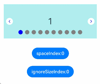
Setting **true** positions the indicator closer to the **Swiper** component's bottom. For the usage, see [Example 9: Using the space and bottom APIs on the Navigation Indicator](#example-9-using-the-space-and-bottom-apis-on-the-navigation-indicator).
**NOTE**
The **ignoreSize** property does not apply to the digit-style navigation indicator in the following scenarios:
• [vertical](#vertical) is set to **false** and the value of **bottom** is greater than 0.
• When [vertical](#vertical) is set to **true**:
1. The value of **bottom** is greater than 0.
2. The value of **bottom** is **undefined**.
3. **isSidebarMiddle** is set to **false**.|
**Return value**
| Type| Description |
| --- | ------------------ |
| T | Current navigation indicator.|
### start12+
start(value: LengthMetrics): T
Sets the distance between the navigation indicator and the right edge (in right-to-left scripts) or the left edge (in left-to-right scripts) of the **Swiper** component.
**Widget capability**: This API can be used in ArkTS widgets since API version 12.
**Atomic service API**: This API can be used in atomic services since API version 12.
**System capability**: SystemCapability.ArkUI.ArkUI.Full
**Parameters**
| Name| Type | Mandatory| Description |
| ------ | ------------------------------------------------------------ | ---- | ------------------------------------------------------------ |
| value | [LengthMetrics](../js-apis-arkui-graphics.md#lengthmetrics12) | Yes | Distance between the navigation indicator and the right edge (in right-to-left scripts) or the left edge (in left-to-right scripts) of the **Swiper** component.
Default value: **0**
Unit: vp|
**Return value**
| Type| Description |
| --- | ------------------ |
| T | Current navigation indicator.|
### end12+
end(value: LengthMetrics): T
Sets the distance between the navigation indicator and the left edge (in right-to-left scripts) or the right edge (in left-to-right scripts) of the **Swiper** component.
**Widget capability**: This API can be used in ArkTS widgets since API version 12.
**Atomic service API**: This API can be used in atomic services since API version 12.
**System capability**: SystemCapability.ArkUI.ArkUI.Full
**Parameters**
| Name| Type | Mandatory | Description |
| ------ | ---------------------------- | ---- | ---------------------------------------- |
| value | [LengthMetrics](../js-apis-arkui-graphics.md#lengthmetrics12) | Yes | Distance between the navigation indicator and the left edge (in right-to-left scripts) or the right edge (in left-to-right scripts) of the **Swiper** component.
Default value: **0**
Unit: vp |
**Return value**
| Type| Description |
| --- | ------------------ |
| T | Current navigation indicator.|
### dot
static dot(): DotIndicator
Returns a **DotIndicator** object.
**Widget capability**: This API can be used in ArkTS widgets since API version 10.
**Atomic service API**: This API can be used in atomic services since API version 11.
**System capability**: SystemCapability.ArkUI.ArkUI.Full
**Return value**
| Type | Description |
| ------------------------------- | ------------ |
| [DotIndicator](#dotindicator10) | Dot-style navigation indicator.|
### digit
static digit(): DigitIndicator
Returns **DigitIndicator** object.
**Widget capability**: This API can be used in ArkTS widgets since API version 10.
**Atomic service API**: This API can be used in atomic services since API version 11.
**System capability**: SystemCapability.ArkUI.ArkUI.Full
**Return value**
| Type | Description |
| ----------------------------------- | ------------ |
| [DigitIndicator](#digitindicator10) | Digit-style navigation indicator.|
## DotIndicator10+
A constructor used to create a **DotIndicator** object. It inherits from [Indicator](#indicator10).
**Atomic service API**: This API can be used in atomic services since API version 11.
**System capability**: SystemCapability.ArkUI.ArkUI.Full
### itemWidth
itemWidth(value: Length): DotIndicator
Sets the width of the dot-style navigation indicator. This parameter cannot be set in percentage.
**Widget capability**: This API can be used in ArkTS widgets since API version 10.
**Atomic service API**: This API can be used in atomic services since API version 11.
**System capability**: SystemCapability.ArkUI.ArkUI.Full
**Parameters**
| Name| Type | Mandatory| Description |
| ------ | ---------------------------- | ---- | ------------------------------------------------------------ |
| value | [Length](ts-types.md#length) | Yes | Width of the dot-style navigation indicator. This parameter cannot be set in percentage.
Default value: **6**
Unit: vp|
**Return value**
| Type | Description |
| ------------------------------- | ------------ |
| [DotIndicator](#dotindicator10) | Current dot-style navigation indicator.|
### itemHeight
itemHeight(value: Length): DotIndicator
Sets the height of the dot-style navigation indicator. This parameter cannot be set in percentage.
**Widget capability**: This API can be used in ArkTS widgets since API version 10.
**Atomic service API**: This API can be used in atomic services since API version 11.
**System capability**: SystemCapability.ArkUI.ArkUI.Full
**Parameters**
| Name| Type | Mandatory| Description |
| ------ | ---------------------------- | ---- | ------------------------------------------------------------ |
| value | [Length](ts-types.md#length) | Yes | Height of the dot-style navigation indicator. This parameter cannot be set in percentage.
Default value: **6**
Unit: vp|
**Return value**
| Type | Description |
| ------------------------------- | ------------ |
| [DotIndicator](#dotindicator10) | Current dot-style navigation indicator.|
### selectedItemWidth
selectedItemWidth(value: Length): DotIndicator
Sets the width of the selected dot in the dot-style navigation indicator. This parameter cannot be set in percentage.
**Widget capability**: This API can be used in ArkTS widgets since API version 10.
**Atomic service API**: This API can be used in atomic services since API version 11.
**System capability**: SystemCapability.ArkUI.ArkUI.Full
**Parameters**
| Name| Type | Mandatory| Description |
| ------ | ---------------------------- | ---- | ------------------------------------------------------------ |
| value | [Length](ts-types.md#length) | Yes | Width of the selected dot in the dot-style navigation indicator. This parameter cannot be set in percentage.
Default value: **6**
Unit: vp|
**Return value**
| Type | Description |
| ------------------------------- | ------------ |
| [DotIndicator](#dotindicator10) | Current dot-style navigation indicator.|
### selectedItemHeight
selectedItemHeight(value: Length): DotIndicator
Sets the height of the selected dot in the dot-style navigation indicator. This parameter cannot be set in percentage.
**Widget capability**: This API can be used in ArkTS widgets since API version 10.
**Atomic service API**: This API can be used in atomic services since API version 11.
**System capability**: SystemCapability.ArkUI.ArkUI.Full
**Parameters**
| Name| Type | Mandatory| Description |
| ------ | ---------------------------- | ---- | ------------------------------------------------------------ |
| value | [Length](ts-types.md#length) | Yes | Height of the selected dot in the dot-style navigation indicator. This parameter cannot be set in percentage.
Default value: **6**
Unit: vp|
**Return value**
| Type | Description |
| ------------------------------- | ------------ |
| [DotIndicator](#dotindicator10) | Current dot-style navigation indicator.|
### mask
mask(value: boolean): DotIndicator
Sets whether to enable the mask for the dot-style navigation indicator.
**Widget capability**: This API can be used in ArkTS widgets since API version 10.
**Atomic service API**: This API can be used in atomic services since API version 11.
**System capability**: SystemCapability.ArkUI.ArkUI.Full
**Parameters**
| Name| Type | Mandatory| Description |
| ------ | ------- | ---- | ------------------------------------------------------------ |
| value | boolean | Yes | Whether to enable the mask for the dot-style navigation indicator. The value **true** means to enable the mask for the dot-style navigation indicator, and **false** means the opposite.
Default value: **false**.|
**Return value**
| Type | Description |
| ------------------------------- | ------------ |
| [DotIndicator](#dotindicator10) | Current dot-style navigation indicator.|
### color
color(value: ResourceColor): DotIndicator
Sets the color of the dot-style navigation indicator.
**Widget capability**: This API can be used in ArkTS widgets since API version 10.
**Atomic service API**: This API can be used in atomic services since API version 11.
**System capability**: SystemCapability.ArkUI.ArkUI.Full
**Parameters**
| Name| Type | Mandatory| Description |
| ------ | ------------------------------------------ | ---- | ------------------------------------------------------------ |
| value | [ResourceColor](ts-types.md#resourcecolor) | Yes | Color of the dot-style navigation indicator.
Default value: **'\#182431'** (10% opacity)|
**Return value**
| Type | Description |
| ------------------------------- | ------------ |
| [DotIndicator](#dotindicator10) | Current dot-style navigation indicator.|
### selectedColor
selectedColor(value: ResourceColor): DotIndicator
Sets the color of the selected dot in the dot-style navigation indicator.
**Widget capability**: This API can be used in ArkTS widgets since API version 10.
**Atomic service API**: This API can be used in atomic services since API version 11.
**System capability**: SystemCapability.ArkUI.ArkUI.Full
**Parameters**
| Name| Type | Mandatory| Description |
| ------ | ------------------------------------------ | ---- | ------------------------------------------------------------ |
| value | [ResourceColor](ts-types.md#resourcecolor) | Yes | Color of the selected dot in the dot-style navigation indicator.
Default value: **'\#007DFF'**|
**Return value**
| Type | Description |
| ------------------------------- | ------------ |
| [DotIndicator](#dotindicator10) | Current dot-style navigation indicator.|
### maxDisplayCount12+
maxDisplayCount(maxDisplayCount: number): DotIndicator
Sets the maximum number of navigation dots in the dot-style navigation indicator.
**Atomic service API**: This API can be used in atomic services since API version 12.
**System capability**: SystemCapability.ArkUI.ArkUI.Full
**Parameters**
| Name | Type | Mandatory| Description |
| --------------- | ------ | ---- | ------------------------------------------------------------ |
| maxDisplayCount | number | Yes | Maximum number of navigation dots in the dot-style navigation indicator. If the actual number of navigation dots exceeds this limit, the overflow effect is activated, as shown in Example 5.
This parameter has no default value. If an invalid value is set, no overflow effect is applied.
Value range: [6, 9].
**NOTE**
In scenarios involving overflow display:
1. Interactive features, such as gestures and mouse operations, are not supported.
2. The position of the selected navigation dot corresponding to the middle page is not strictly fixed; it depends on the sequence of previous page-turning operations.
3. Currently, only scenarios with **displayCount** set to **1** are supported.|
**Return value**
| Type | Description |
| ------------------------------- | ------------ |
| [DotIndicator](#dotindicator10) | Current dot-style navigation indicator.|
### space19+
space(space: LengthMetrics): DotIndicator
Sets the spacing between the dots in a dot-style navigation indicator for the **Swiper** component. Note that percentage values are not supported.
**Widget capability**: This API can be used in ArkTS widgets since API version 19.
**Atomic service API**: This API can be used in atomic services since API version 19.
**System capability**: SystemCapability.ArkUI.ArkUI.Full
**Parameters**
| Name| Type | Mandatory| Description |
| ------ | ---------------------------- | ---- | ------------------------------------------------------------ |
| space | [LengthMetrics](../js-apis-arkui-graphics.md#lengthmetrics12) | Yes | Spacing between the dots in the dot-style navigation indicator. Percentage values are not supported.
Default value: **8**
Unit: vp|
**Return value**
| Type | Description |
| ------------------------------- | ------------ |
| [DotIndicator](#dotindicator10) | Current dot-style navigation indicator.|
### constructor
constructor()
A constructor used to create a **DotIndicator** object.
**Widget capability**: This API can be used in ArkTS widgets since API version 10.
**Atomic service API**: This API can be used in atomic services since API version 11.
**System capability**: SystemCapability.ArkUI.ArkUI.Full
>**NOTE**
>
>When pressed, the navigation indicator is zoomed in to 1.33 times. To account for this, there is a certain distance between the navigation indicator's visible boundary and its actual boundary in the non-pressed state. The distance increases with the value of **itemWidth**, **itemHeight**, **selectedItemWidth**, and **selectedItemHeight**.
## DigitIndicator10+
A constructor used to create a **DigitIndicator** object. It inherits from [Indicator](#indicator10).
**Widget capability**: This API can be used in ArkTS widgets since API version 10.
**Atomic service API**: This API can be used in atomic services since API version 11.
**System capability**: SystemCapability.ArkUI.ArkUI.Full
>**NOTE**
>
>When pages are turned by group, the child nodes displayed in the digit-style navigation indicator do not count placeholder nodes.
>The maximum value of [maxFontScale](ts-basic-components-text.md#maxfontscale12) for the digit-style navigation indicator is 2.
### fontColor
fontColor(value: ResourceColor): DigitIndicator
Sets the font color of the digit-style navigation indicator.
**Widget capability**: This API can be used in ArkTS widgets since API version 10.
**Atomic service API**: This API can be used in atomic services since API version 11.
**System capability**: SystemCapability.ArkUI.ArkUI.Full
**Parameters**
| Name| Type | Mandatory| Description |
| ------ | ------------------------------------------ | ---- | ------------------------------------------------------------ |
| value | [ResourceColor](ts-types.md#resourcecolor) | Yes | Font color of the digit-style navigation indicator.
Default value: **'\#ff182431'**|
**Return value**
| Type | Description |
| ----------------------------------- | ------------ |
| [DigitIndicator](#digitindicator10) | Current digit-style navigation indicator.|
### selectedFontColor
selectedFontColor(value: ResourceColor): DigitIndicator
Sets the font color of the selected digit in the digit-style navigation indicator.
**Widget capability**: This API can be used in ArkTS widgets since API version 10.
**Atomic service API**: This API can be used in atomic services since API version 11.
**System capability**: SystemCapability.ArkUI.ArkUI.Full
**Parameters**
| Name| Type | Mandatory| Description |
| ------ | ------------------------------------------ | ---- | ------------------------------------------------------------ |
| value | [ResourceColor](ts-types.md#resourcecolor) | Yes | Font color of the selected digit in the digit-style navigation indicator.
Default value: **'\#ff182431'**|
**Return value**
| Type | Description |
| ----------------------------------- | ------------ |
| [DigitIndicator](#digitindicator10) | Current digit-style navigation indicator.|
### digitFont
digitFont(value: Font): DigitIndicator
Sets the font style of the digit-style navigation indicator.
**Widget capability**: This API can be used in ArkTS widgets since API version 10.
**Atomic service API**: This API can be used in atomic services since API version 11.
**System capability**: SystemCapability.ArkUI.ArkUI.Full
**Parameters**
| Name| Type | Mandatory| Description |
| ------ | ------------------------ | ---- | ------------------------------------------------------------ |
| value | [Font](ts-types.md#font) | Yes | Font style of the digit-style navigation indicator.
Only the **size** and **weight** parameters in **Font** are adjustable. Setting **family** and **style** has no effect.
Default value:
{ size: 14, weight: FontWeight.Normal } |
**Return value**
| Type | Description |
| ----------------------------------- | ------------ |
| [DigitIndicator](#digitindicator10) | Current digit-style navigation indicator.|
### selectedDigitFont
selectedDigitFont(value: Font): DigitIndicator
Sets the font style of the selected digit in the digit-style navigation indicator.
**Widget capability**: This API can be used in ArkTS widgets since API version 10.
**Atomic service API**: This API can be used in atomic services since API version 11.
**System capability**: SystemCapability.ArkUI.ArkUI.Full
**Parameters**
| Name| Type | Mandatory| Description |
| ------ | ------------------------ | ---- | ------------------------------------------------------------ |
| value | [Font](ts-types.md#font) | Yes | Font style of the selected digit in the digit-style navigation indicator.
Default value:
{ size: 14, weight: FontWeight.Normal } |
>**NOTE**
>
> When pages are turned by group, the child nodes displayed in the digit-style navigation indicator do not count placeholder nodes.
**Return value**
| Type | Description |
| ----------------------------------- | ------------ |
| [DigitIndicator](#digitindicator10) | Current digit-style navigation indicator.|
### constructor
constructor()
A constructor used to create a **DigitIndicator** object.
**Widget capability**: This API can be used in ArkTS widgets since API version 10.
**Atomic service API**: This API can be used in atomic services since API version 11.
**System capability**: SystemCapability.ArkUI.ArkUI.Full
## ArrowStyle10+
Describes the left and right arrow attributes.
**Atomic service API**: This API can be used in atomic services since API version 11.
**System capability**: SystemCapability.ArkUI.ArkUI.Full
| Name | Type | Mandatory | Description |
| ---------------- | ---------------------------------------- | ---- | ---------------------------------------- |
| showBackground | boolean | No | Whether to show the background for the arrow. The value **true** means to show the background for the arrow, and **false** means the opposite.
Default value: **false**. |
| isSidebarMiddle | boolean | No | Whether the arrow is centered on both sides of the **Swiper** component. The value **true** means that the arrow is centered on both sides of the **Swiper** component, and **false** means that the arrow is show on either side of the navigation indicator.
Default value: **false**.
|
| backgroundSize | [Length](ts-types.md#length) | No | Size of the background.
On both sides of the navigation indicator:
Default value: **24vp**.
On both sides of the component:
Default value: **32vp**.
Percentage values are not supported.|
| backgroundColor | [ResourceColor](ts-types.md#resourcecolor) | No | Color of the background.
On both sides of the navigation indicator:
Default value: **'\#00000000'**.
On both sides of the component:
Default value: **'\#19182431'**.|
| arrowSize | [Length](ts-types.md#length) | No | Size of the arrow.
On both sides of the navigation indicator:
Default value: **18vp**.
On both sides of the component:
Default value: **24vp**.
**NOTE**
If **showBackground** is set to **true**, the value of **arrowSize** is 3/4 of the value of **backgroundSize**.
Percentage values are not supported.|
| arrowColor | [ResourceColor](ts-types.md#resourcecolor) | No | Color of the arrow.
Default value: **'\#182431'** |
## SwiperAutoFill10+
Describes the auto-fill attribute.
**Widget capability**: This API can be used in ArkTS widgets since API version 10.
**Atomic service API**: This API can be used in atomic services since API version 11.
**System capability**: SystemCapability.ArkUI.ArkUI.Full
| Name | Type | Mandatory| Description |
| ------- | -------------------- | ------ | ------------------------------------ |
| minSize | [VP](ts-types.md#vp10) | Yes | Minimum width of the element.
Default value: **0**.|
## AutoPlayOptions18+
Defines the properties for controlling the automatic playback behavior.
**Widget capability**: This API can be used in ArkTS widgets since API version 18.
**Atomic service API**: This API can be used in atomic services since API version 18.
**System capability**: SystemCapability.ArkUI.ArkUI.Full
| Name | Type | Mandatory | Description |
| ---------------- | ---------------------------------------- | ---- | ---------------------------------------- |
| stopWhenTouched | boolean | Yes | Whether the automatic playback stops immediately when the component is touched.
The value **true** means that the automatic playback stops immediately when the component is touched, and **false** means the opposite.
Default value: **true**.|
## Events
In addition to the [universal events](ts-component-general-events.md), the following events are supported.
### onChange
onChange(event: Callback\)
Triggered when the index of the currently displayed child component changes. The return value is the index of the currently displayed child component.
When the **Swiper** component is used together with **LazyForEach**, the subpage UI update cannot be triggered in the **onChange** event.
**Widget capability**: This API can be used in ArkTS widgets since API version 10.
**Atomic service API**: This API can be used in atomic services since API version 11.
**System capability**: SystemCapability.ArkUI.ArkUI.Full
**Parameters**
| Name| Type | Mandatory| Description |
| ------ | ------ | ---- | -------------------- |
| event | [Callback](./ts-types.md#callback12)\ | Yes | Index of the currently displayed element.|
### onAnimationStart9+
onAnimationStart(event: OnSwiperAnimationStartCallback)
Triggered when the page transition animation starts.
> **NOTE**
>
> - When this callback is invoked, the page transition animation logic is executed in the rendering thread, allowing the idle main thread to load resources required by child components. This reduces preloading time for nodes within the **cachedCount** range. For best practices, see [Optimizing Frame Loss During Swiper Component Loading – Preloading Data](https://developer.huawei.com/consumer/en/doc/best-practices/bpta-swiper_high_performance_development_guide#section8783121513246).
**Widget capability**: This API can be used in ArkTS widgets since API version 10.
**Atomic service API**: This API can be used in atomic services since API version 11.
**System capability**: SystemCapability.ArkUI.ArkUI.Full
**Parameters**
| Name| Type | Mandatory| Description |
| ------ | ------ | ---- | -------------------- |
| event | [OnSwiperAnimationStartCallback](#onswiperanimationstartcallback18) | Yes | Callback triggered when the page transition animation starts.|
>**NOTE**
>
>- When the duration of the page transition animation is set to 0, this callback is triggered only in the following scenarios: swiping to turn pages, automatic playback, calling **SwiperController.showNext()** or **SwiperController.showPrevious()**, and touching navigation points to navigate.
### onAnimationEnd9+
onAnimationEnd(event: OnSwiperAnimationEndCallback)
Triggered when the page transition animation ends.
This event is triggered when the switching animation of the **Swiper** component ends, whether it is caused by gesture interruption or by calling **finishAnimation** through **SwiperController**.
**Widget capability**: This API can be used in ArkTS widgets since API version 10.
**Atomic service API**: This API can be used in atomic services since API version 11.
**System capability**: SystemCapability.ArkUI.ArkUI.Full
**Parameters**
| Name| Type | Mandatory| Description |
| ------ | ------ | ---- | -------------------- |
| event | [OnSwiperAnimationEndCallback](#onswiperanimationendcallback18) | Yes | Callback triggered when the page transition animation ends.|
>**NOTE**
>
>- When the duration of the page transition animation is set to 0, this callback is triggered only in the following scenarios: swiping to turn pages, automatic playback, calling **SwiperController.showNext()** or **SwiperController.showPrevious()**, and touching navigation points to navigate.
### onGestureSwipe10+
onGestureSwipe(event: OnSwiperGestureSwipeCallback)
Triggered on a frame-by-frame basis when the page is turned by a swipe.
**Atomic service API**: This API can be used in atomic services since API version 11.
**System capability**: SystemCapability.ArkUI.ArkUI.Full
**Parameters**
| Name| Type | Mandatory| Description |
| ------ | ------ | ---- | -------------------- |
| event | [OnSwiperGestureSwipeCallback](#onswipergestureswipecallback18) | Yes | Callback triggered on a frame-by-frame basis when the page is turned by a swipe. **onGestureSwipe** is called after **onTouch**. For post-release operations, consider using [onAnimationStart](#onanimationstart9).|
### customContentTransition12+
customContentTransition(transition: SwiperContentAnimatedTransition)
Defines a custom page transition animation. During finger-following swipes and post-release transition animations, this triggers a frame-by-frame callback for all pages in the viewport, allowing you to customize animations by modifying properties like opacity, scale, and translation.
Instructions:
1. This API does not work when **prevMargin** and **nextMargin** are set in such a way that the **Swiper** frontend and backend display the same page during loop playback.
2. During finger-following swipes and post-release transition animations, the [SwiperContentTransitionProxy](#swipercontenttransitionproxy12) callback is invoked for all pages in the viewport on a frame-by-frame basis. For example, when there are two pages whose subscripts are 0 and 1 in the viewport, two callbacks whose indexes are 0 and 1 are invoked in each frame.
3. When the **swipeByGroup** parameter of the **displayCount** attribute is set to **true**, the callback is invoked for all pages in a group if any page in the group is within the viewport; and all pages in a group are removed from the render tree if none of them are within the viewport.
4. During finger-following swipes and post-release transition animations, the default animation (page scrolling) is still effective. If you do not want the page to scroll, you can set the **translate** property on the main axis to offset the page scrolling. For example, if the value of **displayCount** is **2** and there are two pages whose subscripts are 0 and 1 within the viewport, you can set the **translate** property on the main axis to the following on a frame-by-frame basis: **translate** for page 0 = **-position** x **mainAxisLength**; **translate** for page 1 = **-(position - 1)** x **mainAxisLength**
**Atomic service API**: This API can be used in atomic services since API version 12.
**System capability**: SystemCapability.ArkUI.ArkUI.Full
**Parameters**
| Name| Type| Mandatory| Description|
| ------ | ---- | ---- | ---- |
| transition | [SwiperContentAnimatedTransition](#swipercontentanimatedtransition12) | Yes| Information about the custom page transition animation.|
### onContentDidScroll12+
onContentDidScroll(handler: ContentDidScrollCallback)
Triggered when content in the **Swiper** component scrolls.
Instructions:
1. This API does not work when **prevMargin** and **nextMargin** are set in such a way that the **Swiper** frontend and backend display the same page during loop playback.
2. During page scrolling, the [ContentDidScrollCallback](#contentdidscrollcallback12) callback is invoked for all pages in the viewport on a frame-by-frame basis. For example, when there are two pages whose subscripts are 0 and 1 in the viewport, two callbacks whose indexes are 0 and 1 are invoked in each frame.
3. When the **swipeByGroup** parameter of the **displayCount** attribute is set to **true**, the callback is invoked for all pages in a group if any page in the group is within the viewport.
**Atomic service API**: This API can be used in atomic services since API version 12.
**System capability**: SystemCapability.ArkUI.ArkUI.Full
**Parameters**
| Name| Type| Mandatory| Description|
| ------ | ---- | ---- | ---- |
| handler | [ContentDidScrollCallback](#contentdidscrollcallback12) | Yes| Callback triggered when content in the **Swiper** component scrolls.|
### onSelected18+
onSelected(event: Callback\)
Triggered when the selected element changes. The index of the currently selected element is returned.
**Widget capability**: This API can be used in ArkTS widgets since API version 18.
**Atomic service API**: This API can be used in atomic services since API version 18.
**System capability**: SystemCapability.ArkUI.ArkUI.Full
**Parameters**
| Name| Type | Mandatory| Description |
| ------ | ------ | ---- | -------------------- |
| event | [Callback](./ts-types.md#callback12)\ | Yes | Index of the currently selected element.|
> **NOTE**
>
> In the **onSelected** callback, do not modify the **index** attribute of the **Swiper** component, or call the **SwiperController.changeIndex()**, **SwiperController.showNext()**, or **SwiperController.showPrevious()** APIs.
### onUnselected18+
onUnselected(event: Callback\)
Triggered when the selected element changes. The index of the element that is about to be hidden is returned.
**Widget capability**: This API can be used in ArkTS widgets since API version 18.
**Atomic service API**: This API can be used in atomic services since API version 18.
**System capability**: SystemCapability.ArkUI.ArkUI.Full
**Parameters**
| Name| Type | Mandatory| Description |
| ------ | ------ | ---- | -------------------- |
| event | [Callback](./ts-types.md#callback12)\ | Yes | Index of the element that is about to be hidden.|
> **NOTE**
>
> In the **onUnselected** callback, do not modify the **index** attribute of the **Swiper** component, nor call the **SwiperController.changeIndex()**, **SwiperController.showNext()**, or **SwiperController.showPrevious()** APIs.
### onContentWillScroll15+
onContentWillScroll(handler: ContentWillScrollCallback)
Triggered when the **Swiper** component is about to scroll. This event allows you to intercept and control the scrolling behavior of the component. The component determines whether to allow the scroll action based on the return value. If **true** is returned, the scroll action is allowed, and the pages in the **Swiper** component will follow the scrolling. If **false** is returned, the scroll action is disallowed, and the pages will remain stationary.
1. This event is only triggered by gesture operations, including finger swipes, scrolling the mouse wheel, and moving focus using keyboard arrow keys.
2. During finger swipes, the event is triggered for each frame. The system uses the return value of the event to determine whether to respond to the swipe for each frame.
3. For scrolling the mouse wheel and moving focus using keyboard arrow keys, the event is triggered once per page turning. The system uses the return value to decide whether to allow the page turning.
**Widget capability**: This API can be used in ArkTS widgets since API version 15.
**Atomic service API**: This API can be used in atomic services since API version 15.
**System capability**: SystemCapability.ArkUI.ArkUI.Full
**Parameters**
| Name| Type| Mandatory| Description|
| ------ | ---- | ---- | ---- |
| handler | [ContentWillScrollCallback](#contentwillscrollcallback15) | Yes| Callback triggered when content in the **Swiper** component scrolls.|
## OnSwiperAnimationStartCallback18+
type OnSwiperAnimationStartCallback = (index: number, targetIndex: number, extraInfo: SwiperAnimationEvent) => void
Defines the callback triggered when the page transition animation starts.
**Widget capability**: This API can be used in ArkTS widgets since API version 18.
**Atomic service API**: This API can be used in atomic services since API version 18.
**System capability**: SystemCapability.ArkUI.ArkUI.Full
**Parameters**
| Name | Type | Mandatory| Description |
| ------------------------- | ---------------------------------------------------------- | ---- | ------------------------------------------------------------ |
| index | number | Yes | Index of the currently displayed element. If there are multiple columns, **index** indicates the index of the leftmost component. |
| targetIndex10+ | number | Yes | Index of the target element to switch to. |
| extraInfo10+ | [SwiperAnimationEvent](#swiperanimationevent10) | Yes | Extra information of the animation, including the offset of the currently displayed element and target element relative to the start position of the **Swiper** along the main axis, and the hands-off velocity.|
## OnSwiperAnimationEndCallback18+
type OnSwiperAnimationEndCallback = (index: number, extraInfo: SwiperAnimationEvent) => void
Defines the callback triggered when the page transition animation ends.
**Widget capability**: This API can be used in ArkTS widgets since API version 18.
**Atomic service API**: This API can be used in atomic services since API version 18.
**System capability**: SystemCapability.ArkUI.ArkUI.Full
**Parameters**
| Name | Type | Mandatory| Description |
| ----------------------- | ---------------------------------------------------------- | ---- | ------------------------------------------------------------ |
| index | number | Yes | Index of the currently displayed element. If there are multiple columns, **index** indicates the index of the leftmost component. |
| extraInfo10+ | [SwiperAnimationEvent](#swiperanimationevent10) | Yes | Extra information of the animation, which is the offset of the currently displayed element relative to the start position of the **Swiper** along the main axis.|
## OnSwiperGestureSwipeCallback18+
type OnSwiperGestureSwipeCallback = (index: number, extraInfo: SwiperAnimationEvent) => void
Defines the callback triggered on a frame-by-frame basis when the page is turned by a swipe.
**Atomic service API**: This API can be used in atomic services since API version 18.
**System capability**: SystemCapability.ArkUI.ArkUI.Full
**Parameters**
| Name | Type | Mandatory| Description |
| --------- | ---------------------------------------------------------- | ---- | ------------------------------------------------------------ |
| index | number | Yes | Index of the currently displayed element. If there are multiple columns, **index** indicates the index of the leftmost component. |
| extraInfo | [SwiperAnimationEvent](#swiperanimationevent10) | Yes | Extra information of the animation, which is the offset of the currently displayed element relative to the start position of the **Swiper** along the main axis.|
## ContentDidScrollCallback12+
type ContentDidScrollCallback = (selectedIndex: number, index: number, position: number, mainAxisLength: number) => void
Triggered during the swipe action of the **Swiper** component. For details about the parameters, see [SwiperContentTransitionProxy](#swipercontenttransitionproxy12).
**Atomic service API**: This API can be used in atomic services since API version 12.
**System capability**: SystemCapability.ArkUI.ArkUI.Full
| Name| Type| Mandatory| Description|
| ------ | ---- | ---- | ---- |
| selectedIndex | number | Yes| Index of the currently selected page.|
| index | number | Yes| Index of a page in the viewport.|
| position | number | Yes| Position of the page specified by **index** relative to the start position of the **Swiper** main axis (start position of the page corresponding to **selectedIndex**).|
| mainAxisLength | number | Yes| Length of the page specified by **index** along the main axis, in vp.|
## ContentWillScrollCallback15+
type ContentWillScrollCallback = (result: SwiperContentWillScrollResult) => boolean
Defines the callback triggered when the **Swiper** component is about to scroll. The return value indicates whether the scroll action is allowed.
**Widget capability**: This API can be used in ArkTS widgets since API version 15.
**Atomic service API**: This API can be used in atomic services since API version 15.
**System capability**: SystemCapability.ArkUI.ArkUI.Full
**Parameters**
| Name| Type| Mandatory| Description|
| ------ | ---- | ---- | ---- |
| result | [SwiperContentWillScrollResult](#swipercontentwillscrollresult15) | Yes| Information related to the upcoming scroll action, including the index of the current page, the index of the page that will be displayed in the scroll direction, and the displacement of the scroll action.|
**Return value**
| Type| Description|
| ------ | ---- |
| boolean | Whether the scroll action is allowed. The value **true** means the scroll action is allowed, and **false** means the opposite.|
## SwiperContentWillScrollResult15+
Provides information related to the upcoming scroll action, including the index of the current page, the index of the page that will be displayed in the scroll direction, and the displacement of the scroll action.
**Widget capability**: This API can be used in ArkTS widgets since API version 15.
**Atomic service API**: This API can be used in atomic services since API version 15.
**System capability**: SystemCapability.ArkUI.ArkUI.Full
| Name| Type| Mandatory| Description|
| ------ | ---- | ---- | ---- |
| currentIndex | number | Yes| Index of the current page. During a finger swipe, this value remains constant as long as the finger is on the screen, even if the page has completely moved out of view.|
| comingIndex | number | Yes| Index of the page that will be displayed in the scroll direction.|
| offset | number | Yes| Displacement of the scroll action, which is signed to indicate different swipe directions. A positive value indicates a swipe from index=1 to index=0, while a negative value indicates a swipe from index=0 to index=1.
This value represents the offset for each frame during a finger swipe and the distance for page turning when the mouse wheel or keyboard navigation is used.|
## SwiperAnimationEvent10+
Describes the animation information of the **Swiper** component.
**Atomic service API**: This API can be used in atomic services since API version 11.
**System capability**: SystemCapability.ArkUI.ArkUI.Full
| Name | Type | Read Only| Optional| Description |
| ------------- | ----------- | ---- | ---- |------------------------------- |
| currentOffset | number | No| No| Offset of the currently displayed element relative to the start position of the **Swiper** along the main axis. Unit: vp
Default value: **0**|
| targetOffset | number | No| No| Offset of the target element relative to the start position of the **Swiper** along the main axis. Unit: vp
Default value: **0**|
| velocity | number | No| No| Hands-off velocity at the beginning of the animation. Unit: VP/S
Default value: **0**|
## SwiperContentAnimatedTransition12+
Provides the information about the custom page transition animation.
**Atomic service API**: This API can be used in atomic services since API version 12.
**System capability**: SystemCapability.ArkUI.ArkUI.Full
| Name| Type| Mandatory| Description|
| ------ | ---- | ---- | ---- |
| timeout | number | No| Timeout for the page transition animation. The timeout timer starts when the default animation (page scrolling) reaches the point where the first frame is moved out of the viewport. If you do not call the **finishTransition** API of [SwiperContentTransitionProxy](#swipercontenttransitionproxy12) before the timer expires, the component considers that the custom animation of the page ends and immediately removes the page node from the render tree. The unit is ms. The default value is **0**.|
| transition | Callback<[SwiperContentTransitionProxy](#swipercontenttransitionproxy12)> | Yes| Content of the custom page transition animation.|
## SwiperContentTransitionProxy12+
Implements the proxy object returned during the execution of the custom page transition animation of the **Swiper** component. You can use this object to obtain the page information in the custom animation viewport. You can also call the **finishTransition** API of this object to notify the **Swiper** component that the custom animation has finished playing.
**Atomic service API**: This API can be used in atomic services since API version 12.
**System capability**: SystemCapability.ArkUI.ArkUI.Full
### Attributes
| Name| Type| Read Only| Optional| Description|
| ---- | ---- | --- | ---- | --- |
| selectedIndex | number | No| No| Index of the currently selected page.|
| index | number | No| No| Index of a page in the viewport.|
| position | number | No| No| Position of the page specified by **index** relative to the start position of the **Swiper** main axis (start position of the page corresponding to **selectedIndex**).|
| mainAxisLength | number | No| No| Length of the page specified by **index** along the main axis, in vp.|
>**NOTE**
>
>- For example, when the index of the currently selected child component is 0, during a transition animation from page 0 to page 1, the callback is triggered for all pages within the viewport on every frame. When pages 0 and 1 are both in the viewport, the callback is triggered twice per frame. The first callback has **selectedIndex** as **0**, **index** as **0**, **position** as the ratio of how much page 0 has moved relative to its position before the animation started on the current frame, and **mainAxisLength** as the length of page 0 on the main axis. The second callback has **selectedIndex** as **0**, **index** as **1**, **position** as the ratio of how much page 1 has moved relative to page 0 before the animation started on the current frame, and **mainAxisLength** as the length of page 1 on the main axis.
>
>- If the animation curve is a spring interpolation curve, during the transition animation from page 0 to page 1, due to the position and velocity when the user lifts their finger off the screen, animation may overshoot and slide past to page 2, then bounce back to page 1. Throughout this process, a callback is triggered for pages 1 and 2 within the viewport on every frame.
### finishTransition12+
finishTransition(): void
Notifies the **Swiper** component that the custom animation has finished playing.
**Atomic service API**: This API can be used in atomic services since API version 12.
**System capability**: SystemCapability.ArkUI.ArkUI.Full
## Example
### Example 1: Setting the Navigation Indicator Interaction and Page Turning Effect
This example demonstrates how to use the **changeIndex** API with **SwiperAnimationMode** to move to a specific page in the **Swiper** component.
```ts
// xxx.ets
class MyDataSource implements IDataSource {
private list: number[] = [];
constructor(list: number[]) {
this.list = list;
}
totalCount(): number {
return this.list.length;
}
getData(index: number): number {
return this.list[index];
}
registerDataChangeListener(listener: DataChangeListener): void {
}
unregisterDataChangeListener() {
}
}
@Entry
@Component
struct SwiperExample {
private swiperController: SwiperController = new SwiperController();
private data: MyDataSource = new MyDataSource([]);
aboutToAppear(): void {
let list: number[] = [];
for (let i = 1; i <= 10; i++) {
list.push(i);
}
this.data = new MyDataSource(list);
}
build() {
Column({ space: 5 }) {
Swiper(this.swiperController) {
LazyForEach(this.data, (item: string) => {
Text(item.toString())
.width('90%')
.height(160)
.backgroundColor(0xAFEEEE)
.textAlign(TextAlign.Center)
.fontSize(30)
}, (item: string) => item)
}
.cachedCount(2)
.index(1)
.autoPlay(true)
.interval(4000)
.loop(true)
.indicatorInteractive(true)
.duration(1000)
.itemSpace(5)
.prevMargin(35)
.nextMargin(35)
.indicator( // Set the style of the navigation indicator.
new DotIndicator()
.itemWidth(15)
.itemHeight(15)
.selectedItemWidth(15)
.selectedItemHeight(15)
.color(Color.Gray)
.selectedColor(Color.Blue))
.displayArrow({ // Set the arrow style of the navigation indicator.
showBackground: true,
isSidebarMiddle: true,
backgroundSize: 24,
backgroundColor: Color.White,
arrowSize: 18,
arrowColor: Color.Blue
}, false)
.curve(Curve.Linear)
.onChange((index: number) => {
console.info(index.toString());
})
.onGestureSwipe((index: number, extraInfo: SwiperAnimationEvent) => {
console.info("index: " + index);
console.info("current offset: " + extraInfo.currentOffset);
})
.onAnimationStart((index: number, targetIndex: number, extraInfo: SwiperAnimationEvent) => {
console.info("index: " + index);
console.info("targetIndex: " + targetIndex);
console.info("current offset: " + extraInfo.currentOffset);
console.info("target offset: " + extraInfo.targetOffset);
console.info("velocity: " + extraInfo.velocity);
})
.onAnimationEnd((index: number, extraInfo: SwiperAnimationEvent) => {
console.info("index: " + index);
console.info("current offset: " + extraInfo.currentOffset);
})
Row({ space: 12 }) {
Button('showPrevious')
.onClick(() => {
this.swiperController.showPrevious();
})
Button('showNext')
.onClick(() => {
this.swiperController.showNext();
})
}.margin(5)
Row({ space: 5 }) {
Button('FAST 0')
.onClick(() => {
this.swiperController.changeIndex(0, SwiperAnimationMode.FAST_ANIMATION);
})
Button('FAST 3')
.onClick(() => {
this.swiperController.changeIndex(3, SwiperAnimationMode.FAST_ANIMATION);
})
Button('FAST ' + 9)
.onClick(() => {
this.swiperController.changeIndex(9, SwiperAnimationMode.FAST_ANIMATION);
})
}.margin(5)
}.width('100%')
.margin({ top: 5 })
}
}
```
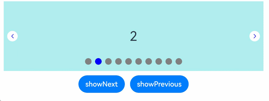
### Example 2: Implementing a Digit Indicator
This example showcases how to implement a digit indicator using the **DigitIndicator** API.
```ts
// xxx.ets
class MyDataSource implements IDataSource {
private list: number[] = [];
constructor(list: number[]) {
this.list = list;
}
totalCount(): number {
return this.list.length;
}
getData(index: number): number {
return this.list[index];
}
registerDataChangeListener(listener: DataChangeListener): void {
}
unregisterDataChangeListener() {
}
}
@Entry
@Component
struct SwiperExample {
private swiperController: SwiperController = new SwiperController();
private data: MyDataSource = new MyDataSource([]);
aboutToAppear(): void {
let list: number[] = [];
for (let i = 1; i <= 10; i++) {
list.push(i);
}
this.data = new MyDataSource(list);
}
build() {
Column({ space: 5 }) {
Swiper(this.swiperController) {
LazyForEach(this.data, (item: string) => {
Text(item.toString())
.width('90%')
.height(160)
.backgroundColor(0xAFEEEE)
.textAlign(TextAlign.Center)
.fontSize(30)
}, (item: string) => item)
}
.cachedCount(2)
.index(1)
.autoPlay(true)
.interval(4000)
.indicator(Indicator.digit() // Set the digit-style navigation indicator.
.top(200)
.fontColor(Color.Gray)
.selectedFontColor(Color.Gray)
.digitFont({ size: 20, weight: FontWeight.Bold })
.selectedDigitFont({ size: 20, weight: FontWeight.Normal }))
.loop(true)
.duration(1000)
.itemSpace(0)
.displayArrow(true, false)
Row({ space: 12 }) {
Button('showNext')
.onClick(() => {
this.swiperController.showNext();
})
Button('showPrevious')
.onClick(() => {
this.swiperController.showPrevious();
})
}.margin(5)
}.width('100%')
.margin({ top: 5 })
}
}
```

### Example 3: Configuring Group Page-Turning
This example illustrates the group page-turning effect using the **displayCount** property.
```ts
// xxx.ets
class MyDataSource implements IDataSource {
private list: number[] = [];
constructor(list: number[]) {
this.list = list;
}
totalCount(): number {
return this.list.length;
}
getData(index: number): number {
return this.list[index];
}
registerDataChangeListener(listener: DataChangeListener): void {
}
unregisterDataChangeListener() {
}
}
@Entry
@Component
struct SwiperExample {
private swiperController: SwiperController = new SwiperController();
private data: MyDataSource = new MyDataSource([]);
aboutToAppear(): void {
let list: number[] = [];
for (let i = 1; i <= 10; i++) {
list.push(i);
}
this.data = new MyDataSource(list);
}
build() {
Column({ space: 5 }) {
Swiper(this.swiperController) {
LazyForEach(this.data, (item: string) => {
Text(item.toString())
.width('90%')
.height(160)
.backgroundColor(0xAFEEEE)
.textAlign(TextAlign.Center)
.fontSize(30)
}, (item: string) => item)
}
.displayCount(3, true)
.autoPlay(true)
.interval(4000)
.loop(true)
.duration(1000)
.itemSpace(10)
.indicator( // Set the style of the navigation indicator.
new DotIndicator()
.itemWidth(15)
.itemHeight(15)
.selectedItemWidth(15)
.selectedItemHeight(15)
.color(Color.Gray)
.selectedColor(Color.Blue))
Row({ space: 12 }) {
Button('showNext')
.onClick(() => {
this.swiperController.showNext();
})
Button('showPrevious')
.onClick(() => {
this.swiperController.showPrevious();
})
}.margin(5)
}.width('100%')
.margin({ top: 5 })
}
}
```

### Example 4: Customizing the Page Page Transition Animation
This example presents how to implement a custom page transition animation for the **Swiper** component through the **customContentTransition** API.
```ts
// EntryAbility.ets
import { Configuration, UIAbility } from '@kit.AbilityKit';
import { i18n } from '@kit.LocalizationKit';
import { CommonUtil } from '../common/CommonUtil';
export default class EntryAbility extends UIAbility {
onConfigurationUpdate(newConfig: Configuration): void {
// Listen for system configuration changes.
if (newConfig.language) {
CommonUtil.setIsRTL(i18n.isRTL(newConfig.language));
}
}
}
```
```ts
// CommonUtil.ets
import { i18n, intl } from '@kit.LocalizationKit';
export class CommonUtil {
private static isRTL: boolean = i18n.isRTL((new intl.Locale()).language);
public static setIsRTL(isRTL: boolean): void {
CommonUtil.isRTL = isRTL;
}
public static getIsRTL(): boolean {
return CommonUtil.isRTL;
}
}
```
```ts
// xxx.ets
import { CommonUtil } from '../common/CommonUtil';
@Entry
@Component
struct SwiperCustomAnimationExample {
private DISPLAY_COUNT: number = 2;
private MIN_SCALE: number = 0.75;
@State backgroundColors: Color[] = [Color.Green, Color.Blue, Color.Yellow, Color.Pink, Color.Gray, Color.Orange];
@State opacityList: number[] = [];
@State scaleList: number[] = [];
@State translateList: number[] = [];
@State zIndexList: number[] = [];
aboutToAppear(): void {
for (let i = 0; i < this.backgroundColors.length; i++) {
this.opacityList.push(1.0);
this.scaleList.push(1.0);
this.translateList.push(0.0);
this.zIndexList.push(0);
}
}
build() {
Column() {
Swiper() {
ForEach(this.backgroundColors, (backgroundColor: Color, index: number) => {
Text(index.toString()).width('100%').height('100%').fontSize(50).textAlign(TextAlign.Center)
.backgroundColor(backgroundColor)
// Customize how the opacity, scale, translate, and other properties change during the custom page transition animation.
.opacity(this.opacityList[index])
.scale({ x: this.scaleList[index], y: this.scaleList[index] })
.translate({ x: this.translateList[index] })
.zIndex(this.zIndexList[index])
})
}
.height(300)
.indicator(false)
.displayCount(this.DISPLAY_COUNT, true)
.customContentTransition({
// The page is removed from the render tree when 1000 ms (timeout time) has elapsed.
timeout: 1000,
// Called on a frame-by-frame basis for all pages in the viewport. You can change the values of attributes such as opacity, scale, translate, and zIndex in the callback to implement a custom animation.
transition: (proxy: SwiperContentTransitionProxy) => {
if (!CommonUtil.getIsRTL()) {
if (proxy.position <= proxy.index % this.DISPLAY_COUNT || proxy.position >= this.DISPLAY_COUNT + proxy.index % this.DISPLAY_COUNT) {
// Reset the attribute values when a page in the same group is swiped left or is swiped right to be completely out of the viewport.
this.opacityList[proxy.index] = 1.0;
this.scaleList[proxy.index] = 1.0;
this.translateList[proxy.index] = 0.0;
this.zIndexList[proxy.index] = 0;
} else {
// When a page in the same group is swiped right but is still within the viewport, the attribute values of the left and right pages in the same group are changed frame by frame based on the position. The changes implement the custom page transition animation in which the two pages move close to the middle of the and are transparently scaled in or out.
if (proxy.index % this.DISPLAY_COUNT === 0) {
this.opacityList[proxy.index] = 1 - proxy.position / this.DISPLAY_COUNT;
this.scaleList[proxy.index] = this.MIN_SCALE + (1 - this.MIN_SCALE) * (1 - proxy.position / this.DISPLAY_COUNT);
this.translateList[proxy.index] = -proxy.position * proxy.mainAxisLength + (1 - this.scaleList[proxy.index]) * proxy.mainAxisLength / 2.0;
} else {
this.opacityList[proxy.index] = 1 - (proxy.position - 1) / this.DISPLAY_COUNT;
this.scaleList[proxy.index] = this.MIN_SCALE + (1 - this.MIN_SCALE) * (1 - (proxy.position - 1) / this.DISPLAY_COUNT);
this.translateList[proxy.index] = -(proxy.position - 1) * proxy.mainAxisLength - (1 - this.scaleList[proxy.index]) * proxy.mainAxisLength / 2.0;
}
this.zIndexList[proxy.index] = -1;
}
} else {
// Layout adaptation for right-to-left scripts
if (proxy.position >= -proxy.index % this.DISPLAY_COUNT || proxy.position <= -this.DISPLAY_COUNT - proxy.index % this.DISPLAY_COUNT) {
// Reset the properties when a page in the same group is swiped out of the viewport.
this.opacityList[proxy.index] = 1.0;
this.scaleList[proxy.index] = 1.0;
this.translateList[proxy.index] = 0.0;
this.zIndexList[proxy.index] = 0;
} else {
// When a page in the same group is swiped left but is still within the viewport, modify property values frame by frame based on the position for the left and right pages in the group to achieve a custom transition animation where the two pages move toward the center of the Swiper with opacity and scaling effects.
if (proxy.index % this.DISPLAY_COUNT === 0) {
this.opacityList[proxy.index] = 1 + proxy.position / this.DISPLAY_COUNT;
this.scaleList[proxy.index] = this.MIN_SCALE + (1 - this.MIN_SCALE) * (1 + proxy.position / this.DISPLAY_COUNT);
this.translateList[proxy.index] = -proxy.position * proxy.mainAxisLength - (1 - this.scaleList[proxy.index]) * proxy.mainAxisLength / 2.0;
} else {
this.opacityList[proxy.index] = 1 + (proxy.position + 1) / this.DISPLAY_COUNT;
this.scaleList[proxy.index] = this.MIN_SCALE + (1 - this.MIN_SCALE) * (1 + (proxy.position + 1) / this.DISPLAY_COUNT);
this.translateList[proxy.index] = -(proxy.position + 1) * proxy.mainAxisLength + (1 - this.scaleList[proxy.index]) * proxy.mainAxisLength / 2.0;
}
this.zIndexList[proxy.index] = -1;
}
}
}
})
.onContentDidScroll((selectedIndex: number, index: number, position: number, mainAxisLength: number) => {
// Listen for Swiper page scroll events. In this callback, you can customize the navigation indicator animation.
console.info("onContentDidScroll selectedIndex: " + selectedIndex + ", index: " + index + ", position: " + position + ", mainAxisLength: " + mainAxisLength);
})
}.width('100%')
}
}
```
### Example 5: Configuring Overflow for the Dot Indicator
This example illustrates the activation of the overflow effect when the number of navigation dots exceeds the limit set through the **maxDisplayCount** property of the **DotIndicator** API.
```ts
class MyDataSource implements IDataSource {
private list: number[] = [];
constructor(list: number[]) {
this.list = list;
}
totalCount(): number {
return this.list.length;
}
getData(index: number): number {
return this.list[index];
}
registerDataChangeListener(listener: DataChangeListener): void {
}
unregisterDataChangeListener() {
}
}
@Entry
@Component
struct Index {
private swiperController: SwiperController = new SwiperController();
private data: MyDataSource = new MyDataSource([]);
aboutToAppear(): void {
let list: number[] = [];
for (let i = 1; i <= 15; i++) {
list.push(i);
}
this.data = new MyDataSource(list);
}
build() {
Column({ space: 5 }) {
Swiper(this.swiperController) {
LazyForEach(this.data, (item: string) => {
Text(item.toString())
.width('90%')
.height(160)
.backgroundColor(0xAFEEEE)
.textAlign(TextAlign.Center)
.fontSize(30)
}, (item: string) => item)
}
.cachedCount(2)
.index(5)
.autoPlay(true)
.interval(4000)
.loop(true)
.duration(1000)
.itemSpace(0)
.indicator( // Set the style of the navigation indicator.
new DotIndicator()
.itemWidth(8)
.itemHeight(8)
.selectedItemWidth(16)
.selectedItemHeight(8)
.color(Color.Gray)
.selectedColor(Color.Blue)
.maxDisplayCount(9))
.displayArrow({ // Set the arrow style of the navigation indicator.
showBackground: true,
isSidebarMiddle: true,
backgroundSize: 24,
backgroundColor: Color.White,
arrowSize: 18,
arrowColor: Color.Blue
}, false)
.curve(Curve.Linear)
Row({ space: 12 }) {
Button('showNext')
.onClick(() => {
this.swiperController.showNext();
})
Button('showPrevious')
.onClick(() => {
this.swiperController.showPrevious();
})
}.margin(5)
}.width('100%')
.margin({ top: 5 })
}
}
```

### Example 6: Preloading Child Nodes
This example shows how to use the **preloadItems** API to preload specified child nodes.
```ts
// xxx.ets
import { BusinessError } from '@kit.BasicServicesKit';
@Entry
@Component
struct SwiperPreloadItems {
@State currentIndex: number = 1;
private swiperController: SwiperController = new SwiperController();
@State arr: string[] = ["0", "1", "2", "3", "4", "5"];
build() {
Column() {
Swiper(this.swiperController) {
ForEach(this.arr, (item: string) => {
MyComponent({ txt: item })
})
}
.cachedCount(1, true)
.width("70%")
.height("50%")
Button('preload items: [2, 3]')
.margin(5)
.onClick(() => {
// Preload child nodes with index=2 and index=3.
try {
this.swiperController.preloadItems([2, 3])
.then(() => {
console.info('preloadItems [2, 3] success.');
})
.catch((error: BusinessError) => {
console.error('preloadItems [2, 3] failed, error code: ' + error.code + ', error message: ' + error.message);
})
} catch (error) {
console.error('preloadItems [2, 3] failed, error code: ' + error.code + ', error message: ' + error.message);
}
})
}
.width("100%")
.margin(5)
}
}
@Component
struct MyComponent {
private txt: string = "";
aboutToAppear(): void {
console.info('aboutToAppear txt:' + this.txt);
}
aboutToDisappear(): void {
console.info('aboutToDisappear txt:' + this.txt);
}
build() {
Text(this.txt)
.textAlign(TextAlign.Center)
.width('100%')
.height('100%')
.backgroundColor(0xAFEEEE)
}
}
```
### Example 7: Implementing Synchronized Switching Between the Tabs and Swiper Components
This example shows how to implement synchronized switching between the **Tabs** and **Swiper** components using the **onSelected** callback.
```ts
// xxx.ets
class MyDataSource implements IDataSource {
private list: number[] = [];
constructor(list: number[]) {
this.list = list;
}
totalCount(): number {
return this.list.length;
}
getData(index: number): number {
return this.list[index];
}
registerDataChangeListener(listener: DataChangeListener): void {
}
unregisterDataChangeListener() {
}
}
@Entry
@Component
struct TabsSwiperExample {
@State fontColor: string = '#182431';
@State selectedFontColor: string = '#007DFF';
@State currentIndex: number = 0;
private list: number[] = [];
private tabsController: TabsController = new TabsController();
private swiperController: SwiperController = new SwiperController();
private swiperData: MyDataSource = new MyDataSource([]);
aboutToAppear(): void {
for (let i = 0; i <= 9; i++) {
this.list.push(i);
}
this.swiperData = new MyDataSource(this.list);
}
@Builder tabBuilder(index: number, name: string) {
Column() {
Text(name)
.fontColor(this.currentIndex === index ? this.selectedFontColor : this.fontColor)
.fontSize(16)
.fontWeight(this.currentIndex === index ? 500 : 400)
.lineHeight(22)
.margin({ top: 17, bottom: 7 })
Divider()
.strokeWidth(2)
.color('#007DFF')
.opacity(this.currentIndex === index ? 1 : 0)
}.width('20%')
}
build() {
Column() {
Tabs({ barPosition: BarPosition.Start, controller: this.tabsController }) {
ForEach(this.list, (index: number) =>{
TabContent().tabBar(this.tabBuilder(index, 'Tab ' + this.list[index]))
})
}
.onTabBarClick((index: number) => {
this.currentIndex = index;
this.swiperController.changeIndex(index, true);
})
.barMode(BarMode.Scrollable)
.backgroundColor('#F1F3F5')
.height(56)
.width('100%')
Swiper(this.swiperController) {
LazyForEach(this.swiperData, (item: string) => {
Text(item.toString())
.onAppear(()=>{
console.info('onAppear ' + item.toString());
})
.onDisAppear(()=>{
console.info('onDisAppear ' + item.toString());
})
.width('100%')
.height('40%')
.backgroundColor(0xAFEEEE)
.textAlign(TextAlign.Center)
.fontSize(30)
}, (item: string) => item)
}
.loop(false)
.onSelected((index: number) => {
console.info("onSelected:" + index);
this.currentIndex = index;
this.tabsController.changeIndex(index);
})
}
}
}
```

### Example 8: Intercepting the Scrolling Behavior
This example demonstrates how to use the **onContentWillScroll** event to allow only forward scrolling and intercept backward scrolling.
```ts
// xxx.ets
class MyDataSource implements IDataSource {
private list: number[] = [];
constructor(list: number[]) {
this.list = list;
}
totalCount(): number {
return this.list.length;
}
getData(index: number): number {
return this.list[index];
}
registerDataChangeListener(listener: DataChangeListener): void {
}
unregisterDataChangeListener() {
}
}
@Entry
@Component
struct SwiperExample {
private swiperController: SwiperController = new SwiperController();
private data: MyDataSource = new MyDataSource([]);
private currentIndex: number = 4;
aboutToAppear(): void {
let list: number[] = [];
for (let i = 1; i <= 10; i++) {
list.push(i);
}
this.data = new MyDataSource(list);
}
build() {
Column({ space: 5 }) {
Swiper(this.swiperController) {
LazyForEach(this.data, (item: string) => {
Text(item.toString())
.width('90%')
.height(160)
.backgroundColor(0xAFEEEE)
.textAlign(TextAlign.Center)
.fontSize(30)
}, (item: string) => item)
}
.index(this.currentIndex)
.loop(false)
.onChange((index: number) => {
this.currentIndex = index;
})
.onContentWillScroll((result: SwiperContentWillScrollResult) => {
if (result.comingIndex > this.currentIndex) {
return false;
}
return true;
})
Row({ space: 12 }) {
Button('showNext')
.onClick(() => {
this.swiperController.showNext();
})
Button('showPrevious')
.onClick(() => {
this.swiperController.showPrevious();
})
}.margin(5)
}.width('100%')
.margin({ top: 5 })
}
}
```
### Example 9: Using the space and bottom APIs on the Navigation Indicator
This example demonstrates how to use the **bottom** and **space** APIs to set the spacing between the dots in a dot-style navigation indicator and the bottom margin of the **Swiper** component.
```ts
import { LengthMetrics } from '@kit.ArkUI';
// MyDataSource.ets
class MyDataSource implements IDataSource {
private list: number[] = [];
constructor(list: number[]) {
this.list = list;
}
totalCount(): number {
return this.list.length;
}
getData(index: number): number {
return this.list[index];
}
registerDataChangeListener(listener: DataChangeListener): void {
}
unregisterDataChangeListener() {
}
}
// SwiperExample.ets
@Entry
@Component
struct SwiperExample {
@State space: LengthMetrics = LengthMetrics.vp(0);
@State spacePool: LengthMetrics[] = [LengthMetrics.vp(0), LengthMetrics.px(3), LengthMetrics.vp(10)];
@State spaceIndex: number = 0;
@State ignoreSize: boolean = false;
@State ignoreSizePool: boolean[] = [false, true];
@State ignoreSizeIndex: number = 0;
private swiperController1: SwiperController = new SwiperController();
private data1: MyDataSource = new MyDataSource([]);
aboutToAppear(): void {
let list1: number[] = [];
for (let i = 1; i <= 10; i++) {
list1.push(i);
}
this.data1 = new MyDataSource(list1);
}
build() {
Scroll() {
Column({ space: 20 }) {
Swiper(this.swiperController1) {
LazyForEach(this.data1, (item: string) => {
Text(item.toString())
.width('90%')
.height(120)
.backgroundColor(0xAFEEEE)
.textAlign(TextAlign.Center)
.fontSize(30)
}, (item: string) => item)
}
.indicator(new DotIndicator()
.space(this.space)
.bottom(LengthMetrics.vp(0), this.ignoreSize)
.itemWidth(15)
.itemHeight(15)
.selectedItemWidth(15)
.selectedItemHeight(15)
.color(Color.Gray)
.selectedColor(Color.Blue))
.displayArrow({
showBackground: true,
isSidebarMiddle: true,
backgroundSize: 24,
backgroundColor: Color.White,
arrowSize: 18,
arrowColor: Color.Blue
}, false)
Column({ space: 4 }) {
Button('spaceIndex:' + this.spaceIndex).onClick(() => {
this.spaceIndex = (this.spaceIndex + 1) % this.spacePool.length;
this.space = this.spacePool[this.spaceIndex];
}).margin(10)
Button('ignoreSizeIndex:' + this.ignoreSizeIndex).onClick(() => {
this.ignoreSizeIndex = (this.ignoreSizeIndex + 1) % this.ignoreSizePool.length;
this.ignoreSize = this.ignoreSizePool[this.ignoreSizeIndex];
}).margin(10)
}.margin(2)
}.width('100%')
}
}
}
```