# Indicator
The **Indicator** component provides two types of navigation indicators: dot indicators and digit indicators.
It encapsulates the existing [indicator](ts-container-swiper.md#indicator) capabilities—previously part of the [Swiper](ts-container-swiper.md) component—and delivers them as a standalone component. You can use the **Indicator** component independently or bind it to a **Swiper** component through **IndicatorComponentController**.
When multiple **Indicator** components are bound to a single **Swiper**, only the last bound **Indicator** is active.
Conversely, if an **Indicator** is bound to multiple **Swiper** components, only the last bound **Swiper** works with the **Indicator**.
> **NOTE**
>
> This component is supported since API version 15. Updates will be marked with a superscript to indicate their earliest API version.
## Child Components
Not supported
## APIs
IndicatorComponent(controller?: IndicatorComponentController)
A constructor used to create an **Indicator** component. You can optionally pass a controller to manage the **Indicator** component.
**Widget capability**: This API can be used in ArkTS widgets since API version 15.
**Atomic service API**: This API can be used in atomic services since API version 15.
**System capability**: SystemCapability.ArkUI.ArkUI.Full
**Parameters**
|Name|Type|Mandatory|Description|
| ----- | ----- | -- | --- |
| controller | [IndicatorComponentController](#indicatorcomponentcontroller) | No| Controller to manage the **Indicator** component.|
## Attributes
In addition to the [universal attributes](ts-component-general-attributes.md), the following attributes are supported.
### style
style(indicatorStyle: DotIndicator | DigitIndicator)
Sets the style of the navigation indicator.
**Widget capability**: This API can be used in ArkTS widgets since API version 15.
**Atomic service API**: This API can be used in atomic services since API version 15.
**System capability**: SystemCapability.ArkUI.ArkUI.Full
**Parameters**
| Name| Type | Mandatory| Description |
| ------ | ------------------------------------------------------------ | ---- | ------------------------------------------------------------ |
| indicatorStyle | [DotIndicator](ts-container-swiper.md#dotindicator10) \| [DigitIndicator](ts-container-swiper.md#digitindicator10) | Yes | Style of the navigation indicator.
\- **DotIndicator**: dot style.
\- **DigitIndicator**: digit style.
Default style: **DotIndicator**|
> **NOTE**
>
> When **indicatorStyle** is set to **DotIndicator**, [maxDisplayCount](ts-container-swiper.md#maxdisplaycount12) does not take effect.
### count
count(totalCount: number)
Sets the total number of navigation points.
When the **Indicator** component is used with a **Swiper** component, the count is subject to the number of pages in the **Swiper** component.
**Widget capability**: This API can be used in ArkTS widgets since API version 15.
**Atomic service API**: This API can be used in atomic services since API version 15.
**System capability**: SystemCapability.ArkUI.ArkUI.Full
**Parameters**
| Name| Type | Mandatory| Description |
| ------ | ------ | ---- | ------------------------------------------------ |
| totalCount | number | Yes | Total number of navigation points.
Default value: **2**|
### initialIndex
initialIndex(index: number)
Sets the initial index of the navigation indicator when it first appears. If the value is less than 0 or greater than or equal to the total count, the default value **0** is used.
This attribute does not take effect when the **Indicator** component is bound to a **Swiper** component.
**Widget capability**: This API can be used in ArkTS widgets since API version 15.
**Atomic service API**: This API can be used in atomic services since API version 15.
**System capability**: SystemCapability.ArkUI.ArkUI.Full
**Parameters**
| Name| Type | Mandatory| Description |
| ------ | ------ | ---- | ------------------------------------------------ |
| index | number | Yes | Initial index of the navigation indicator when it first appears.
Default value: **0**|
### loop
loop(isLoop: boolean)
Sets whether to enable looping.
This attribute does not take effect when the **Indicator** component is bound to a **Swiper** component.
**Widget capability**: This API can be used in ArkTS widgets since API version 15.
**Atomic service API**: This API can be used in atomic services since API version 15.
**System capability**: SystemCapability.ArkUI.ArkUI.Full
**Parameters**
| Name| Type | Mandatory| Description |
| ------ | ------- | ---- | ------------------------------- |
| isLoop | boolean | Yes | Whether to enable looping. The value **true** means to enable looping, and **false** means the opposite.
Default value: **true**|
### vertical
vertical(isVertical: boolean)
Sets whether vertical swiping is used.
This attribute does not take effect when the **Indicator** component is bound to a **Swiper** component.
**Widget capability**: This API can be used in ArkTS widgets since API version 15.
**Atomic service API**: This API can be used in atomic services since API version 15.
**System capability**: SystemCapability.ArkUI.ArkUI.Full
**Parameters**
| Name| Type | Mandatory| Description |
| ------ | ------- | ---- | ---------------------------------- |
| isVertical | boolean | Yes | Whether vertical swiping is used. The value **true** means vertical swiping, and **false** means horizontal swiping.
Default value: **false**.|
## Events
In addition to the [universal events](ts-component-general-events.md), the following events are supported.
### onChange
onChange(event: Callback\)
Triggered when the currently selected navigation index changes. The callback provides the new index.
**Widget capability**: This API can be used in ArkTS widgets since API version 15.
**Atomic service API**: This API can be used in atomic services since API version 15.
**System capability**: SystemCapability.ArkUI.ArkUI.Full
**Parameters**
| Name| Type | Mandatory| Description |
| ------ | ------ | ---- | -------------------- |
| event | [Callback](./ts-types.md#callback12)\ | Yes | Callback triggered when the index changes.|
## IndicatorComponentController
Implements a controller for the **Indicator** component, allowing you to control navigation.
### constructor
constructor()
A constructor used to create an **IndicatorComponentController** object.
**Widget capability**: This API can be used in ArkTS widgets since API version 15.
**Atomic service API**: This API can be used in atomic services since API version 15.
**System capability**: SystemCapability.ArkUI.ArkUI.Full
### showNext
showNext(): void
Moves to the next navigation point.
**Widget capability**: This API can be used in ArkTS widgets since API version 15.
**Atomic service API**: This API can be used in atomic services since API version 15.
**System capability**: SystemCapability.ArkUI.ArkUI.Full
### showPrevious
showPrevious(): void
Moves to the previous navigation point.
**Widget capability**: This API can be used in ArkTS widgets since API version 15.
**Atomic service API**: This API can be used in atomic services since API version 15.
**System capability**: SystemCapability.ArkUI.ArkUI.Full
### changeIndex
changeIndex(index: number, useAnimation?: boolean): void
Moves to a specific navigation index.
**Widget capability**: This API can be used in ArkTS widgets since API version 15.
**Atomic service API**: This API can be used in atomic services since API version 15.
**System capability**: SystemCapability.ArkUI.ArkUI.Full
**Parameters**
| Name | Type | Mandatory | Description |
| -------- | ---------- | ---- | -------- |
| index| number | Yes | Target navigation index.|
| useAnimation| boolean | No | Whether to use an animation for when the target index is reached. The value **true** means to use an animation, and **false** means the opposite.
Default value: **false**.|
## Example
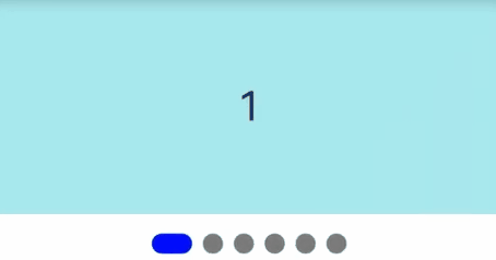
### Example 1: Using a Dot Indicator with a Swiper Component
This example shows how to bind a dot-style **Indicator** component to a **Swiper** component using **IndicatorComponentController**.
```
@Entry
@Component
struct DotIndicatorDemo {
private indicatorController: IndicatorComponentController = new IndicatorComponentController();
private swiperController: SwiperController = new SwiperController();
@State list: number[] = [];
aboutToAppear(): void {
for (let i = 1; i <= 6; i++) {
this.list.push(i);
}
}
build() {
Column() {
Swiper(this.swiperController) {
ForEach(this.list, (item: string) => {
Text(item.toString())
.width('100%')
.height(160)
.backgroundColor(0xAFEEEE)
.textAlign(TextAlign.Center)
.fontSize(30)
}, (item: string) => item)
}
.cachedCount(2)
.index(0)
.autoPlay(true)
.interval(2000)
.indicator(this.indicatorController)
.loop(true)
.duration(1000)
.itemSpace(0)
.curve(Curve.Linear)
.onChange((index: number) => {
console.info(index.toString());
})
IndicatorComponent(this.indicatorController)
.initialIndex(0)
.style(
new DotIndicator()
.itemWidth(15)
.itemHeight(15)
.selectedItemWidth(15)
.selectedItemHeight(15)
.color(Color.Gray)
.selectedColor(Color.Blue))
.loop(true)
.count(6)
.vertical(true)
.onChange((index: number) => {
console.log("current index: " + index );
})
}
}
}
```
### Example 2: Using a Digit Indicator with a Swiper Component
This example shows how to bind a digit-style **Indicator** component to a **Swiper** component using **IndicatorComponentController**.
```
@Entry
@Component
struct DigitIndicatorDemo {
private indicatorController: IndicatorComponentController = new IndicatorComponentController();
private swiperController: SwiperController = new SwiperController();
@State list: number[] = [];
aboutToAppear(): void {
for (let i = 1; i <= 6; i++) {
this.list.push(i);
}
}
build() {
Column() {
Swiper(this.swiperController) {
ForEach(this.list, (item: string) => {
Text(item.toString())
.width('100%')
.height(160)
.backgroundColor(0xAFEEEE)
.textAlign(TextAlign.Center)
.fontSize(30)
}, (item: string) => item)
}
.cachedCount(2)
.index(0)
.autoPlay(true)
.interval(2000)
.indicator(this.indicatorController)
.loop(true)
.duration(1000)
.itemSpace(0)
.curve(Curve.Linear)
.onChange((index: number) => {
console.info(index.toString());
})
IndicatorComponent(this.indicatorController)
.initialIndex(0)
.style(Indicator.digit()
.fontColor(Color.Gray)
.selectedFontColor(Color.Gray)
.digitFont({ size: 20, weight: FontWeight.Bold })
.selectedDigitFont({ size: 20, weight: FontWeight.Normal }))
.loop(true)
.count(6)
.vertical(true)
.onChange((index: number) => {
console.log("current index: " + index );
})
}
}
}
```