# Refresh
The **Refresh** component is a container that provides the pull-to-refresh feature.
> **NOTE**
>
> - This component is supported since API version 8. Updates will be marked with a superscript to indicate their earliest API version.
>
> - This component provides linkage with a vertical scrolling **Swiper** and **Web** component since API version 12. The linkage does not work if the **loop** attribute of **Swiper** is set to **true**.
## Child Components
This component supports only one child component.
Since API version 11, this component's child component moves down with the pull-down gesture.
## APIs
Refresh(value: RefreshOptions)
Creates a **Refresh** container.
**Atomic service API**: This API can be used in atomic services since API version 11.
**System capability**: SystemCapability.ArkUI.ArkUI.Full
**Parameters**
| Name| Type| Mandatory| Description|
| -------- | -------- | -------- | -------- |
| value | [RefreshOptions](#refreshoptions)| Yes| Parameters of the **Refresh** component.|
## RefreshOptions
Defines the options of the **Refresh** component.
**System capability**: SystemCapability.ArkUI.ArkUI.Full
| Name | Type | Mandatory | Description |
| ---------- | ---------------------------------------- | ---- | ---------------------------------------- |
| refreshing | boolean | Yes | Whether the component is being refreshed. The value **true** means that the component is being refreshed, and **false** means the opposite. Default value: **false** This parameter supports two-way binding through [$$](../../../ui/state-management/arkts-two-way-sync.md). **Atomic service API**: This API can be used in atomic services since API version 11.|
| offset(deprecated) | number \| string | No | Distance from the pull-down starting point to the top of the component. Default value: **16**. Unit: vp. If the type is string, the pixel unit must be explicitly specified, for example, **'10px'**; if the unit is not specified, for example, **'10'**, the default unit vp is used. This API is deprecated since API version 11. No substitute API is provided. **NOTE** The value range of **offset** is [0vp, 64vp]. If the value is greater than 64 vp, the value 64 vp will be used. The value cannot be a percentage or a negative number.|
| friction(deprecated) | number \| string | No | Coefficient of friction, which indicates the **** component's sensitivity to the pull-down gesture. The value ranges from 0 to 100. Default value: **62** - **0** indicates that the **Refresh** component is not responsive to the pull-down gesture. - **100** indicates that the **Refresh** component is highly responsive to the pull-down gesture. - A larger value indicates higher responsiveness of the **Refresh** component to the pull-down gesture. This API is deprecated since API version 11. You can use [pullDownRatio](#pulldownratio12) instead since API version 12.|
| builder10+ | [CustomBuilder](ts-types.md#custombuilder8) | No | Custom content in the refreshing area. **NOTE** In API version 10 and earlier versions, there is a height limit of 64 vp on custom components. This restriction is removed since API version 11. When a custom component is set with a fixed height, it will be displayed below the refreshing area at that fixed height; when the custom component does not have a height set, its height will adapt to the height of the refreshing area, which may result in the height of the custom component changing to 0 along with the refreshing area. To maintain the intended layout, configure a minimum height constraint for a custom component, which ensures that the component's height does not fall below a certain threshold. For details about how to apply this constraint, see [Example 3](#example-3-customizing-the-refreshing-area-content-with-builder). Since API version 12, use **refreshingContent** instead of **builder** for customizing the content of the refreshing area, to avoid animation interruptions caused by the destruction and re-creation of the custom component during the refreshing process. **Atomic service API**: This API can be used in atomic services since API version 11.|
| promptText12+ | [ResourceStr](ts-types.md#resourcestr) | No| Custom text displayed at the bottom of the refreshing area. **NOTE** When setting the text, follow the constraints on the **Text** components. If you are using **builder** or **refreshingContent** to customize the content displayed in the refreshing area, the text set with **promptText** will not be displayed. When **promptText** is set and effective, the [refreshOffset](#refreshoffset12) attribute defaults to 96 vp. The maximum font scale factor for the custom text, as specified by [maxFontScale](ts-basic-components-text.md#maxfontscale12), is 2. **Atomic service API**: This API can be used in atomic services since API version 12.|
| refreshingContent12+ | [ComponentContent](../js-apis-arkui-ComponentContent.md) | No | Custom content in the refreshing area. **NOTE** If this parameter and the **builder** parameter are set at the same time, the **builder** parameter does not take effect. When a custom component is set with a fixed height, it will be displayed below the refreshing area at that fixed height; when the custom component does not have a height set, its height will adapt to the height of the refreshing area, which may result in the height of the custom component changing to 0 along with the refreshing area. To maintain the intended layout, configure a minimum height constraint for a custom component, which ensures that the component's height does not fall below a certain threshold. For details about how to apply this constraint, see [Example 4](#example-4-customizing-the-refreshing-area-content-with-refreshingcontent). **Atomic service API**: This API can be used in atomic services since API version 12.|
> **Supplementary Notes**
> - If neither **builder** nor **refreshingContent** is set, the pull-down displacement effect is implemented by adjusting the [translate](ts-universal-attributes-transformation.md#translate) attribute of the child component. During the pull-down process, the [onAreaChange](ts-universal-component-area-change-event.md#onareachange) event of the child component is not triggered, and any changes made to the [translate](ts-universal-attributes-transformation.md#translate) attribute of the child component do not take effect.
> - When **builder** or **refreshingContent** is set, the pull-down displacement effect is implemented by adjusting the position of the child component relative to the **Refresh** component. During the pull-down process, the [onAreaChange](ts-universal-component-area-change-event.md#onareachange) event of the child component can be triggered. However, if the [position](ts-universal-attributes-location.md#position) attribute is set for the child component, the position of the child component relative to the **Refresh** component is fixed, preventing the child component from moving down with the pull gesture.
## Attributes
In addition to the [universal attributes](ts-component-general-attributes.md), the following attributes are supported.
### refreshOffset12+
refreshOffset(value: number)
Sets the minimum pull-down offset required to trigger a refresh. If the distance pulled down is less than the value specified by this attribute, releasing the gesture does not trigger a refresh.
**Atomic service API**: This API can be used in atomic services since API version 12.
**System capability**: SystemCapability.ArkUI.ArkUI.Full
**Parameters**
| Name| Type | Mandatory| Description |
| ------ | ------------------------------------------- | ---- | ---------------------------------------------------------- |
| value | number | Yes| Pull-down offset, in vp. Default value: 96 vp when [promptText](#refreshoptions) is set and 64 vp when [promptText](#refreshoptions) is not set. If the value specified is 0 or less than 0, the default value is used.|
### pullToRefresh12+
pullToRefresh(value: boolean)
Sets whether to initiate a refresh when the pull-down distance exceeds the value of [refreshOffset](#refreshoffset12).
**Atomic service API**: This API can be used in atomic services since API version 12.
**System capability**: SystemCapability.ArkUI.ArkUI.Full
**Parameters**
| Name| Type | Mandatory| Description |
| ------ | ------------------------------------------- | ---- | ---------------------------------------------------------- |
| value | boolean | Yes| Whether to initiate a refresh when the pull-down distance exceeds the value of [refreshOffset](#refreshoffset12). The value **true** means to initiate a refresh, and **false** means the opposite. Default value: **true**|
### pullDownRatio12+
pullDownRatio(ratio: [Optional](ts-universal-attributes-custom-property.md#optional12)\)
Sets the pull-down ratio.
**Atomic service API**: This API can be used in atomic services since API version 12.
**System capability**: SystemCapability.ArkUI.ArkUI.Full
**Parameters**
| Name| Type | Mandatory| Description |
| ------ | ------------------------------------------- | ---- | ---------------------------------------------------------- |
| ratio | [Optional](ts-universal-attributes-custom-property.md#optional12)\ | Yes| Pull-down ratio. A larger value indicates higher responsiveness to the pull-down gesture. The value **0** indicates that the pull-down does not follow the gesture, and **1** indicates that the pull-down follows the gesture proportionally. If this parameter is not set or is set to **undefined**, a dynamic pull-down ratio is used. That is, the larger the pull-down distance, the smaller the ratio. The value ranges from 0 to 1. A value less than 0 is handled as **0**, and a value greater than 1 is handled as **1**.
### maxPullDownDistance20+
maxPullDownDistance(distance: Optional\)
Sets the maximum pull-down distance.
**Atomic service API**: This API can be used in atomic services since API version 20.
**System capability**: SystemCapability.ArkUI.ArkUI.Full
**Parameters**
| Name| Type | Mandatory| Description |
| ------ | ------------------------------------------- | ---- | ---------------------------------------------------------- |
| distance | [Optional](ts-universal-attributes-custom-property.md#optional12)\ | Yes| Maximum pull-down distance. The minimum value for the maximum pull-down distance is 0. Values less than 0 are treated as **0**. If this value is less than the refresh offset (**refreshOffset**), the refresh action will not be triggered when the pull-down gesture is released. If set to **undefined** or **null**, this parameter is considered not set. Default value: **undefined**.
## Events
In addition to the [universal events](ts-component-general-events.md), the following events are supported.
### onStateChange
onStateChange(callback: (state: RefreshStatus) => void)
Called when the refresh status changes.
**Atomic service API**: This API can be used in atomic services since API version 11.
**System capability**: SystemCapability.ArkUI.ArkUI.Full
**Parameters**
| Name| Type | Mandatory| Description |
| ------ | --------------------------------------- | ---- | ---------- |
| state | [RefreshStatus](#refreshstatus) | Yes | Refresh status.|
### onRefreshing
onRefreshing(callback: () => void)
Called when the component starts refreshing.
**Atomic service API**: This API can be used in atomic services since API version 11.
**System capability**: SystemCapability.ArkUI.ArkUI.Full
### onOffsetChange12+
onOffsetChange(callback: Callback\)
Called when the pull-down distance changes.
**Atomic service API**: This API can be used in atomic services since API version 12.
**System capability**: SystemCapability.ArkUI.ArkUI.Full
**Parameters**
| Name| Type | Mandatory| Description |
| ------ | --------------------------------------- | ---- | ---------- |
| callback | Callback\ | Yes | Pull-down distance. Unit: vp|
## RefreshStatus
Enumerates the states of a refresh operation.
**Atomic service API**: This API can be used in atomic services since API version 11.
**System capability**: SystemCapability.ArkUI.ArkUI.Full
| Name | Value | Description |
| -------- | -------- | -------------------- |
| Inactive | 0 | The component is not pulled down. This is the default value. |
| Drag | 1 | The component is being pulled down, but the pull-down distance is shorter than the minimum length required to trigger the refresh. |
| OverDrag | 2 | The component is being pulled down, and the pull-down distance exceeds the minimum length required to trigger the refresh. |
| Refresh | 3 | The pull-down ends, and the component rebounds to the minimum length required to trigger the refresh and enters the refreshing state.|
| Done | 4 | The refresh is complete, and the component returns to the initial state (at the top). |
## Example
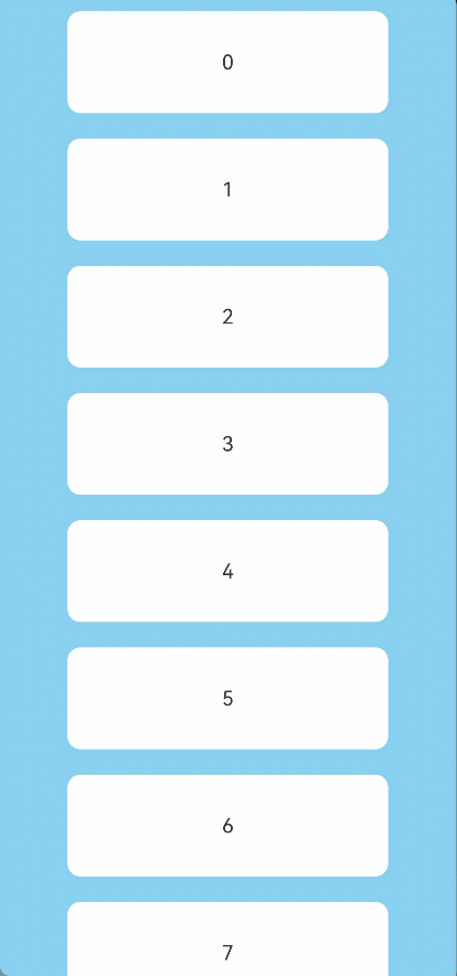
### Example 1: Using the Default Refreshing Style
This example implements a **Refresh** component with its refreshing area in the default style.
```ts
// xxx.ets
@Entry
@Component
struct RefreshExample {
@State isRefreshing: boolean = false;
@State arr: String[] = ['0', '1', '2', '3', '4', '5', '6', '7', '8', '9', '10'];
build() {
Column() {
Refresh({ refreshing: $$this.isRefreshing }) {
List() {
ForEach(this.arr, (item: string) => {
ListItem() {
Text('' + item)
.width('70%')
.height(80)
.fontSize(16)
.margin(10)
.textAlign(TextAlign.Center)
.borderRadius(10)
.backgroundColor(0xFFFFFF)
}
}, (item: string) => item)
}
.onScrollIndex((first: number) => {
console.info(first.toString());
})
.width('100%')
.height('100%')
.alignListItem(ListItemAlign.Center)
.scrollBar(BarState.Off)
}
.onStateChange((refreshStatus: RefreshStatus) => {
console.info('Refresh onStatueChange state is ' + refreshStatus);
})
.onOffsetChange((value: number) => {
console.info('Refresh onOffsetChange offset:' + value);
})
.onRefreshing(() => {
setTimeout(() => {
this.isRefreshing = false;
}, 2000)
console.log('onRefreshing test');
})
.backgroundColor(0x89CFF0)
.refreshOffset(64)
.pullToRefresh(true)
}
}
}
```

### Example 2: Setting the Text Displayed in the Refreshing Area
This example shows how to set the text displayed in the refreshing area using the [promptText](#refreshoptions) parameter.
```ts
// xxx.ets
@Entry
@Component
struct RefreshExample {
@State isRefreshing: boolean = false;
@State promptText: string = "Refreshing...";
@State arr: String[] = ['0', '1', '2', '3', '4', '5', '6', '7', '8', '9', '10'];
build() {
Column() {
Refresh({ refreshing: $$this.isRefreshing, promptText: this.promptText }) {
List() {
ForEach(this.arr, (item: string) => {
ListItem() {
Text('' + item)
.width('70%')
.height(80)
.fontSize(16)
.margin(10)
.textAlign(TextAlign.Center)
.borderRadius(10)
.backgroundColor(0xFFFFFF)
}
}, (item: string) => item)
}
.onScrollIndex((first: number) => {
console.info(first.toString());
})
.width('100%')
.height('100%')
.alignListItem(ListItemAlign.Center)
.scrollBar(BarState.Off)
}
.backgroundColor(0x89CFF0)
.pullToRefresh(true)
.refreshOffset(96)
.onStateChange((refreshStatus: RefreshStatus) => {
console.info('Refresh onStatueChange state is ' + refreshStatus);
})
.onOffsetChange((value: number) => {
console.info('Refresh onOffsetChange offset:' + value);
})
.onRefreshing(() => {
setTimeout(() => {
this.isRefreshing = false;
}, 2000)
console.log('onRefreshing test');
})
}
}
}
```

### Example 3: Customizing the Refreshing Area Content with builder
This example shows how to customize the content displayed in the refreshing area using the [builder](#refreshoptions) parameter.
```ts
// xxx.ets
@Entry
@Component
struct RefreshExample {
@State isRefreshing: boolean = false;
@State arr: String[] = ['0', '1', '2', '3', '4', '5', '6', '7', '8', '9', '10'];
@Builder
customRefreshComponent() {
Stack() {
Row() {
LoadingProgress().height(32)
Text("Refreshing...").fontSize(16).margin({ left: 20 })
}
.alignItems(VerticalAlign.Center)
}
.align(Alignment.Center)
.clip(true)
// Set a minimum height constraint to ensure that the height of the custom component does not fall below the specified minHeight when the height of the refreshing area changes.
.constraintSize({ minHeight: 32 })
.width("100%")
}
build() {
Column() {
Refresh({ refreshing: $$this.isRefreshing, builder: this.customRefreshComponent() }) {
List() {
ForEach(this.arr, (item: string) => {
ListItem() {
Text('' + item)
.width('70%')
.height(80)
.fontSize(16)
.margin(10)
.textAlign(TextAlign.Center)
.borderRadius(10)
.backgroundColor(0xFFFFFF)
}
}, (item: string) => item)
}
.onScrollIndex((first: number) => {
console.info(first.toString());
})
.width('100%')
.height('100%')
.alignListItem(ListItemAlign.Center)
.scrollBar(BarState.Off)
}
.backgroundColor(0x89CFF0)
.pullToRefresh(true)
.refreshOffset(64)
.onStateChange((refreshStatus: RefreshStatus) => {
console.info('Refresh onStatueChange state is ' + refreshStatus);
})
.onRefreshing(() => {
setTimeout(() => {
this.isRefreshing = false;
}, 2000)
console.log('onRefreshing test');
})
}
}
}
```
### Example 4: Customizing the Refreshing Area Content with refreshingContent
This example shows how to customize the content displayed in the refreshing area using the [refreshingContent](#refreshoptions) parameter.
```ts
// xxx.ets
import { ComponentContent } from '@ohos.arkui.node';
class Params {
refreshStatus: RefreshStatus = RefreshStatus.Inactive;
constructor(refreshStatus: RefreshStatus) {
this.refreshStatus = refreshStatus;
}
}
@Builder
function customRefreshingContent(params: Params) {
Stack() {
Row() {
LoadingProgress().height(32)
Text("refreshStatus: " + params.refreshStatus).fontSize(16).margin({ left: 20 })
}
.alignItems(VerticalAlign.Center)
}
.align(Alignment.Center)
.clip(true)
// Set a minimum height constraint to ensure that the height of the custom component does not fall below the specified minHeight when the height of the refreshing area changes.
.constraintSize({ minHeight: 32 })
.width("100%")
}
@Entry
@Component
struct RefreshExample {
@State isRefreshing: boolean = false;
@State arr: String[] = ['0', '1', '2', '3', '4', '5', '6', '7', '8', '9', '10'];
@State refreshStatus: RefreshStatus = RefreshStatus.Inactive;
private contentNode?: ComponentContent