# Shape Clipping
Shape clipping changes the visible portion of a component through clipping or masking.
> **NOTE**
>
> The initial APIs of this module are supported since API version 7. Updates will be marked with a superscript to indicate their earliest API version.
## clip12+
clip(value: boolean): T
Sets whether to clip the areas of child components that extend beyond this component's boundaries, that is, whether to perform clipping based on the edge contour of the parent container
**System capability**: SystemCapability.ArkUI.ArkUI.Full
**Widget capability**: This API can be used in ArkTS widgets since API version 12.
**Atomic service API**: This API can be used in atomic services since API version 12.
**Parameters**
| Name| Type | Mandatory| Description |
| ------ | ------- | ---- | ------------------------------------------------------------ |
| value | boolean | Yes | Whether to perform clipping based on the edge contour of the parent container. Default value: **false** **true**: Perform clipping. **false**: Do not perform clipping. **NOTE** If this parameter is set to **true**, child components exceeding the current component's bounds will not respond to bound gesture events.|
**Return value**
| Type | Description |
| ------ | ------------------------ |
| T | Current component.|
## clip18+
clip(clip: Optional\): T
Sets whether to clip the areas of child components that extend beyond this component's boundaries, that is, whether to perform clipping based on the edge contour of the parent container Compared with [clip12+](#clip12), this API supports the **undefined** type for the **clip** parameter.
**System capability**: SystemCapability.ArkUI.ArkUI.Full
**Widget capability**: This API can be used in ArkTS widgets since API version 18.
**Atomic service API**: This API can be used in atomic services since API version 18.
**Parameters**
| Name| Type | Mandatory | Description|
| ------ | ------------------ | ------------------------------------------------------------ | ---- |
| clip | Optional\ | Yes| Whether to perform clipping based on the edge contour of the parent container. Default value: **false** **NOTE** If this parameter is set to **true**, child components exceeding the current component's bounds will not respond to bound gesture events. If **clip** is set to **undefined**, clipping is disabled, and child components are not clipped. |
**Return value**
| Type | Description |
| ------ | ------------------------ |
| T | Current component.|
## clip(deprecated)
clip(value: boolean | CircleAttribute | EllipseAttribute | PathAttribute | RectAttribute): T
Sets whether to clip this component based on the given shape.
> **NOTE**
>
> This API is supported since API version 7 and deprecated since API version 12. You are advised to use [clip](#clip12) and [clipShape](#clipshape12) instead.
**Widget capability**: This API can be used in ArkTS widgets since API version 9.
**System capability**: SystemCapability.ArkUI.ArkUI.Full
**Parameters**
| Name| Type | Mandatory| Description |
| ------ | ------------------------------------------------------------ | ---- | ------------------------------------------------------------ |
| value | boolean \| [CircleAttribute](ts-drawing-components-circle.md) \| [EllipseAttribute](ts-drawing-components-ellipse.md) \| [PathAttribute](ts-drawing-components-path.md) \| [RectAttribute](ts-drawing-components-rect.md) | Yes | Clip mode. If the value is a shape attribute, the component is clipped based on the specified shape. If the value is of the Boolean type, it specifies whether to clip the component based on the boundaries of the parent container. Default value: **false** **NOTE** If the value is a shape attribute, the clipped area can still respond to bound gesture events. If the value is of the Boolean type, the clipped area will not respond to bound gesture events.|
**Return value**
| Type | Description |
| ------ | ------------------------ |
| T | Current component.|
## clipShape12+
clipShape(value: CircleShape | EllipseShape | PathShape | RectShape): T
Clips this component according to the specified shape (which may include position information).
> **NOTE**
>
> Different shapes support different ranges of attributes. A path is one type of shape, along with others like ellipses and rectangles.
>
> Path shapes do not support setting width and height attributes. For details about the supported attributes, see the specific shape documentation.
>
> The [fill](../js-apis-arkui-shape.md#fill) attribute of shapes has no effect on the **clipShape** API.
**System capability**: SystemCapability.ArkUI.ArkUI.Full
**Widget capability**: This API can be used in ArkTS widgets since API version 12.
**Atomic service API**: This API can be used in atomic services since API version 12.
**Parameters**
| Name| Type | Mandatory| Description |
| ------ | ------------------------------------------------------------ | ---- | ------------------------------------------------------------ |
| value | [CircleShape](../js-apis-arkui-shape.md#circleshape) \| [EllipseShape](../js-apis-arkui-shape.md#ellipseshape) \| [PathShape](../js-apis-arkui-shape.md#pathshape) \| [RectShape](../js-apis-arkui-shape.md#rectshape) | Yes | Shape (which may include position information) to clip the current component. **NOTE** The clipped area remains responsive to bound gesture events.|
**Return value**
| Type | Description |
| ------ | ------------------------ |
| T | Current component.|
## clipShape18+
clipShape(shape: Optional\): T
Clips this component according to the specified shape (which may include position information). Compared with [clipShape12+](#clipshape12), this API supports the **undefined** type for the **shape** parameter.
> **NOTE**
>
> Different shapes support different ranges of attributes. A path is one type of shape, along with others like ellipses and rectangles.
>
> Path shapes do not support setting width and height attributes. For details about the supported attributes, see the specific shape documentation.
>
> The [fill](../js-apis-arkui-shape.md#fill) attribute of shapes has no effect on the **clipShape** API.
**System capability**: SystemCapability.ArkUI.ArkUI.Full
**Widget capability**: This API can be used in ArkTS widgets since API version 18.
**Atomic service API**: This API can be used in atomic services since API version 18.
**Parameters**
| Name| Type | Mandatory| Description |
| ------ | ------------------------------------------------------------ | ---- | ------------------------------------------------------------ |
| shape | Optional\<[CircleShape](../js-apis-arkui-shape.md#circleshape) \| [EllipseShape](../js-apis-arkui-shape.md#ellipseshape) \| [PathShape](../js-apis-arkui-shape.md#pathshape) \| [RectShape](../js-apis-arkui-shape.md#rectshape)> | Yes | Shape (which may include position information) to clip the current component. **NOTE** The clipped area remains responsive to bound gesture events. If **shape** is set to **undefined**, the previous value is retained.|
**Return value**
| Type | Description |
| ------ | ------------------------ |
| T | Current component.|
## mask12+
mask(value: ProgressMask): T
Adds a mask to the component to indicate the progress.
**System capability**: SystemCapability.ArkUI.ArkUI.Full
**Atomic service API**: This API can be used in atomic services since API version 12.
**Parameters**
| Name| Type | Mandatory| Description |
| ------ | ------------------------------- | ---- | ---------------------------------------------------- |
| value | [ProgressMask](#progressmask10) | Yes | Mask to add to the component, which allows for dynamic adjustment of progress, maximum value, and color settings.|
**Return value**
| Type | Description |
| ------ | ------------------------ |
| T | Current component.|
## mask18+
mask(mask: Optional\): T
Adds a mask to the component to indicate the progress. Compared with [mask12+](#mask12), this API supports the **undefined** type for the **mask** parameter.
**System capability**: SystemCapability.ArkUI.ArkUI.Full
**Atomic service API**: This API can be used in atomic services since API version 18.
**Parameters**
| Name| Type | Mandatory| Description |
| ------ | ------------------------------------------------------------ | ---- | -------------------------------- |
| mask | Optional\<[ProgressMask](#progressmask10)> | Yes| Mask to add to the component, which allows for dynamic adjustment of progress, maximum value, and color settings. If **mask** is set to **undefined**, the component to revert to its original effect without the mask to indicate the progress. |
**Return value**
| Type | Description |
| ------ | ------------------------ |
| T | Current component.|
## mask(deprecated)
mask(value: CircleAttribute | EllipseAttribute | PathAttribute | RectAttribute | ProgressMask): T
Adds a mask of the specified shape to the component.
> **NOTE**
>
> This API is supported since API version 7 and deprecated since API version 12. You are advised to use [mask](#mask12) and [maskShape](#maskshape12) instead.
**Widget capability**: This API can be used in ArkTS widgets since API version 9.
**System capability**: SystemCapability.ArkUI.ArkUI.Full
**Parameters**
| Name| Type | Mandatory| Description |
| ------ | ------------------------------------------------------------ | ---- | -------------------------------- |
| value | [CircleAttribute](ts-drawing-components-circle.md) \| [EllipseAttribute](ts-drawing-components-ellipse.md) \| [PathAttribute](ts-drawing-components-path.md) \| [RectAttribute](ts-drawing-components-rect.md) \| [ProgressMask](#progressmask10)10+ | Yes | Mask of the specified shape to add to the component.|
**Return value**
| Type | Description |
| ------ | ------------------------ |
| T | Current component.|
## maskShape12+
maskShape(value: CircleShape | EllipseShape | PathShape | RectShape): T
Adds a mask of the specified shape to the component.
**System capability**: SystemCapability.ArkUI.ArkUI.Full
**Widget capability**: This API can be used in ArkTS widgets since API version 12.
**Atomic service API**: This API can be used in atomic services since API version 12.
**Parameters**
| Name| Type | Mandatory| Description |
| ------ | ------------------------------------------------------------ | ---- | -------------------------------- |
| value | [CircleShape](../js-apis-arkui-shape.md#circleshape) \| [EllipseShape](../js-apis-arkui-shape.md#ellipseshape) \| [PathShape](../js-apis-arkui-shape.md#pathshape) \| [RectShape](../js-apis-arkui-shape.md#rectshape) | Yes | Mask of the specified shape to add to the component.|
**Return value**
| Type | Description |
| ------ | ------------------------ |
| T | Current component.|
## maskShape18+
maskShape(shape: Optional\): T
Adds a mask of the specified shape to the component. Compared with [maskShape12+](#maskshape12), this API supports the **undefined** type for the **shape** parameter.
**System capability**: SystemCapability.ArkUI.ArkUI.Full
**Widget capability**: This API can be used in ArkTS widgets since API version 18.
**Atomic service API**: This API can be used in atomic services since API version 18.
**Parameters**
| Name| Type | Mandatory| Description |
| ------ | ------------------------------------------------------------ | ---- | ------------------------------------------------------------ |
| shape | Optional\<[CircleShape](../js-apis-arkui-shape.md#circleshape) \| [EllipseShape](../js-apis-arkui-shape.md#ellipseshape) \| [PathShape](../js-apis-arkui-shape.md#pathshape) \| [RectShape](../js-apis-arkui-shape.md#rectshape)> | Yes | Mask of the specified shape to add to the component. If **shape** is set to **undefined**, the previous value is retained.|
**Return value**
| Type | Description |
| ------ | ------------------------ |
| T | Current component.|
## ProgressMask10+
Implements a **ProgressMask** object to set the progress, maximum value, and color of the mask.
**Atomic service API**: This API can be used in atomic services since API version 11.
**System capability**: SystemCapability.ArkUI.ArkUI.Full
### constructor10+
constructor(value: number, total: number, color: ResourceColor)
Constructs a **ProgressMask** object.
**Atomic service API**: This API can be used in atomic services since API version 11.
**System capability**: SystemCapability.ArkUI.ArkUI.Full
**Parameters**
| Name| Type | Mandatory| Description |
| ------ | ------------------------------------------ | ---- | ------------------ |
| value | number | Yes | Current value of the progress mask. Value range: [0.0, +∞)|
| total | number | Yes | Maximum value of the progress mask. Value range: [0.0, +∞)|
| color | [ResourceColor](ts-types.md#resourcecolor) | Yes | Color of the progress mask. |
### updateProgress10+
updateProgress(value: number): void
Updates the progress value of the progress mask.
**Atomic service API**: This API can be used in atomic services since API version 11.
**System capability**: SystemCapability.ArkUI.ArkUI.Full
**Parameters**
| Name| Type| Mandatory| Description |
| ------ | -------- | ---- | ------------------ |
| value | number | Yes | Current value of the progress mask.|
### updateColor10+
updateColor(value: ResourceColor): void
Updates the color of the progress mask.
**Atomic service API**: This API can be used in atomic services since API version 11.
**System capability**: SystemCapability.ArkUI.ArkUI.Full
**Parameters**
| Name| Type | Mandatory| Description |
| ------ | ------------------------------------------ | ---- | ---------------- |
| value | [ResourceColor](ts-types.md#resourcecolor) | Yes | Color of the progress mask.|
### enableBreathingAnimation12+
enableBreathingAnimation(value: boolean): void
Sets whether to enable the breathing animation when the progress indicator is full. By default, the breathing animation is disabled.
**Atomic service API**: This API can be used in atomic services since API version 12.
**System capability**: SystemCapability.ArkUI.ArkUI.Full
**Parameters**
| Name| Type | Mandatory| Description |
| ------ | ------------------------------------------ | ---- | ---------------- |
| value | boolean | Yes | Whether to enable the breathing animation. The value **true** means to enable the breathing animation, and **false** means the opposite. Default value: **false**|
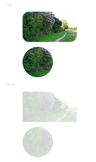
## Example
### Example 1: Using Different Clipping Attributes
```ts
// xxx.ets
import { CircleShape, RectShape } from '@kit.ArkUI';
@Entry
@Component
struct ClipAndMaskExample {
build() {
Column({ space: 15 }) {
Text('clip').fontSize(12).width('75%').fontColor('#DCDCDC')
Row() {
Image($r('app.media.testImg')).width('500px').height('280px')
}
.clip(true) // If clip is not set to true, the image is not confined by the rounded corners of the component and may extend beyond the component.
.borderRadius(20)
// Clip the image based on a circle with a diameter of 280 px.
Image($r('app.media.testImg'))
.clipShape(new CircleShape({ width: '280px', height: '280px' }))
.width('500px').height('280px')
Text('mask').fontSize(12).width('75%').fontColor('#DCDCDC')
// Add a 500x280 px square mask to the image.
Image($r('app.media.testImg'))
.maskShape(new RectShape({ width: '500px', height: '280px' }).fill(Color.Gray))
.width('500px').height('280px')
// Add a 280x280 px circular mask to the image.
Image($r('app.media.testImg'))
.maskShape(new CircleShape({ width: '280px', height: '280px' }).fill(Color.Gray))
.width('500px').height('280px')
}
.width('100%')
.margin({ top: 15 })
}
}
```
### Example 2: Clipping and Masking with Animation
```ts
@Entry
@Component
struct ProgressMaskExample {
@State progressFlag1: boolean = true;
@State color: Color = 0x01006CDE;
@State value: number = 10.0;
@State enableBreathingAnimation: boolean = false;
@State progress: ProgressMask = new ProgressMask(10.0, 100.0, Color.Gray);
build() {
Column({ space: 15 }) {
Text('progress mask').fontSize(12).width('75%').fontColor('#DCDCDC')
// Add a 280x280 px progress mask to the image.
Image($r('app.media.testImg'))
.width('500px').height('280px')
.mask(this.progress)
.animation({
duration: 2000, // Animation duration.
curve: Curve.Linear, // Animation curve.
delay: 0, // Animation delay.
iterations: 1, // Number of playback times.
playMode: PlayMode.Normal // Animation playback mode.
}) // Animation configuration for the width and height attributes of the