# Checkbox
提供多选框组件,通常用于某选项的打开或关闭。
> **说明:**
>
> API version 11开始,Checkbox默认样式由圆角方形变为圆形。
>
> 该组件从API version 8开始支持。后续版本如有新增内容,则采用上角标单独标记该内容的起始版本。
## 子组件
无
## 接口
Checkbox(options?: CheckboxOptions)
多选框组件。
**卡片能力:** 从API version 9开始,该接口支持在ArkTS卡片中使用。
**原子化服务API:** 从API version 11开始,该接口支持在原子化服务中使用。
**系统能力:** SystemCapability.ArkUI.ArkUI.Full
**参数:**
| 参数名 | 类型 | 必填 | 说明 |
| ------- | ------------------------------------------- | ---- | ------------------ |
| options | [CheckboxOptions](#checkboxoptions对象说明) | 否 | 配置多选框的参数。 |
## CheckboxOptions对象说明
多选框的信息。
**系统能力:** SystemCapability.ArkUI.ArkUI.Full
| 名称 | 类型 | 只读 | 可选 | 说明 |
| --------| --------| ------ | -------- | -------- |
| name | string | 否 | 是 | 指定多选框名称。
**卡片能力:** 从API version 9开始,该接口支持在ArkTS卡片中使用。
**原子化服务API:** 从API version 11开始,该接口支持在原子化服务中使用。 |
| group | string | 否 | 是 | 用于指定多选框所属群组的名称(即所属CheckboxGroup的名称)。
**说明:**
未配合使用[CheckboxGroup](ts-basic-components-checkboxgroup.md)组件时,此值无用。
**卡片能力:** 从API version 9开始,该接口支持在ArkTS卡片中使用。
**原子化服务API:** 从API version 11开始,该接口支持在原子化服务中使用。 |
| indicatorBuilder12+ | [CustomBuilder](ts-types.md#custombuilder8) | 否 | 是 | 配置多选框的选中样式为自定义组件。自定义组件与Checkbox组件为中心点对齐显示。indicatorBuilder设置为undefined/null时,默认为indicatorBuilder未设置状态。
**原子化服务API:** 从API version 12开始,该接口支持在原子化服务中使用。|
## 属性
除支持[通用属性](ts-component-general-attributes.md)外,还支持以下属性:
### select
select(value: boolean)
设置多选框选中状态。
从API version 10开始,该属性支持[$$](../../../ui/state-management/arkts-two-way-sync.md)双向绑定变量。
从API version 18开始,该属性支持[!!](../../../ui/state-management/arkts-new-binding.md#系统组件参数双向绑定)双向绑定变量。
**卡片能力:** 从API version 9开始,该接口支持在ArkTS卡片中使用。
**原子化服务API:** 从API version 11开始,该接口支持在原子化服务中使用。
**系统能力:** SystemCapability.ArkUI.ArkUI.Full
**参数:**
| 参数名 | 类型 | 必填 | 说明 |
| ------ | ------- | ---- | ------------------------------------------------------------ |
| value | boolean | 是 | 多选框是否选中。
默认值:false
值为true时,多选框被选中。值为false时,多选框未选中。 |
### select18+
select(isSelected: Optional\)
设置多选框选中状态。与[select](#select)相比,isSelected参数新增了对undefined类型的支持。
该属性支持[$$](../../../ui/state-management/arkts-two-way-sync.md)、[!!](../../../ui/state-management/arkts-new-binding.md#系统组件参数双向绑定)双向绑定变量。
**卡片能力:** 从API version 18开始,该接口支持在ArkTS卡片中使用。
**原子化服务API:** 从API version 18开始,该接口支持在原子化服务中使用。
**系统能力:** SystemCapability.ArkUI.ArkUI.Full
**参数:**
| 参数名 | 类型 | 必填 | 说明 |
| ---------- | ------------------------------------------------------------ | ---- | ------------------------------------------------------------ |
| isSelected | [Optional](ts-universal-attributes-custom-property.md#optionalt12)\ | 是 | 多选框是否选中。
当isSelected的值为undefined时取默认值false。
值为true时,多选框被选中。值为false时,多选框未选中。 |
### selectedColor
selectedColor(value: ResourceColor)
设置多选框选中状态颜色。
**卡片能力:** 从API version 9开始,该接口支持在ArkTS卡片中使用。
**原子化服务API:** 从API version 11开始,该接口支持在原子化服务中使用。
**系统能力:** SystemCapability.ArkUI.ArkUI.Full
**参数:**
| 参数名 | 类型 | 必填 | 说明 |
| ------ | ------------------------------------------ | ---- | ------------------------------------------------------------ |
| value | [ResourceColor](ts-types.md#resourcecolor) | 是 | 多选框选中状态颜色。
默认值:$r('sys.color.ohos_id_color_text_primary_activated')
异常值按照默认值处理。 |
### selectedColor18+
selectedColor(resColor: Optional\)
设置多选框选中状态颜色。与[selectedColor](#selectedcolor)相比,resColor参数新增了对undefined类型的支持。
**卡片能力:** 从API version 18开始,该接口支持在ArkTS卡片中使用。
**原子化服务API:** 从API version 18开始,该接口支持在原子化服务中使用。
**系统能力:** SystemCapability.ArkUI.ArkUI.Full
**参数:**
| 参数名 | 类型 | 必填 | 说明 |
| -------- | ------------------------------------------------------------ | ---- | ------------------------------------------------------------ |
| resColor | [Optional](ts-universal-attributes-custom-property.md#optionalt12)\<[ResourceColor](ts-types.md#resourcecolor)> | 是 | 多选框选中状态颜色。
当resColor的值为undefined时取默认值$r('sys.color.ohos_id_color_text_primary_activated')。
异常值按照默认值处理。 |
### unselectedColor10+
unselectedColor(value: ResourceColor)
设置多选框非选中状态的边框颜色。
**原子化服务API:** 从API version 11开始,该接口支持在原子化服务中使用。
**系统能力:** SystemCapability.ArkUI.ArkUI.Full
**参数:**
| 参数名 | 类型 | 必填 | 说明 |
| ------ | ------------------------------------------ | ---- | -------------------------- |
| value | [ResourceColor](ts-types.md#resourcecolor) | 是 | 多选框非选中状态边框颜色。
默认值:$r('sys.color.ohos_id_color_switch_outline_off') |
### unselectedColor18+
unselectedColor(resColor: Optional\)
设置多选框非选中状态的边框颜色。与[unselectedColor](#unselectedcolor10)10+相比,resColor参数新增了对undefined类型的支持。
**原子化服务API:** 从API version 18开始,该接口支持在原子化服务中使用。
**系统能力:** SystemCapability.ArkUI.ArkUI.Full
**参数:**
| 参数名 | 类型 | 必填 | 说明 |
| -------- | ------------------------------------------------------------ | ---- | ------------------------------------------------------------ |
| resColor | [Optional](ts-universal-attributes-custom-property.md#optionalt12)\<[ResourceColor](ts-types.md#resourcecolor)> | 是 | 多选框非选中状态边框颜色。
当resColor的值为undefined时取默认值$r('sys.color.ohos_id_color_switch_outline_off')|
### mark10+
mark(value: MarkStyle)
设置多选框内部图标的样式。
**原子化服务API:** 从API version 11开始,该接口支持在原子化服务中使用。
**系统能力:** SystemCapability.ArkUI.ArkUI.Full
**参数:**
| 参数名 | 类型 | 必填 | 说明 |
| ------ | -------------------------------------------- | ---- | ------------------------------------------------------------ |
| value | [MarkStyle](ts-types.md#markstyle10对象说明) | 是 | 多选框内部图标样式。 从API version 12开始,设置了indicatorBuilder时,按照indicatorBuilder中的内容显示。
默认值:{
strokeColor : `$r('sys.color.ohos_id_color_foreground_contrary')`,
strokeWidth: `$r('sys.float.ohos_id_checkbox_stroke_width')`,
size: '20vp'
} |
### mark18+
mark(style: Optional\)
设置多选框内部图标的样式。与[mark](#mark10)10+相比,style参数新增了对undefined类型的支持。
**原子化服务API:** 从API version 18开始,该接口支持在原子化服务中使用。
**系统能力:** SystemCapability.ArkUI.ArkUI.Full
**参数:**
| 参数名 | 类型 | 必填 | 说明 |
| ------ | ------------------------------------------------------------ | ---- | ------------------------------------------------------------ |
| style | [Optional](ts-universal-attributes-custom-property.md#optionalt12)\<[MarkStyle](ts-types.md#markstyle10对象说明)> | 是 | 多选框内部图标样式。 设置了indicatorBuilder时,按照indicatorBuilder中的内容显示。
当style的值为undefined时,默认值:{
strokeColor : `$r('sys.color.ohos_id_color_foreground_contrary')`,
strokeWidth: `$r('sys.float.ohos_id_checkbox_stroke_width')`,
size: '20vp'
} |
### shape11+
shape(value: CheckBoxShape)
设置CheckBox组件形状,包括圆形和圆角方形。如果想要调整当前CheckBox的样式,需使用[contentModifier](#contentmodifier12)属性自定义CheckBox样式。
**卡片能力:** 从API version 11开始,该接口支持在ArkTS卡片中使用。
**原子化服务API:** 从API version 12开始,该接口支持在原子化服务中使用。
**系统能力:** SystemCapability.ArkUI.ArkUI.Full
**参数:**
| 参数名 | 类型 | 必填 | 说明 |
| ------ | ----------------------------------------------------- | ---- | ------------------------------------------------------------ |
| value | [CheckBoxShape](ts-appendix-enums.md#checkboxshape11) | 是 | CheckBox组件形状,包括圆形和圆角方形。
默认值:CheckBoxShape.CIRCLE |
### shape18+
shape(shape: Optional\)
设置CheckBox组件形状,包括圆形和圆角方形。与[shape](#shape11)11+相比,shape参数新增了对undefined类型的支持。如果想要调整当前CheckBox的样式,需使用[contentModifier](#contentmodifier12)属性自定义CheckBox样式。
**卡片能力:** 从API version 18开始,该接口支持在ArkTS卡片中使用。
**原子化服务API:** 从API version 18开始,该接口支持在原子化服务中使用。
**系统能力:** SystemCapability.ArkUI.ArkUI.Full
**参数:**
| 参数名 | 类型 | 必填 | 说明 |
| ------ | ------------------------------------------------------------ | ---- | ------------------------------------------------------------ |
| shape | [Optional](ts-universal-attributes-custom-property.md#optionalt12)\<[CheckBoxShape](ts-appendix-enums.md#checkboxshape11)> | 是 | CheckBox组件形状,包括圆形和圆角方形。
当shape的值为undefined时,默认值为CheckBoxShape.CIRCLE。 |
### contentModifier12+
contentModifier(modifier: ContentModifier\)
定制CheckBox内容区的方法。设置该属性时,会导致其他属性设置失效。
**原子化服务API:** 从API version 12开始,该接口支持在原子化服务中使用。
**系统能力:** SystemCapability.ArkUI.ArkUI.Full
**参数:**
| 参数名 | 类型 | 必填 | 说明 |
| ------ | --------------------------------------------- | ---- | ------------------------------------------------ |
| modifier | [ContentModifier\](#checkboxconfiguration12对象说明) | 是 | 在CheckBox组件上,定制内容区的方法。
modifier:内容修改器,开发者需要自定义class实现ContentModifier接口。 |
### contentModifier18+
contentModifier(modifier: Optional>)
定制CheckBox内容区的方法。与[contentModifier](#contentmodifier12)12+相比,modifier参数新增了对undefined类型的支持。设置该属性时,会导致其他属性设置失效。
**原子化服务API:** 从API version 18开始,该接口支持在原子化服务中使用。
**系统能力:** SystemCapability.ArkUI.ArkUI.Full
**参数:**
| 参数名 | 类型 | 必填 | 说明 |
| -------- | ------------------------------------------------------------ | ---- | ------------------------------------------------------------ |
| modifier | [Optional](ts-universal-attributes-custom-property.md#optionalt12)\<[ContentModifier\](#checkboxconfiguration12对象说明)> | 是 | 在CheckBox组件上,定制内容区的方法。
modifier:内容修改器,开发者需要自定义class实现ContentModifier接口。
当modifier的值为undefined时,不使用内容修改器。 |
## 事件
支持[通用事件](ts-component-general-events.md)外,还支持以下事件:
### onChange
onChange(callback: OnCheckboxChangeCallback)
当选中状态发生变化时,触发该回调。
**卡片能力:** 从API version 9开始,该接口支持在ArkTS卡片中使用。
**原子化服务API:** 从API version 11开始,该接口支持在原子化服务中使用。
**系统能力:** SystemCapability.ArkUI.ArkUI.Full
**参数:**
| 参数名 | 类型 | 必填 | 说明 |
| -------- | ------------------------------------------------------- | ---- | ---------------- |
| callback | [OnCheckboxChangeCallback](#oncheckboxchangecallback18) | 是 | 返回选中的状态。 |
### onChange18+
onChange(callback: Optional\)
当选中状态发生变化时,触发该回调。与[onChange](#onchange)相比,callback参数新增了对undefined类型的支持。
**卡片能力:** 从API version 18开始,该接口支持在ArkTS卡片中使用。
**原子化服务API:** 从API version 18开始,该接口支持在原子化服务中使用。
**系统能力:** SystemCapability.ArkUI.ArkUI.Full
**参数:**
| 参数名 | 类型 | 必填 | 说明 |
| -------- | ------------------------------------------------------------ | ---- | ------------------------------------------------------------ |
| callback | [Optional](ts-universal-attributes-custom-property.md#optionalt12)\<[OnCheckboxChangeCallback](#oncheckboxchangecallback18)> | 是 | 返回选中的状态。
当callback的值为undefined时,不使用回调函数。 |
## OnCheckboxChangeCallback18+
type OnCheckboxChangeCallback = (value: boolean) => void
选中的状态。
**卡片能力:** 从API version 18开始,该接口支持在ArkTS卡片中使用。
**原子化服务API:** 从API version 18开始,该接口支持在原子化服务中使用。
**系统能力:** SystemCapability.ArkUI.ArkUI.Full
**参数:**
| 参数名 | 类型 | 必填 | 说明 |
| ------ | ------- | ---- | ------------------------------------------------- |
| value | boolean | 是 | 返回true表示已选中。返回false表示未选中。 |
## CheckBoxConfiguration12+对象说明
开发者需要自定义class实现ContentModifier接口。继承自[CommonConfiguration](ts-universal-attributes-content-modifier.md#commonconfigurationt)。
**原子化服务API:** 从API version 12开始,该接口支持在原子化服务中使用。
**系统能力:** SystemCapability.ArkUI.ArkUI.Full
| 名称 | 类型 | 只读 | 可选 | 说明 |
| ------ | ------ | ------ |-------------------------------- |-------------------------------- |
| name | string | 否 | 否 |当前多选框名称。 |
| selected | boolean| 否 | 否 | 指示多选框是否被选中,值为true时,多选框被选中。值为false时,多选框未选中。如果select属性没有设置默认值是false。如果设置select属性,此值与设置select属性的值相同。 |
| triggerChange |Callback\| 否 | 否 |触发多选框选中状态变化。true表示从未选中变为选中,false表示从选中变为未选中。 |
## 示例
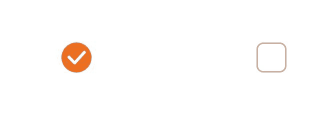
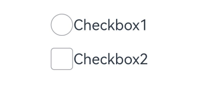
### 示例1(设置多选框形状)
该示例通过配置CheckBoxShape实现圆形和圆角方形多选框样式。
```ts
// xxx.ets
@Entry
@Component
struct CheckboxExample {
build() {
Flex({ justifyContent: FlexAlign.SpaceEvenly }) {
Checkbox({ name: 'checkbox1', group: 'checkboxGroup' })
.select(true)
.selectedColor(0xed6f21)
.shape(CheckBoxShape.CIRCLE)
.onChange((value: boolean) => {
console.info('Checkbox1 change is' + value);
})
Checkbox({ name: 'checkbox2', group: 'checkboxGroup' })
.select(false)
.selectedColor(0x39a2db)
.shape(CheckBoxShape.ROUNDED_SQUARE)
.onChange((value: boolean) => {
console.info('Checkbox2 change is' + value);
})
}
}
}
```
### 示例2(设置多选框颜色)
该示例通过配置mark实现自定义多选框的颜色。
```ts
// xxx.ets
@Entry
@Component
struct Index {
build() {
Row() {
Column() {
Flex({ justifyContent: FlexAlign.Center, alignItems: ItemAlign.Center }) {
Checkbox({ name: 'checkbox1', group: 'checkboxGroup' })
.selectedColor(0x39a2db)
.shape(CheckBoxShape.ROUNDED_SQUARE)
.onChange((value: boolean) => {
console.info('Checkbox1 change is'+ value);
})
.mark({
strokeColor:Color.Black,
size: 50,
strokeWidth: 5
})
.unselectedColor(Color.Red)
.width(30)
.height(30)
Text('Checkbox1').fontSize(20)
}
Flex({ justifyContent: FlexAlign.Center, alignItems: ItemAlign.Center }) {
Checkbox({ name: 'checkbox2', group: 'checkboxGroup' })
.selectedColor(0x39a2db)
.shape(CheckBoxShape.ROUNDED_SQUARE)
.onChange((value: boolean) => {
console.info('Checkbox2 change is' + value);
})
.width(30)
.height(30)
Text('Checkbox2').fontSize(20)
}
}
.width('100%')
}
.height('100%')
}
}
```
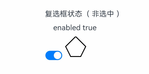
### 示例3(自定义多选框样式)
该示例通过[contentModifier](#contentmodifier12)属性实现了自定义复选框样式的功能,自定义样式实现了一个五边形复选框,如果选中,内部会出现红色三角图案,标题会显示选中字样,如果取消选中,红色三角图案消失,标题会显示非选中字样。
```ts
// xxx.ets
class MyCheckboxStyle implements ContentModifier {
selectedColor: Color = Color.White;
constructor(selectedColor: Color) {
this.selectedColor = selectedColor;
}
applyContent(): WrappedBuilder<[CheckBoxConfiguration]> {
return wrapBuilder(buildCheckbox);
}
}
@Builder
function buildCheckbox(config: CheckBoxConfiguration) {
Column({ space: 10 }) {
Text(config.name + (config.selected ? "( 选中 )" : "( 非选中 )")).margin({ right: 70, top: 50 })
Text(config.enabled ? "enabled true" : "enabled false").margin({ right: 110 })
Shape() {
Path()
.width(100)
.height(100)
.commands('M100 0 L0 100 L50 200 L150 200 L200 100 Z')
.fillOpacity(0)
.strokeWidth(3)
.onClick(() => {
if (config.selected) {
config.triggerChange(false);
} else {
config.triggerChange(true);
}
})
.opacity(config.enabled ? 1 : 0.1)
Path()
.width(10)
.height(10)
.commands('M50 0 L100 100 L0 100 Z')
.visibility(config.selected ? Visibility.Visible : Visibility.Hidden)
.fill(config.selected ? (config.contentModifier as MyCheckboxStyle).selectedColor : Color.Black)
.stroke((config.contentModifier as MyCheckboxStyle).selectedColor)
.margin({ left: 10, top: 10 })
.opacity(config.enabled ? 1 : 0.1)
}
.width(300)
.height(200)
.viewPort({
x: 0,
y: 0,
width: 310,
height: 310
})
.strokeLineJoin(LineJoinStyle.Miter)
.strokeMiterLimit(5)
.margin({ left: 50 })
}
}
@Entry
@Component
struct Index {
@State checkboxEnabled: boolean = true;
build() {
Column({ space: 100 }) {
Checkbox({ name: '复选框状态', group: 'checkboxGroup' })
.contentModifier(new MyCheckboxStyle(Color.Red))
.onChange((value: boolean) => {
console.info('Checkbox change is' + value);
}).enabled(this.checkboxEnabled)
Row() {
Toggle({ type: ToggleType.Switch, isOn: true }).onChange((value: boolean) => {
if (value) {
this.checkboxEnabled = true;
} else {
this.checkboxEnabled = false;
}
})
}.position({ x: 50, y: 130 })
}.margin({ top: 30 })
}
}
```
### 示例4(设置文本多选框样式)
该示例通过配置indicatorBuilder实现选中样式为Text。
```ts
// xxx.ets
@Entry
@Component
struct CheckboxExample {
@Builder
indicatorBuilder(value: number) {
Column(){
Text(value > 99 ? '99+': value.toString())
.textAlign(TextAlign.Center)
.fontSize(value > 99 ? '16vp': '20vp')
.fontWeight(FontWeight.Medium)
.fontColor('#ffffffff')
}
}
build() {
Row() {
Column() {
Flex({ justifyContent: FlexAlign.Center, alignItems: ItemAlign.Center}) {
Checkbox({ name: 'checkbox1', group: 'checkboxGroup', indicatorBuilder:()=>{this.indicatorBuilder(9)}})
.shape(CheckBoxShape.CIRCLE)
.onChange((value: boolean) => {
console.info('Checkbox1 change is'+ value);
})
.mark({
strokeColor:Color.Black,
size: 50,
strokeWidth: 5
})
.width(30)
.height(30)
Text('Checkbox1').fontSize(20)
}.padding(15)
Flex({ justifyContent: FlexAlign.Center, alignItems: ItemAlign.Center }) {
Checkbox({ name: 'checkbox2', group: 'checkboxGroup', indicatorBuilder:()=>{this.indicatorBuilder(100)}})
.shape(CheckBoxShape.ROUNDED_SQUARE)
.onChange((value: boolean) => {
console.info('Checkbox2 change is' + value);
})
.width(30)
.height(30)
Text('Checkbox2').fontSize(20)
}
}
.width('100%')
}
.height('100%')
}
}
```
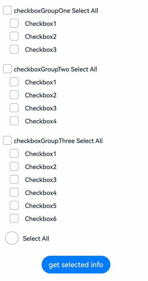
### 示例5(获取多选框选中信息)
该示例通过选中Checkbox以及CheckboxGroup多选框来获取选中的信息。
```ts
// xxx.ets
@Entry
@Component
struct CheckboxExample {
@State arrOne: Array = ['1', '2', '3'];
@State arrTwo: Array = ['1', '2', '3', '4'];
@State arrThree: Array = ['1', '2', '3', '4', '5', '6'];
@State selected: boolean = false;
@State infoOne: string = '';
@State infoTwo: string = '';
@State infoThree: string = '';
build() {
Column() {
// 单元项全选按钮
Flex({ justifyContent: FlexAlign.Start, alignItems: ItemAlign.Center }) {
CheckboxGroup({ group: 'checkboxGroupOne' })
.selectAll(this.selected)
.checkboxShape(CheckBoxShape.ROUNDED_SQUARE)
.selectedColor('#007DFF')
.onChange((itemName: CheckboxGroupResult) => {
this.infoOne = "checkboxGroupOne" + JSON.stringify(itemName);
console.info("checkboxGroupOne" + JSON.stringify(itemName));
})
Text('checkboxGroupOne Select All').fontSize(14).lineHeight(20).fontColor('#182431').fontWeight(500)
}
// 选项1
Flex({ justifyContent: FlexAlign.Start, alignItems: ItemAlign.Center }) {
Column() {
ForEach(this.arrOne, (item: string) => {
Row() {
Checkbox({ name: 'checkbox' + item, group: 'checkboxGroupOne' })
.selectedColor('#007DFF')
.shape(CheckBoxShape.ROUNDED_SQUARE)
.onChange((value: boolean) => {
console.info('Checkbox' + item + 'change is' + value);
})
.margin({ left: 20 })
Text('Checkbox' + item)
.fontSize(14)
.lineHeight(20)
.fontColor('#182431')
.fontWeight(500)
.margin({ left: 10 })
}
}, (item: string) => item)
}
}.margin({ bottom: 15 })
Flex({ justifyContent: FlexAlign.Start, alignItems: ItemAlign.Center }) {
CheckboxGroup({ group: 'checkboxGroupTwo' })
.selectAll(this.selected)
.checkboxShape(CheckBoxShape.ROUNDED_SQUARE)
.selectedColor('#007DFF')
.onChange((itemName: CheckboxGroupResult) => {
this.infoTwo = "checkboxGroupTwo" + JSON.stringify(itemName);
console.info("checkboxGroupTwo" + JSON.stringify(itemName));
})
Text('checkboxGroupTwo Select All').fontSize(14).lineHeight(20).fontColor('#182431').fontWeight(500)
}
// 选项2
Flex({ justifyContent: FlexAlign.Start, alignItems: ItemAlign.Center }) {
Column() {
ForEach(this.arrTwo, (item: string) => {
Row() {
Checkbox({ name: 'checkbox' + item, group: 'checkboxGroupTwo' })
.selectedColor('#007DFF')
.shape(CheckBoxShape.ROUNDED_SQUARE)
.onChange((value: boolean) => {
console.info('Checkbox' + item + 'change is' + value);
})
.margin({ left: 20 })
Text('Checkbox' + item)
.fontSize(14)
.lineHeight(20)
.fontColor('#182431')
.fontWeight(500)
.margin({ left: 10 })
}
}, (item: string) => item)
}
}.margin({ bottom: 15 })
Flex({ justifyContent: FlexAlign.Start, alignItems: ItemAlign.Center }) {
CheckboxGroup({ group: 'checkboxGroupThree' })
.selectAll(this.selected)
.checkboxShape(CheckBoxShape.ROUNDED_SQUARE)
.selectedColor('#007DFF')
.onChange((itemName: CheckboxGroupResult) => {
this.infoThree = "checkboxGroupThree" + JSON.stringify(itemName);
console.info("checkboxGroupThree" + JSON.stringify(itemName));
})
Text('checkboxGroupThree Select All').fontSize(14).lineHeight(20).fontColor('#182431').fontWeight(500)
}
// 选项3
Flex({ justifyContent: FlexAlign.Start, alignItems: ItemAlign.Center }) {
Column() {
ForEach(this.arrThree, (item: string) => {
Row() {
Checkbox({ name: 'checkbox' + item, group: 'checkboxGroupThree' })
.selectedColor('#007DFF')
.shape(CheckBoxShape.ROUNDED_SQUARE)
.onChange((value: boolean) => {
console.info('Checkbox' + item + 'change is' + value);
})
.margin({ left: 20 })
Text('Checkbox' + item)
.fontSize(14)
.lineHeight(20)
.fontColor('#182431')
.fontWeight(500)
.margin({ left: 10 })
}
}, (item: string) => item)
}
}.margin({ bottom: 15 })
//全选按钮
Flex({ justifyContent: FlexAlign.Start, alignItems: ItemAlign.Center }) {
Row() {
CheckboxGroup({ group: 'checkboxGroup' })
.checkboxShape(CheckBoxShape.CIRCLE)
.selectedColor('#007DFF')
.width(30)
.margin({ left: 10 })
.onChange(() => {
this.selected = !this.selected
})
Text('Select All')
.fontSize(14)
.lineHeight(20)
.fontColor('#182431')
.fontWeight(500)
.margin({ left: 10 })
}
}.margin({ bottom: 15 })
//获取选中信息
Button('get selected info')
.margin({ top: 10 })
.onClick(() => {
this.getUIContext().getPromptAction().showToast({
message: 'selected info: ' + this.infoOne + '\n' + this.infoTwo + '\n' + this.infoThree
})
})
}.padding(10)
}
}
```
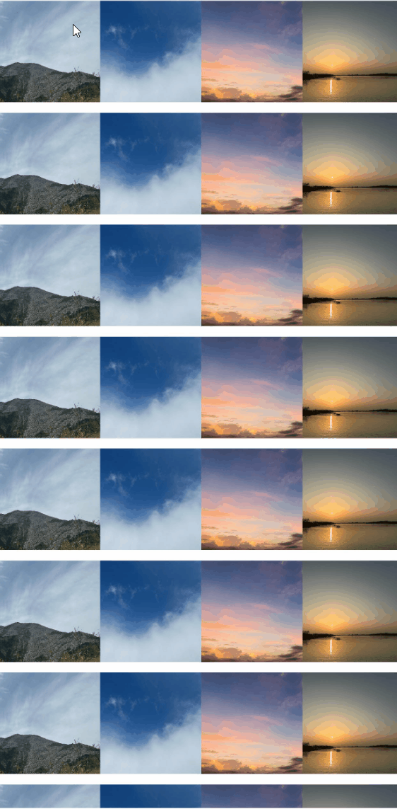
### 示例6(设置滑动多选)
该示例通过设置手势事件实现Checkbox滑动多选。
```ts
// xxx.ets
import { componentUtils, ComponentUtils, UIContext } from '@kit.ArkUI';
import { LinkedList } from '@kit.ArkTS';
@Entry
@Component
struct Index {
@State isChoosing: boolean = false;
@State selectedStart: number = -1;
@State @Watch('onSelectedEndChange') selectedEnd: number = -1;
selectedPhotos: LinkedList = new LinkedList();
@State selectedList: number[] = [];
@State image: Resource[] =
// $r('app.media.xxx')需要替换为开发者所需的图像资源文件。
[$r("app.media.imageOne"), $r('app.media.imageTwo'), $r('app.media.imageThree'), $r('app.media.imageFour')];
private selectedState: SelectedState = SelectedState.None;
private componentUtils: ComponentUtils = this.getUIContext().getComponentUtils();
private listScroller: ListScroller = new ListScroller();
private currentOffsetY: number = 0;
onChange() {
console.info('change successful');
}
getSpeed(fingerY: number, edge: number) {
return 150 * 150 * (fingerY - edge) / 2000 / Math.abs(fingerY - edge);
}
getIndex(fingerX: number, fingerY: number) {
let rect: componentUtils.ComponentInfo | null = null;
for (let i = 0; i < 100; i++) {
let uiContext: UIContext = this.getUIContext();
rect = this.componentUtils.getRectangleById(`stack${i}`);
if (rect) {
const x1 = uiContext.px2vp(rect.windowOffset.x);
const x2 = uiContext.px2vp(rect.windowOffset.x + rect.size.width);
const y1 = uiContext.px2vp(rect.windowOffset.y);
const y2 = uiContext.px2vp(rect.windowOffset.y + rect.size.height);
if (x1 <= fingerX && fingerX < x2 && y1 <= fingerY && fingerY < y2) {
return i;
}
}
}
return this.selectedEnd;
}
onSelectedEndChange() {
let start: number = -1;
let end: number = -1;
if (this.selectedEnd > this.selectedStart) {
start = this.selectedStart;
end = this.selectedEnd;
} else {
end = this.selectedStart;
start = this.selectedEnd;
}
if (this.selectedState == SelectedState.Selected) {
for (let i = start; i <= end; i++) {
if (!this.selectedPhotos.has(i)) {
this.selectedPhotos.add(i);
}
}
} else if (this.selectedState == SelectedState.Remove) {
for (let i = start; i <= end; i++) {
if (this.selectedPhotos.has(i)) {
this.selectedPhotos.remove(i);
}
}
}
this.selectedList = this.selectedPhotos.convertToArray();
}
scroll(fingerY: number) {
if (fingerY > 700 && !this.listScroller.isAtEnd()) {
this.listScroller.scrollBy(0, this.getSpeed(fingerY, 700));
return;
}
if (fingerY < 200 && this.currentOffsetY > 0) {
this.listScroller.scrollBy(0, this.getSpeed(fingerY, 200));
return;
}
}
onPanGestureUpdate(event: GestureEvent) {
const fingerInfo = event.fingerList[event.fingerList.length - 1];
const fingerX = fingerInfo.globalX;
const fingerY = fingerInfo.globalY;
this.selectedEnd = this.getIndex(fingerX, fingerY);
this.scroll(fingerY);
}
build() {
Column() {
if (this.isChoosing) {
Row() {
Text('取消')
.onClick(() => {
this.isChoosing = false;
this.selectedStart = -1;
this.selectedEnd = -1;
this.selectedPhotos.clear();
this.selectedList = [];
})
}
.width('100%')
.justifyContent(FlexAlign.SpaceEvenly)
}
List({ space: 10, scroller: this.listScroller }) {
ForEach(Array.from({ length: 100 }), (item: string, index: number) => {
ListItem() {
Stack({ alignContent: Alignment.TopEnd }) {
Image(this.image[(index % 4)])
.width('100%')
.draggable(false)
Checkbox({ name: index.toString() })
.shape(CheckBoxShape.CIRCLE)
.visibility(this.isChoosing ? Visibility.Visible : Visibility.None)
.select(this.selectedList.includes(index))
}
.id(`stack${index}`)
.width('100%')
}
.draggable(false)
}, (item: string, index: number) => 'listItem' + index)
}
.id('list')
.height('100%')
.width('100%')
.lanes(4)
.alignListItem(ListItemAlign.Center)
.onDidScroll(() => {
this.currentOffsetY = this.listScroller.currentOffset().yOffset;
})
.gesture(
GestureGroup(GestureMode.Exclusive,
GestureGroup(GestureMode.Sequence,
LongPressGesture()
.onAction(() => {
this.isChoosing = true;
}),
PanGesture()
.onActionStart(event => {
if (!this.isChoosing) {
return;
}
const fingerInfo = event.fingerList[event.fingerList.length - 1];
const fingerX = fingerInfo.globalX;
const fingerY = fingerInfo.globalY;
this.selectedStart = this.getIndex(fingerX, fingerY);
if (this.selectedPhotos.has(this.selectedStart)) {
this.selectedState = SelectedState.Remove;
} else {
this.selectedState = SelectedState.Selected;
}
})
.onActionUpdate(event => {
if (!this.isChoosing) {
return;
}
this.onPanGestureUpdate(event);
})
.onActionEnd(() => {
if (!this.isChoosing) {
return;
}
this.selectedState = SelectedState.None;
})
),
PanGesture()
.onActionStart(event => {
if (!this.isChoosing) {
return;
}
const fingerInfo = event.fingerList[event.fingerList.length - 1];
const fingerX = fingerInfo.globalX;
const fingerY = fingerInfo.globalY;
this.selectedStart = this.getIndex(fingerX, fingerY);
if (this.selectedPhotos.has(this.selectedStart)) {
this.selectedState = SelectedState.Remove;
} else {
this.selectedState = SelectedState.Selected;
}
})
.onActionUpdate(event => {
if (!this.isChoosing) {
return;
}
this.onPanGestureUpdate(event);
})
.onActionEnd(() => {
if (!this.isChoosing) {
return;
}
this.selectedState = SelectedState.None;
})
)
)
}
}
}
enum SelectedState {
None,
Selected,
Remove
}
```