# 日期滑动选择器弹窗 (DatePickerDialog)
根据指定的日期范围创建日期滑动选择器并展示在弹窗上。
> **说明:**
>
> - 该组件从API version 8开始支持。后续版本如有新增内容,则采用上角标单独标记该内容的起始版本。
>
> - 本模块功能依赖UI的执行上下文,不可在[UI上下文不明确](../../../ui/arkts-global-interface.md#ui上下文不明确)的地方使用,参见[UIContext](../arkts-apis-uicontext-uicontext.md)说明。
>
> - 本模块不支持深浅色模式热更新,如果需要进行深浅色模式切换,请重新打开弹窗。
## DatePickerDialog
### show(deprecated)
static show(options?: DatePickerDialogOptions)
定义日期滑动选择器弹窗并弹出。
> **说明:**
>
> 从API version 18开始废弃。建议使用[UIContext](../arkts-apis-uicontext-uicontext.md)中的[showDatePickerDialog](../arkts-apis-uicontext-uicontext.md#showdatepickerdialog)替代。
>
> 从API version 10开始,可以通过使用[UIContext](../arkts-apis-uicontext-uicontext.md)中的[showDatePickerDialog](../arkts-apis-uicontext-uicontext.md#showdatepickerdialog)来明确UI的执行上下文。
**原子化服务API:** 从API version 11开始,该接口支持在原子化服务中使用。
**系统能力:** SystemCapability.ArkUI.ArkUI.Full
**设备行为差异:** 该接口在Wearable设备上使用时,应用程序运行异常,异常信息中提示接口未定义,在其他设备中可正常调用。
**参数:**
| 参数名 | 类型 | 必填 | 说明 |
| ------- | ----------------------------------------------------------- | ---- | -------------------------- |
| options | [DatePickerDialogOptions](#datepickerdialogoptions对象说明) | 否 | 配置日期选择器弹窗的参数。 |
## DatePickerDialogOptions对象说明
日期选择器弹窗选项。
继承自[DatePickerOptions](ts-basic-components-datepicker.md#datepickeroptions对象说明)。
**系统能力:** SystemCapability.ArkUI.ArkUI.Full
| 名称 | 类型 | 只读 | 可选 | 说明 |
| -------- | -------- | -------- | -------- | -------- |
| lunar | boolean | 否 | 是 | 日期是否显示为农历。
- true:显示为农历。
- false:不显示为农历。
默认值:false
**原子化服务API:** 从API version 11开始,该接口支持在原子化服务中使用。 |
| showTime10+ | boolean | 否 | 是 | 是否在弹窗内展示时间选择器。
- true:展示时间选择器。
- false:不展示时间选择器。
默认值:false
**说明:**
1. 当showTime为true时,点击弹窗的标题日期可以在"日期选择器"和"日期选择器+时间选择器"两个页面中切换。
2. 当showTime为true时,mode参数不生效,"日期选择器"页面显示默认年月日三列。
**原子化服务API:** 从API version 11开始,该接口支持在原子化服务中使用。 |
| useMilitaryTime10+ | boolean | 否 | 是 | 弹窗内展示的时间选择器是否为24小时制,仅当showTime为true时生效。
- true:显示24小时制。
- false:显示12小时制。
默认值:false
**说明:**
当展示的时间选择器为12小时制时,上午和下午的标识不会根据小时数自动切换。
**原子化服务API:** 从API version 11开始,该接口支持在原子化服务中使用。 |
| lunarSwitch10+ | boolean | 否 | 是 | 是否展示切换农历的开关。
- true:展示切换农历的开关。
- false:不展示切换农历的开关。
默认值:false
**原子化服务API:** 从API version 11开始,该接口支持在原子化服务中使用。 |
| lunarSwitchStyle14+ | [LunarSwitchStyle](#lunarswitchstyle14对象说明) | 否 | 是 | 设置农历开关的颜色样式。
默认值:{
selectedColor: `$r('sys.color.ohos_id_color_text_primary_actived')`,
unselectedColor: `$r('sys.color.ohos_id_color_switch_outline_off')`,
strokeColor: Color.White
}
**原子化服务API:** 从API version 14开始,该接口支持在原子化服务中使用。 |
| disappearTextStyle10+ | [PickerTextStyle](ts-picker-common.md#pickertextstyle对象说明) | 否 | 是 | 设置边缘项(以选中项为基准向上或向下的第二项)的文本颜色、字号、字体粗细。
默认值:
{
color: '#ff182431',
font: {
size: '14fp',
weight: FontWeight.Regular
}
}
**原子化服务API:** 从API version 11开始,该接口支持在原子化服务中使用。 |
| textStyle10+ | [PickerTextStyle](ts-picker-common.md#pickertextstyle对象说明) | 否 | 是 | 设置待选项(以选中项为基准向上或向下的第一项)的文本颜色、字号、字体粗细。
默认值:
{
color: '#ff182431',
font: {
size: '16fp',
weight: FontWeight.Regular
}
}
**原子化服务API:** 从API version 11开始,该接口支持在原子化服务中使用。 |
| selectedTextStyle10+ | [PickerTextStyle](ts-picker-common.md#pickertextstyle对象说明) | 否 | 是 | 设置选中项的文本颜色、字号、字体粗细。
默认值:
{
color: '#ff007dff',
font: {
size: '20fp',
weight: FontWeight.Medium
}
}
**原子化服务API:** 从API version 11开始,该接口支持在原子化服务中使用。|
| acceptButtonStyle12+ | [PickerDialogButtonStyle](ts-picker-common.md#pickerdialogbuttonstyle12对象说明) | 否 | 是 | 设置确认按钮显示样式、样式和重要程度、角色、背景色、圆角、文本颜色、字号、字体粗细、字体样式、字体列表、按钮是否默认响应Enter键。
**说明:**
1.acceptButtonStyle与cancelButtonStyle中最多只能有一个primary字段配置为true,如果同时设置为true,则primary字段不生效,保持默认值false。
2.按钮高度默认40vp,在关怀模式-大字体场景下高度不变,即使按钮样式设置为圆角矩形[ROUNDED_RECTANGLE](ts-basic-components-button.md#buttontype枚举说明),呈现效果依然是胶囊型按钮[Capsule](ts-basic-components-button.md#buttontype枚举说明)。
**原子化服务API:** 从API version 12开始,该接口支持在原子化服务中使用。|
| cancelButtonStyle12+ | [PickerDialogButtonStyle](ts-picker-common.md#pickerdialogbuttonstyle12对象说明) | 否 | 是 | 设置取消按钮显示样式、样式和重要程度、角色、背景色、圆角、文本颜色、字号、字体粗细、字体样式、字体列表、按钮是否默认响应Enter键。
**说明:**
1.acceptButtonStyle与cancelButtonStyle中最多只能有一个primary字段配置为true,如果同时设置为true,则primary字段不生效,保持默认值false。
2.按钮高度默认40vp,在关怀模式-大字体场景下高度不变,即使按钮样式设置为圆角矩形[ROUNDED_RECTANGLE](ts-basic-components-button.md#buttontype枚举说明),呈现效果依然是胶囊型按钮[Capsule](ts-basic-components-button.md#buttontype枚举说明)。
**原子化服务API:** 从API version 12开始,该接口支持在原子化服务中使用。|
| alignment10+ | [DialogAlignment](ts-methods-alert-dialog-box.md#dialogalignment枚举说明) | 否 | 是 | 弹窗在竖直方向上的对齐方式。
默认值:DialogAlignment.Default
**原子化服务API:** 从API version 11开始,该接口支持在原子化服务中使用。 |
| offset10+ | [Offset](ts-types.md#offset) | 否 | 是 | 弹窗相对alignment所在位置的偏移量。
默认值:{ dx: 0 , dy: 0 }
**原子化服务API:** 从API version 11开始,该接口支持在原子化服务中使用。|
| maskRect10+| [Rectangle](ts-methods-alert-dialog-box.md#rectangle8类型说明) | 否 | 是 | 弹窗遮蔽层区域,在遮蔽层区域内的事件不透传,在遮蔽层区域外的事件透传。
默认值:{ x: 0, y: 0, width: '100%', height: '100%' }
**原子化服务API:** 从API version 11开始,该接口支持在原子化服务中使用。 |
| onAccept(deprecated) | (value: [DatePickerResult](ts-basic-components-datepicker.md#datepickerresult对象说明)) => void | 否 | 是 | 点击弹窗中的“确定”按钮时触发该回调。
**说明:**
从API version 8 开始支持,从 API version 10 开始废弃。建议使用onDateAccept。 |
| onCancel | [VoidCallback](ts-types.md#voidcallback12) | 否 | 是 | 点击弹窗中的“取消”按钮时触发该回调。
**原子化服务API:** 从API version 11开始,该接口支持在原子化服务中使用。 |
| onChange(deprecated) | (value: [DatePickerResult](ts-basic-components-datepicker.md#datepickerresult对象说明)) => void | 否 | 是 | 滑动弹窗中的滑动选择器使当前选中项改变时触发该回调。
**说明:**
从API version 8 开始支持,从 API version 10 开始废弃。建议使用onDateChange。 |
| onDateAccept10+ | [Callback](ts-types.md#callback12)\ | 否 | 是 | 点击弹窗中的“确定”按钮时触发该回调。
**说明:**
当showTime设置为true时,回调接口返回值value中时和分为选择器选择的时和分。否则,返回值value中时和分为系统时间的时和分。
**原子化服务API:** 从API version 11开始,该接口支持在原子化服务中使用。 |
| onDateChange10+ | [Callback](ts-types.md#callback12)\ | 否 | 是 | 滑动弹窗中的日期使当前选中项改变时触发该回调。
**说明:**
当showTime设置为true时,回调接口返回值value中时和分为选择器选择的时和分。否则,返回值value中时和分为系统时间的时和分。
**原子化服务API:** 从API version 11开始,该接口支持在原子化服务中使用。 |
| backgroundColor11+ | [ResourceColor](ts-types.md#resourcecolor) | 否 | 是 | 弹窗背板颜色。
默认值:Color.Transparent
**说明:**
当设置了backgroundColor为非透明色时,backgroundBlurStyle需要设置为BlurStyle.NONE,否则显示的颜色将不符合预期效果。
**原子化服务API:** 从API version 12开始,该接口支持在原子化服务中使用。 |
| backgroundBlurStyle11+ | [BlurStyle](ts-universal-attributes-background.md#blurstyle9) | 否 | 是 | 弹窗背板模糊材质。
默认值:BlurStyle.COMPONENT_ULTRA_THICK
**说明:**
设置为BlurStyle.NONE关闭背景虚化。设置backgroundBlurStyle为非NONE值时,不要设置backgroundColor,否则显示的颜色将不符合预期效果。
**原子化服务API:** 从API version 12开始,该接口支持在原子化服务中使用。 |
| backgroundBlurStyleOptions19+ | [BackgroundBlurStyleOptions](ts-universal-attributes-background.md#backgroundblurstyleoptions10对象说明) | 否 | 是 | 背景模糊效果。
**原子化服务API:** 从API version 19开始,该接口支持在原子化服务中使用。 |
| backgroundEffect19+ | [BackgroundEffectOptions](ts-universal-attributes-background.md#backgroundeffectoptions11) | 否 | 是 | 背景效果参数。
**原子化服务API:** 从API version 19开始,该接口支持在原子化服务中使用。 |
| onDidAppear12+ | [VoidCallback](ts-types.md#voidcallback12) | 否 | 是 | 弹窗弹出时的事件回调。
**说明:**
1.正常时序为:onWillAppear>>onDidAppear>>(onDateAccept/onCancel/onDateChange)>>onWillDisappear>>onDidDisappear。
2.在onDidAppear内设置改变弹窗显示效果的回调事件。二次弹出生效。
3.快速点击弹出,消失弹窗时,存在onWillDisappear在onDidAppear前生效。
4. 当弹窗入场动效未完成时关闭弹窗,该回调不会触发。
**原子化服务API:** 从API version 12开始,该接口支持在原子化服务中使用。 |
| onDidDisappear12+ | [VoidCallback](ts-types.md#voidcallback12) | 否 | 是 | 弹窗消失时的事件回调。
**说明:**
1.正常时序为:onWillAppear>>onDidAppear>>(onDateAccept/onCancel/onDateChange)>>onWillDisappear>>onDidDisappear。
**原子化服务API:** 从API version 12开始,该接口支持在原子化服务中使用。 |
| onWillAppear12+ | [VoidCallback](ts-types.md#voidcallback12) | 否 | 是 | 弹窗显示动效前的事件回调。
**说明:**
1.正常时序为:onWillAppear>>onDidAppear>>(onDateAccept/onCancel/onDateChange)>>onWillDisappear>>onDidDisappear。
2.在onWillAppear内设置改变弹窗显示效果的回调事件。二次弹出生效。
**原子化服务API:** 从API version 12开始,该接口支持在原子化服务中使用。|
| onWillDisappear12+ | [VoidCallback](ts-types.md#voidcallback12) | 否 | 是 | 弹窗退出动效前的事件回调。
**说明:**
1.正常时序为:onWillAppear>>onDidAppear>>(onDateAccept/onCancel/onDateChange)>>onWillDisappear>>onDidDisappear。
2.快速点击弹出,消失弹窗时,存在onWillDisappear在onDidAppear前生效。
**原子化服务API:** 从API version 12开始,该接口支持在原子化服务中使用。|
| shadow12+ | [ShadowOptions](ts-universal-attributes-image-effect.md#shadowoptions对象说明) \| [ShadowStyle](ts-universal-attributes-image-effect.md#shadowstyle10枚举说明) | 否 | 是 | 设置弹窗背板的阴影。
当设备为2in1时,默认场景下获焦阴影值为ShadowStyle.OUTER_FLOATING_MD,失焦为ShadowStyle.OUTER_FLOATING_SM。
**原子化服务API:** 从API version 12开始,该接口支持在原子化服务中使用。|
| dateTimeOptions12+ | [DateTimeOptions](../../apis-localization-kit/js-apis-intl.md#datetimeoptionsdeprecated) | 否 | 是 | 设置时分是否显示前导0,支持设置hour和minute参数。
默认值:
hour: 24小时制默认为"2-digit",设置hour是否按照2位数字显示,如果实际数值小于10,则会补充前导0并显示,即为"0X";12小时制默认为"numeric",即没有前导0。
minute: 默认为"2-digit",设置minute是否按照2位数字显示,如果实际数值小于10,则会补充前导0并显示,即为"0X"。
**原子化服务API:** 从API version 12开始,该接口支持在原子化服务中使用。|
| enableHoverMode14+ | boolean | 否 | 是 | 是否响应悬停态。
- true:响应悬停态。
- false:不响应悬停态。
默认值:false
**原子化服务API:** 从API version 14开始,该接口支持在原子化服务中使用。|
| hoverModeArea14+ | [HoverModeAreaType](ts-universal-attributes-sheet-transition.md#hovermodeareatype14) | 否 | 是 | 悬停态下弹窗默认展示区域。
默认值:HoverModeAreaType.BOTTOM_SCREEN
**原子化服务API:** 从API version 14开始,该接口支持在原子化服务中使用。|
| enableHapticFeedback18+ | boolean | 否 | 是 | 设置是否开启触控反馈。
- true:开启触控反馈。
- false:不开启触控反馈。
默认值:true
**原子化服务API**: 从API version 18开始,该接口支持在原子化服务中使用。
**说明**:
1. 设置为true后,其生效情况取决于系统的硬件是否支持。
2. 开启触控反馈时,需要在工程的src/main/module.json5文件的"module"内配置requestPermissions字段开启振动权限,配置如下:
"requestPermissions": [{"name": "ohos.permission.VIBRATE"}]|
| canLoop20+ | boolean | 否 | 是 | 设置是否可循环滚动。
默认值:true
**说明:**
true:可循环,年份随着月份的循环滚动进行联动加减,月份随着日的循环滚动进行联动加减。
false:不可循环,年/月/日到达本列的顶部或底部时,无法再进行滚动,年/月/日之间也无法再联动加减。
**原子化服务API:** 从API version 20开始,该接口支持在原子化服务中使用。 |
## LunarSwitchStyle14+对象说明
定义了DatePickerDialog组件中农历切换开关的样式。
**原子化服务API:** 从API version 14开始,该接口支持在原子化服务中使用。
**系统能力:** SystemCapability.ArkUI.ArkUI.Full
| 名称 | 类型 | 只读 | 可选 | 说明 |
| ------ |-------------------|-----|----------|----------|
| selectedColor| [ResourceColor](ts-types.md#resourcecolor) | 否 | 是 | 设置开关开启时开关的背景颜色。
默认值:$r('sys.color.ohos_id_color_text_primary_actived')。 |
| unselectedColor | [ResourceColor](ts-types.md#resourcecolor) | 否 | 是 | 设置开关未开启时开关的边框颜色。
默认值:$r('sys.color.ohos_id_color_switch_outline_off')。 |
| strokeColor | [ResourceColor](ts-types.md#resourcecolor) | 否 | 是 | 设置开关内部图标颜色。
默认值:Color.White。 |
## 示例
> **说明:**
>
> 推荐通过使用[UIContext](../arkts-apis-uicontext-uicontext.md)中的[showDatePickerDialog](../arkts-apis-uicontext-uicontext.md#showdatepickerdialog)来明确UI的执行上下文。
### 示例1(设置显示时间)
该示例通过showTime、useMilitaryTime、dateTimeOptions设置显示时间。
```ts
// xxx.ets
@Entry
@Component
struct DatePickerDialogExample {
selectedDate: Date = new Date("2010-1-1");
build() {
Column() {
Button("DatePickerDialog")
.margin(20)
.onClick(() => {
this.getUIContext().showDatePickerDialog({
start: new Date("2000-1-1"),
end: new Date("2100-12-31"),
selected: this.selectedDate,
showTime: true,
useMilitaryTime: false,
dateTimeOptions: { hour: "numeric", minute: "2-digit" },
onDateAccept: (value: Date) => {
// 保存按下确定按钮时的日期,这样当弹窗再次弹出时显示选中的是上一次确定的日期
this.selectedDate = value;
console.info("DatePickerDialog:onDateAccept()" + value.toString());
},
onCancel: () => {
console.info("DatePickerDialog:onCancel()");
},
onDateChange: (value: Date) => {
console.info("DatePickerDialog:onDateChange()" + value.toString());
},
onDidAppear: () => {
console.info("DatePickerDialog:onDidAppear()");
},
onDidDisappear: () => {
console.info("DatePickerDialog:onDidDisappear()");
},
onWillAppear: () => {
console.info("DatePickerDialog:onWillAppear()");
},
onWillDisappear: () => {
console.info("DatePickerDialog:onWillDisappear()");
}
})
})
}.width('100%')
}
}
```

### 示例2(自定义样式)
该示例通过配置disappearTextStyle、textStyle、selectedTextStyle、acceptButtonStyle、cancelButtonStyle实现了自定义文本以及按钮样式。
```ts
// xxx.ets
@Entry
@Component
struct DatePickerDialogExample {
selectedDate: Date = new Date("2010-1-1");
build() {
Column() {
Button("DatePickerDialog")
.margin(20)
.onClick(() => {
this.getUIContext().showDatePickerDialog({
start: new Date("2000-1-1"),
end: new Date("2100-12-31"),
selected: this.selectedDate,
disappearTextStyle: { color: '#297bec', font: { size: '20fp', weight: FontWeight.Bold } },
textStyle: { color: Color.Black, font: { size: '18fp', weight: FontWeight.Normal } },
selectedTextStyle: { color: Color.Blue, font: { size: '26fp', weight: FontWeight.Regular } },
acceptButtonStyle: {
type: ButtonType.Normal,
style: ButtonStyleMode.NORMAL,
role: ButtonRole.NORMAL,
fontColor: 'rgb(81, 81, 216)',
fontSize: '26fp',
fontWeight: FontWeight.Bolder,
fontStyle: FontStyle.Normal,
fontFamily: 'sans-serif',
backgroundColor: '#A6ACAF',
borderRadius: 20
},
cancelButtonStyle: {
type: ButtonType.Normal,
style: ButtonStyleMode.NORMAL,
role: ButtonRole.NORMAL,
fontColor: Color.Blue,
fontSize: '16fp',
fontWeight: FontWeight.Normal,
fontStyle: FontStyle.Italic,
fontFamily: 'sans-serif',
backgroundColor: '#50182431',
borderRadius: 10
},
onDateAccept: (value: Date) => {
// 保存按下确定按钮时的日期,这样当弹窗再次弹出时显示选中的是上一次确定的日期
this.selectedDate = value;
console.info("DatePickerDialog:onDateAccept()" + value.toString());
},
onCancel: () => {
console.info("DatePickerDialog:onCancel()");
},
onDateChange: (value: Date) => {
console.info("DatePickerDialog:onDateChange()" + value.toString());
},
onDidAppear: () => {
console.info("DatePickerDialog:onDidAppear()");
},
onDidDisappear: () => {
console.info("DatePickerDialog:onDidDisappear()");
},
onWillAppear: () => {
console.info("DatePickerDialog:onWillAppear()");
},
onWillDisappear: () => {
console.info("DatePickerDialog:onWillDisappear()");
}
});
})
}.width('100%')
}
}
```

> **说明:**
>
> 如需完全自定义实现日期滑动选择器弹窗,可以通过先使用[自定义弹窗 (CustomDialog)](ts-methods-custom-dialog-box.md),然后使用[DatePicker](ts-basic-components-datepicker.md)组件来实现。
### 示例3(悬停态弹窗)
该示例展示了在折叠屏悬停态下设置dialog布局区域的效果。
```ts
@Entry
@Component
struct DatePickerDialogExample {
selectedDate: Date = new Date("2010-1-1");
build() {
Column() {
Button("DatePickerDialog")
.margin(20)
.onClick(() => {
this.getUIContext().showDatePickerDialog({
start: new Date("2000-1-1"),
end: new Date("2100-12-31"),
selected: this.selectedDate,
showTime: true,
useMilitaryTime: false,
disappearTextStyle: { color: Color.Pink, font: { size: '22fp', weight: FontWeight.Bold }},
textStyle: { color: '#ff00ff00', font: { size: '18fp', weight: FontWeight.Normal }},
selectedTextStyle: { color: '#ff182431', font: { size: '14fp', weight: FontWeight.Regular }},
onDateAccept: (value: Date) => {
// 保存按下确定按钮时的日期,这样当弹窗再次弹出时显示选中的是上一次确定的日期
this.selectedDate = value;
console.info("DatePickerDialog:onDateAccept()" + value.toString());
},
onCancel: () => {
console.info("DatePickerDialog:onCancel()");
},
onDateChange: (value: Date) => {
console.info("DatePickerDialog:onDateChange()" + value.toString());
},
onDidAppear: () => {
console.info("DatePickerDialog:onDidAppear()");
},
onDidDisappear: () => {
console.info("DatePickerDialog:onDidDisappear()");
},
onWillAppear: () => {
console.info("DatePickerDialog:onWillAppear()");
},
onWillDisappear: () => {
console.info("DatePickerDialog:onWillDisappear()");
},
enableHoverMode: true,
hoverModeArea: HoverModeAreaType.TOP_SCREEN
});
})
}.width('100%')
}
}
```

### 示例4(设置弹窗位置)
该示例通过alignment、offset设置弹窗的位置。
```ts
// xxx.ets
@Entry
@Component
struct DatePickerDialogExample {
selectedDate: Date = new Date("2010-1-1");
build() {
Column() {
Button("DatePickerDialog")
.margin(20)
.onClick(() => {
this.getUIContext().showDatePickerDialog({
start: new Date("2000-1-1"),
end: new Date("2100-12-31"),
selected: this.selectedDate,
alignment: DialogAlignment.Center,
offset: { dx: 20, dy: 0 },
onDateAccept: (value: Date) => {
// 保存按下确定按钮时的日期,这样当弹窗再次弹出时显示选中的是上一次确定的日期
this.selectedDate = value;
console.info("DatePickerDialog:onDateAccept()" + value.toString());
}
});
})
}.width('100%')
}
}
```

### 示例5(设置遮蔽区)
该示例通过maskRect设置遮蔽区。
```ts
// xxx.ets
@Entry
@Component
struct DatePickerDialogExample {
selectedDate: Date = new Date("2010-1-1");
build() {
Column() {
Button("DatePickerDialog")
.margin(20)
.onClick(() => {
this.getUIContext().showDatePickerDialog({
start: new Date("2000-1-1"),
end: new Date("2100-12-31"),
selected: this.selectedDate,
maskRect: {
x: 30,
y: 60,
width: '100%',
height: '60%'
},
onDateAccept: (value: Date) => {
// 保存按下确定按钮时的日期,这样当弹窗再次弹出时显示选中的是上一次确定的日期
this.selectedDate = value;
console.info("DatePickerDialog:onDateAccept()" + value.toString());
}
});
})
}.width('100%')
}
}
```

### 示例6(设置弹窗背板)
该示例通过backgroundColor、backgroundBlurStyle、shadow设置弹窗背板。
```ts
// xxx.ets
@Entry
@Component
struct DatePickerDialogExample {
selectedDate: Date = new Date("2010-1-1");
build() {
Column() {
Button("DatePickerDialog")
.margin(20)
.onClick(() => {
this.getUIContext().showDatePickerDialog({
start: new Date("2000-1-1"),
end: new Date("2100-12-31"),
selected: this.selectedDate,
backgroundColor: 'rgb(204, 226, 251)',
backgroundBlurStyle: BlurStyle.NONE,
shadow: ShadowStyle.OUTER_FLOATING_SM,
onDateAccept: (value: Date) => {
// 保存按下确定按钮时的日期,这样当弹窗再次弹出时显示选中的是上一次确定的日期
this.selectedDate = value;
console.info("DatePickerDialog:onDateAccept()" + value.toString());
}
});
})
}.width('100%')
}
}
```

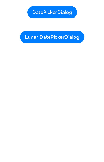
### 示例7(设置公历农历)
该示例通过lunar、lunarSwitch设置弹窗显示公历或农历。
```ts
// xxx.ets
@Entry
@Component
struct DatePickerDialogExample {
selectedDate: Date = new Date("2010-1-1");
build() {
Column() {
Button("DatePickerDialog")
.margin(20)
.onClick(() => {
this.getUIContext().showDatePickerDialog({
start: new Date("2000-1-1"),
end: new Date("2100-12-31"),
selected: this.selectedDate,
lunar: false,
onDateAccept: (value: Date) => {
// 保存按下确定按钮时的日期,这样当弹窗再次弹出时显示选中的是上一次确定的日期
this.selectedDate = value;
console.info("DatePickerDialog:onDateAccept()" + value.toString());
}
});
})
Button("Lunar DatePickerDialog")
.margin(20)
.onClick(() => {
this.getUIContext().showDatePickerDialog({
start: new Date("2000-1-1"),
end: new Date("2100-12-31"),
selected: this.selectedDate,
lunar: true,
lunarSwitch: true,
onDateAccept: (value: Date) => {
this.selectedDate = value;
console.info("DatePickerDialog:onDateAccept()" + value.toString());
}
});
})
}.width('100%')
}
}
```
### 示例8(设置显示月、日列)
该示例通过配置mode参数实现显示月、日两列。
```ts
// xxx.ets
@Entry
@Component
struct DatePickerDialogExample {
selectedDate: Date = new Date("2010-1-1");
build() {
Column() {
Button("DatePickerDialog")
.margin(20)
.onClick(() => {
this.getUIContext().showDatePickerDialog({
start: new Date("2000-1-1"),
end: new Date("2100-12-31"),
selected: this.selectedDate,
mode: DatePickerMode.MONTH_AND_DAY,
onDateAccept: (value: Date) => {
// 保存按下确定按钮时的日期,这样当弹窗再次弹出时显示选中的是上一次确定的日期
this.selectedDate = value;
console.info("DatePickerDialog:onDateAccept()" + value.toString());
}
});
})
}.width('100%')
}
}
```

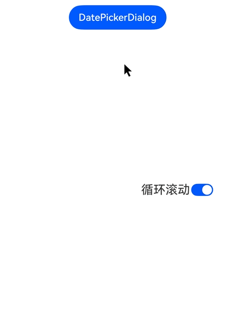
### 示例9(设置循环滚动)
从API version 20开始,可以通过配置canLoop参数设置是否循环滚动。
```ts
// xxx.ets
@Entry
@Component
struct DatePickerDialogExample {
@State isLoop: boolean = true;
selectedDate: Date = new Date("2010-1-1");
build() {
Column() {
Button("DatePickerDialog")
.margin(20)
.onClick(() => {
this.getUIContext().showDatePickerDialog({
start: new Date("2000-1-1"),
end: new Date("2100-12-31"),
selected: this.selectedDate,
canLoop: this.isLoop,
onDateAccept: (value: Date) => {
// 保存按下确定按钮时的日期,这样当弹窗再次弹出时显示选中的是上一次确定的日期
this.selectedDate = value;
console.info("DatePickerDialog:onDateAccept()" + value.toString());
}
});
})
Row() {
Text('循环滚动').fontSize(20)
Toggle({ type: ToggleType.Switch, isOn: true })
.onChange((isOn: boolean) => {
this.isLoop = isOn;
})
}.position({ x: '60%', y: '40%' })
}.width('100%')
}
}
```
### 示例10(自定义背景模糊效果参数)
从API version 19开始,可以通过配置[backgroundBlurStyleOptions](#datepickerdialogoptions对象说明),实现自定义背景模糊效果。
```ts
@Entry
@Component
struct DatePickerDialogExample {
selectedDate: Date = new Date("2010-1-1");
build() {
Stack({ alignContent: Alignment.Top }) {
Image($r('app.media.bg'))
Column() {
Button("DatePickerDialog")
.margin(20)
.onClick(() => {
this.getUIContext().showDatePickerDialog({
start: new Date("2000-1-1"),
end: new Date("2100-12-31"),
selected: this.selectedDate,
backgroundColor: undefined,
backgroundBlurStyle: BlurStyle.Thin,
backgroundBlurStyleOptions: {
colorMode: ThemeColorMode.LIGHT,
adaptiveColor: AdaptiveColor.AVERAGE,
scale: 1,
blurOptions: { grayscale: [20, 20] },
},
});
})
}.width('100%')
}
}
}
```

### 示例11(自定义背景效果参数)
从API version 19开始,该示例通过配置[backgroundEffect](#datepickerdialogoptions对象说明),实现自定义背景效果。
```ts
@Entry
@Component
struct DatePickerDialogExample {
selectedDate: Date = new Date("2010-1-1");
build() {
Stack({ alignContent: Alignment.Top }) {
Image($r('app.media.bg'))
Column() {
Button("DatePickerDialog")
.margin(20)
.onClick(() => {
this.getUIContext().showDatePickerDialog({
start: new Date("2000-1-1"),
end: new Date("2100-12-31"),
selected: this.selectedDate,
backgroundColor: undefined,
backgroundBlurStyle: BlurStyle.Thin,
backgroundEffect: {
radius: 60,
saturation: 0,
brightness: 1,
color: Color.White,
blurOptions: { grayscale: [20, 20] }
},
});
})
}.width('100%')
}
}
}
```
