# 日历选择器弹窗
点击日期弹出日历选择器弹窗,可选择弹窗内任意日期。
> **说明:**
>
> 该组件从API Version 10开始支持。后续版本如有新增内容,则采用上角标单独标记该内容的起始版本。
>
> 本模块功能依赖UI的执行上下文,不可在UI上下文不明确的地方使用,参见[UIContext](../apis/js-apis-arkui-UIContext.md#uicontext)说明。
## CalendarPickerDialog.show
show(options?: CalendarDialogOptions)
定义日历选择器弹窗并弹出。
**系统能力:** SystemCapability.ArkUI.ArkUI.Full
**参数:**
| 参数名 | 类型 | 必填 | 说明 |
| ------- | ------------------------------------------------------- | ---- | -------------------------- |
| options | [CalendarDialogOptions](#calendardialogoptions对象说明) | 否 | 配置日历选择器弹窗的参数。 |
## CalendarDialogOptions对象说明
继承自[CalendarOptions](ts-basic-components-calendarpicker.md#calendaroptions对象说明)。
| 名称 | 类型 | 必填 | 描述 |
| ---------- | ----------------------------------------------- | ---- | ------------------------------------------------------------ |
| onAccept | (value: Date) => void | 否 | 点击弹窗中的“确定”按钮时触发该回调。
value:选中的日期值。 |
| onCancel | () => void | 否 | 点击弹窗中的“取消”按钮时触发该回调。 |
| onChange | (value: Date) => void | 否 | 选择弹窗中日期使当前选中项改变时触发该回调。
value:选中的日期值。 |
## 示例
```ts
// xxx.ets
@Entry
@Component
struct CalendarPickerDialogExample {
private selectedDate: Date = new Date()
build() {
Column() {
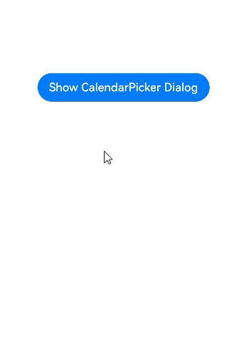
Button("Show CalendarPicker Dialog")
.margin(20)
.onClick(() => {
console.info("CalendarDialog.show")
CalendarPickerDialog.show({
selected: this.selectedDate,
onAccept: (value) => {
console.info("calendar onAccept:" + JSON.stringify(value))
},
onCancel: () => {
console.info("calendar onCancel")
},
onChange: (value) => {
console.info("calendar onChange:" + JSON.stringify(value))
}
})
})
}.width('100%')
}
}
```