# TextArea
多行文本输入框组件,当输入的文本内容超过组件宽度时会自动换行显示。
高度未设置时,组件无默认高度,自适应内容高度。宽度未设置时,默认撑满最大宽度。
> **说明:**
>
> 该组件从API Version 7开始支持。后续版本如有新增内容,则采用上角标单独标记该内容的起始版本。
## 子组件
无
## 接口
TextArea(value?: TextAreaOptions)
**参数:**
| 参数名 |类型|必填|说明|
|-----|-----|----|----|
| value | [TextAreaOptions](#textareaoptions对象说明) | 否 | TextArea组件参数。 |
## TextAreaOptions对象说明
| 参数名 | 参数类型 | 必填 | 参数描述 |
| ----------------------- | ---------------------------------------- | ---- | -------------- |
| placeholder | [ResourceStr](ts-types.md#resourcestr) | 否 | 设置无输入时的提示文本。输入内容后,提示文本不显示。
仅设置placeholder属性时,手柄依然跟随拖动,手柄松开后光标停留在文字开头位置。 |
| text | [ResourceStr](ts-types.md#resourcestr) | 否 | 设置输入框当前的文本内容。建议通过onChange事件将状态变量与文本实时绑定,避免组件刷新时TextArea中的文本内容异常。
从API version 10开始,该参数支持[$$](../../../quick-start/arkts-two-way-sync.md)双向绑定变量。 |
| controller8+ | [TextAreaController](#textareacontroller8) | 否 | 设置TextArea控制器。 |
## 属性
除支持[通用属性](ts-universal-attributes-size.md)和[文本通用属性](ts-universal-attributes-text-style.md)的fontColor、fontSize、fontStyle、fontWeight、fontFamily外,还支持以下属性:
| 名称 | 参数类型 | 描述 |
| ------------------------- | ------------------------------------------------------------ | ------------------------------------------------------------ |
| placeholderColor | [ResourceColor](ts-types.md#resourcecolor) | 设置placeholder文本颜色。
默认值跟随主题。 |
| placeholderFont | [Font](ts-types.md#font) | 设置placeholder文本样式,包括字体大小,字体粗细,字体族,字体风格。目前仅支持默认字体族。 |
| textAlign | [TextAlign](ts-appendix-enums.md#textalign) | 设置文本在输入框中的水平对齐方式。
默认值:TextAlign.Start
**说明:**
支持TextAlign.Start、TextAlign.Center和TextAlign.End。
可通过[align](ts-universal-attributes-location.md)属性控制文本段落在垂直方向上的位置,此组件中不可通过align属性控制文本段落在水平方向上的位置,即align属性中Alignment.TopStart、Alignment.Top、Alignment.TopEnd效果相同,控制内容在顶部,Alignment.Start、Alignment.Center、Alignment.End效果相同,控制内容垂直居中,Alignment.BottomStart、Alignment.Bottom、Alignment.BottomEnd效果相同,控制内容在底部。
当`textAlign`属性设置为TextAlign.JUSTIFY时,最后一行文本不参与两端对齐,为水平对齐首部效果。
从API version 11开始,textAlign可设置TextAlign.JUSTIFY|
| caretColor | [ResourceColor](ts-types.md#resourcecolor) | 设置输入框光标颜色。
默认值:'#007DFF'。 |
| inputFilter8+ | {
value: [ResourceStr](ts-types.md#resourcestr),
error?: (value: string) => void
} | 通过正则表达式设置输入过滤器。匹配表达式的输入允许显示,不匹配的输入将被过滤。仅支持单个字符匹配,不支持字符串匹配。
- value:设置正则表达式。
- error:正则匹配失败时,返回被过滤的内容。 |
| copyOption9+ | [CopyOptions](ts-appendix-enums.md#copyoptions9) | 设置输入的文本是否可复制。
默认值:CopyOptions.LocalDevice,支持设备内复制。
设置CopyOptions.None时,当前TextArea中的文字无法被复制或剪切,仅支持粘贴。
**说明:**
copyOption对于拖拽,只限制是否选中,不涉及拖拽范围。 |
| maxLength10+ | number | 设置文本的最大输入字符数。
默认不设置最大输入字符数限制。
到达文本最大字符限制,将无法继续输入字符,同时边框变为红色。 |
| showCounter10+ | value: boolean, options11+?: [InputCounterOptions](ts-basic-components-textinput.md#inputcounteroptions11对象说明) | 参数value为true时,才能设置options,文本框开启计数下标功能,需要配合maxlength(设置最大字符限制)一起使用。字符计数器显示的效果是当前输入字符数/最大可输入字符数。当输入字符数大于最大字符数乘百分比值时,显示字符计数器。如果用户设置计数器时不设置InputCounterOptions,那么当前输入字符数达到最大字符数时,边框和计数器下标将变为红色。用户同时设置参数value为true和InputCounterOptions,当thresholdPercentage数值在有效区间内,且输入字符数超过最大字符数时,边框和计数器下标将变为红色,框体抖动。highlightBorder设置为false,则不显示红色边框,计数器默认显示红色边框。内联模式下字符计数器不显示。 |
| style10+ | [TextContentStyle](ts-appendix-enums.md#textcontentstyle10) | 设置文本框多态样式。
默认值:TextContentStyle.DEFAULT |
| enableKeyboardOnFocus10+ | boolean | TextArea通过点击以外的方式获焦时,是否绑定输入法。
默认值:true。从API version 10开始,获焦默认绑定输入法。 |
| selectionMenuHidden10+ | boolean | 设置长按、双击输入框或者右键输入框时,是否不弹出文本选择菜单。
默认值:false |
| barState10+ | [BarState](ts-appendix-enums.md#barstate) | 设置输入框编辑态时滚动条的显示模式。
默认值:BarState.Auto |
| maxLines10+ | number | 设置内联输入风格编辑态时文本可显示的最大行数。
默认值:3
**说明:**
取值范围:(0, +∞)。|
| customKeyboard10+ | [CustomBuilder](ts-types.md#custombuilder8) | 设置自定义键盘。
**说明:**
当设置自定义键盘时,输入框激活后不会打开系统输入法,而是加载指定的自定义组件。
自定义键盘的高度可以通过自定义组件根节点的height属性设置,宽度不可设置,使用系统默认值。
自定义键盘采用覆盖原始界面的方式呈现,不会对应用原始界面产生压缩或者上提。
自定义键盘无法获取焦点,但是会拦截手势事件。
默认在输入控件失去焦点时,关闭自定义键盘,开发者也可以通过[TextAreaController](#textareacontroller8).[stopEditing](#stopediting10)方法控制键盘关闭。
如果设备支持拍摄输入,设置自定义键盘后,该输入框会不支持拍摄输入。 |
| type11+ | [TextAreaType](#textareatype11枚举说明) | 设置输入框类型。
默认值:TextAreaType.Normal |
| enterKeyType11+ | [EnterKeyType](ts-basic-components-textinput.md#enterkeytype枚举说明) | 设置输入法回车键类型。
默认值:EnterKeyType.NEW_LINE |
> **说明:**
>
> [通用属性padding](ts-universal-attributes-size.md#padding)的默认值为:
{
top: 8 vp,
right: 16 vp,
bottom: 8 vp,
left: 16 vp
}
从API version 11开始,多行输入框可设置.width('auto')使组件宽度自适应文本宽度,自适应时组件宽度受constraintSize属性以及父容器传递的最大最小宽度限制,其余使用方式参考[尺寸设置](ts-universal-attributes-size.md#属性)。
## 事件
除支持[通用事件](ts-universal-events-click.md)外,还支持以下事件:
| 名称 | 功能描述 |
| ------------------------------------------------------------ | ------------------------------------------------------------ |
| onChange(callback: (value: string) => void) | 输入内容发生变化时,触发该回调。
- value:当前输入的文本内容。 |
| onEditChange(callback: (isEditing: boolean) => void)10+ | 输入状态变化时,触发该回调。有光标时为编辑态,无光标时为非编辑态。isEditing为true表示正在输入。 |
| onCopy8+(callback:(value: string) => void) | 长按输入框内部区域弹出剪贴板后,点击剪切板复制按钮,触发该回调。
- value:复制的文本内容。 |
| onCut8+(callback:(value: string) => void) | 长按输入框内部区域弹出剪贴板后,点击剪切板剪切按钮,触发该回调。
- value:剪切的文本内容。 |
| onPaste(callback:(value: string, event11+: [PasteEvent](ts-basic-components-richeditor.md#pasteevent11)) => void) | 长按输入框内部区域弹出剪贴板后,点击剪切板粘贴按钮,触发该回调。
- value:粘贴的文本内容。
- event:用户自定义的粘贴事件。|
| onTextSelectionChange(callback: (selectionStart: number, selectionEnd: number) => void)10+ | 文本选择的位置发生变化时,触发该回调。
selectionStart:文本选择区域起始位置,文本框中文字的起始位置为0。
selectionEnd:文本选择区域结束位置。 |
| onContentScroll(callback: (totalOffsetX: number, totalOffsetY: number) => void)10+ | 文本内容滚动时,触发该回调。
totalOffsetX:文本在内容区的横坐标偏移,单位px。
totalOffsetY:文本在内容区的纵坐标偏移,单位px。 |
| onSubmit(callback: (enterKey: EnterKeyType) => void)11+ | 按下输入法回车键触发该回调。
enterKey:输入法回车键类型,类型为EnterKeyType.NEW_LINE时不触发onSubmit。具体类型见[EnterKeyType枚举说明](ts-basic-components-textinput.md#enterkeytype枚举说明)。|
## TextAreaController8+
TextArea组件的控制器,目前可通过它设置TextArea组件的光标位置。
### 导入对象
```
controller: TextAreaController = new TextAreaController()
```
### caretPosition8+
caretPosition(value: number): void
设置输入光标的位置。
**参数:**
| 参数名 | 参数类型 | 必填 | 参数描述 |
| ------ | -------- | ---- | -------------------------------------- |
| value | number | 是 | 从字符串开始到光标所在位置的字符长度。 |
### setTextSelection10+
setTextSelection(selectionStart: number, selectionEnd: number): void
组件在获焦状态下,调用该接口设置文本选择区域并高亮显示,且只有在selectionStart小于selectionEnd时,文字才会被选取、高亮显示。
**参数:**
| 参数名 | 参数类型 | 必填 | 参数描述 |
| -------------- | -------- | ---- | ------------------------------------------------------------ |
| selectionStart | number | 是 | 文本选择区域起始位置,文本框中文字的起始位置为0。
当selectionStart小于0时、按照0处理;当selectionStart大于文字最大长度时、按照文字最大长度处理。
|
| selectionEnd | number | 是 | 文本选择区域结束位置。
当selectionEnd小于0时、按照0处理;当selectionEnd大于文字最大长度时、按照文字最大长度处理。
|
### stopEditing10+
stopEditing(): void
退出编辑态。
### getTextContentRect10+
getTextContentRect(): [RectResult](#rectresult10)
获取已编辑文本内容区域相对组件的位置和大小,返回值单位为像素。
**返回值:**
| 类型 | 说明 |
| ------------------- | -------- |
| [RectResult](#rectresult10) | 已编辑文本内容的相对组件的位置和大小。 |
> **说明:**
>
> - 初始不输入文本时,返回值中有相对组件的位置信息,大小为0。
> - 返回值中的位置信息是第一个字符相对于可编辑组件的位置。
> - 有输入时返回信息中的宽度是组件编辑的固定宽度。
### RectResult10+
位置和大小,单位均为像素。
| 参数 | 类型 | 描述 |
| ------- | ------ | ----------------------- |
| x | number | 水平方向横坐标。|
| y | number | 竖直方向纵坐标。|
| width | number | 内容宽度大小。|
| height | number | 内容高度大小。|
### getTextContentLineCount10+
getTextContentLineCount(): number
获取已编辑文本内容的行数。
**返回值:**
| 类型 | 说明 |
| ----- | -------- |
| number| 已编辑文本内容行数。 |
### getCaretOffset11+
getCaretOffset(): CaretOffset
返回当前光标所在位置信息。
**返回值:**
| 类型 | 说明 |
| ----------------------- | ---------------- |
| [CaretOffset](ts-basic-components-textinput.md#caretoffset11对象说明) | 光标相对输入框的位置。 |
> **说明:**
>
> - 在当前帧更新光标位置同时调用该接口,该接口不生效。
## TextAreaType11+枚举说明
| 名称 | 描述 |
| ------------------ | ------------- |
| NORMAL | 基本输入模式。
支持输入数字、字母、下划线、空格、特殊字符。 |
| EMAIL | 邮箱地址输入模式。支持数字,字母,下划线,以及@字符(只能存在一个@字符)。 |
| NUMBER | 纯数字输入模式。 |
| PHONE_NUMBER | 电话号码输入模式。
支持输入数字、+ 、-、*、#,长度不限。 |
## 示例
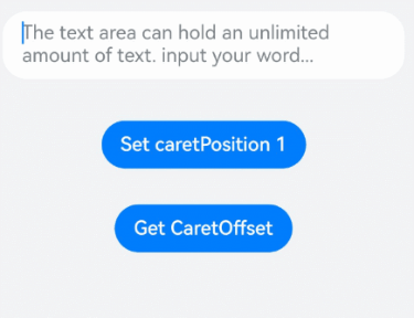
### 示例1
```ts
// xxx.ets
@Entry
@Component
struct TextAreaExample {
@State text: string = ''
@State positionInfo: CaretOffset = { index: 0, x: 0, y: 0 }
controller: TextAreaController = new TextAreaController()
build() {
Column() {
TextArea({
text: this.text,
placeholder: 'The text area can hold an unlimited amount of text. input your word...',
controller: this.controller
})
.placeholderFont({ size: 16, weight: 400 })
.width(336)
.height(56)
.margin(20)
.fontSize(16)
.fontColor('#182431')
.backgroundColor('#FFFFFF')
.onChange((value: string) => {
this.text = value
})
Text(this.text)
Button('Set caretPosition 1')
.backgroundColor('#007DFF')
.margin(15)
.onClick(() => {
// 设置光标位置到第一个字符后
this.controller.caretPosition(1)
})
Button('Get CaretOffset')
.backgroundColor('#007DFF')
.margin(15)
.onClick(() => {
this.positionInfo = this.controller.getCaretOffset()
})
}.width('100%').height('100%').backgroundColor('#F1F3F5')
}
}
```
### 示例2
```ts
// xxx.ets
@Entry
@Component
struct TextAreaExample {
@State text: string = 'test'
@State counterVisible: boolean = false
@State maxNumber: number = -1
controller: TextAreaController = new TextAreaController()
build() {
Column() {
TextArea({
text: this.text,
placeholder: 'The text area can hold an unlimited amount of text. input your word...',
controller: this.controller
})
.placeholderFont({ size: 16, weight: 400 })
.width(336)
.height(56)
.margin(20)
.fontSize(16)
.fontColor('#182431')
.maxLength(4)
.showCounter(true)
.backgroundColor('#FFFFFF')
.onChange((value: string) => {
this.text = value
})
}.width('100%').height('100%').backgroundColor('#F1F3F5')
}
}
```

### 示例3
```ts
// xxx.ets
@Entry
@Component
struct TextAreaExample {
controller: TextAreaController = new TextAreaController()
@State inputValue: string = ""
// 自定义键盘组件
@Builder CustomKeyboardBuilder() {
Column() {
Button('x').onClick(() => {
// 关闭自定义键盘
this.controller.stopEditing()
})
Grid() {
ForEach([1, 2, 3, 4, 5, 6, 7, 8, 9, '*', 0, '#'], (item: number | string) => {
GridItem() {
Button(item + "")
.width(110).onClick(() => {
this.inputValue += item
})
}
})
}.maxCount(3).columnsGap(10).rowsGap(10).padding(5)
}.backgroundColor(Color.Gray)
}
build() {
Column() {
TextArea({ controller: this.controller, text: this.inputValue})
// 绑定自定义键盘
.customKeyboard(this.CustomKeyboardBuilder()).margin(10).border({ width: 1 })
.height(200)
}
}
}
```

### 示例4
```ts
// xxx.ets
@Entry
@Component
struct TextAreaExample {
@State text: string = ''
controller: TextAreaController = new TextAreaController()
build() {
Column() {
TextArea({ text: this.text, controller: this.controller })
.placeholderFont({ size: 16, weight: 400 })
.width(336)
.height(56)
.maxLength(6)
.showCounter(true, { thresholdPercentage: 50, highlightBorder: true })
//计数器显示效果为用户当前输入字符数/最大字符限制数。最大字符限制数通过maxLength()接口设置。
//如果用户当前输入字符数达到最大字符限制乘50%(thresholdPercentage)。字符计数器显示。
//用户设置highlightBorder为false时,配置取消红色边框。不设置此参数时,默认为true。
.onChange((value: string) => {
this.text = value
})
}.width('100%').height('100%').backgroundColor('#F1F3F5')
}
}
```

### 示例5
```ts
// xxx.ets
@Entry
@Component
struct TextInputExample {
@State Text: string = ''
@State enterTypes: Array = [EnterKeyType.Go, EnterKeyType.Search, EnterKeyType.Send, EnterKeyType.Done, EnterKeyType.Next, EnterKeyType.PREVIOUS, EnterKeyType.NEW_LINE]
@State index: number = 0
build() {
Column({ space: 20 }) {
TextArea({ placeholder: '请输入用户名', text: this.Text })
.width(380)
.enterKeyType(this.enterTypes[this.index])
.onChange((value: string) => {
this.Text = value
})
.onSubmit((enterKey: EnterKeyType) => {
console.log("trigger area onsubmit" + enterKey);
})
Button('改变EnterKeyType').onClick(() => {
this.index = (this.index + 1) % this.enterTypes.length;
})
}.width('100%')
}
}
```
