# Page Transition (pageTransition)
You can customize the page entrance and exit animations in the **pageTransition** API for transition between pages. For details, see [Page Transition Animation](../../../ui/arkts-page-transition-animation.md).
> **NOTE**
>
> This event is supported since API version 7. Updates will be marked with a superscript to indicate their earliest API version.
>
> To achieve a better transition effect, you are advised to use the [Navigation](../../../ui/arkts-navigation-navigation.md) component and [modal transition](../../../ui/arkts-modal-transition.md).
## pageTransition
pageTransition?(): void
Defines the transition animation to play when the user accesses this page or is redirected from this page to another page.
**Atomic service API**: This API can be used in atomic services since API version 11.
**System capability**: SystemCapability.ArkUI.ArkUI.Full
## PageTransitionEnter
PageTransitionEnter(value: PageTransitionOptions)
Page entrance animation.
**Atomic service API**: This API can be used in atomic services since API version 11.
**System capability**: SystemCapability.ArkUI.ArkUI.Full
**Parameters**
| Name| Type | Mandatory| Description |
| ------ | ------------------------------------------------------ | ---- | -------------------- |
| value | [PageTransitionOptions](#pagetransitionoptions) | Yes | Page entrance animation.|
## PageTransitionExit
PageTransitionExit(value: PageTransitionOptions)
Page exit animation.
**Atomic service API**: This API can be used in atomic services since API version 11.
**System capability**: SystemCapability.ArkUI.ArkUI.Full
**Parameters**
| Name| Type | Mandatory| Description |
| ------ | ------------------------------------------------------- | ---- | -------------------- |
| value | [PageTransitionOptions](#pagetransitionoptions) | Yes | Page exit animation.|
## PageTransitionOptions
**Atomic service API**: This API can be used in atomic services since API version 11.
| Name | Type | Mandatory| Description |
| -------- | ------------------------------------------------------------ | ---- | ------------------------------------------------------------ |
| type | [RouteType](#routetype) | No | Route type for the page transition effect to take effect.
Default value: **RouteType.None** |
| duration | number | No | Animation duration.
Unit: ms
Default value: **1000** |
| curve | [Curve](ts-appendix-enums.md#curve) \| string \| [ICurve](../js-apis-curve.md#icurve9)10+ | No | Animation curve. The value of the string type can be any of the following: "ease", "ease-in", "ease-out", "ease-in-out", "extreme-deceleration", "fast-out-linear-in", "fast-out-slow-in", "friction", "linear", "linear-out-slow-in", "rhythm", "sharp", "smooth".
Default value: **Curve.Linear**|
| delay | number | No | Animation delay.
Unit: ms
Default value: **0**
**NOTE**
If no match is found, the default page transition effect is used (which may vary according to the device). To disable the default page transition effect, set **duration** to **0**.|
## Attributes
**Atomic service API**: This API can be used in atomic services since API version 11.
| Name | Type | Mandatory| Description |
| --------- | ------------------------------------------------------------ | ---- | ------------------------------------------------------------ |
| slide | [SlideEffect](#slideeffect) | No | Slide effect during page transition.|
| translate | {
x? : number \| string;
y? : number \| string;
z? : number \| string
} | No | Translation effect during page transition, which is the value of the start point of entrance and the end point of exit. When this parameter is set together with **slide**, the latter takes effect by default.
- **x**: translation distance along the x-axis.
- **y**: translation distance along the y-axis.
- **z**: translation distance along the y-axis.|
| scale | {
x? : number;
y? : number;
z? : number;
centerX? : number \| string;
centerY? : number \| string
} | No | Scaling effect during page transition, which is the value of the start point of entrance and the end point of exit.
- **x**: scale ratio along the x-axis.
- **y**: scale ratio along the y-axis.
- **z**: scale ratio along the z-axis.
- **centerX** and **centerY**: scale center point. The default values are both **"50%"**, indicating that the center point of the page.
- If the center point is (0, 0), it refers to the upper left corner of the component.
|
| opacity | number | No | Opacity, which is the opacity value of the start point of entrance or the end point of exit.|
## Events
### onEnter
onEnter(event: (type: RouteType, progress: number) => void): PageTransitionEnterInterface
Invoked on a per-frame basis until the entrance animation is complete, with the **progress** parameter changing from 0 to 1.
**Atomic service API**: This API can be used in atomic services since API version 11.
**System capability**: SystemCapability.ArkUI.ArkUI.Full
**Parameters**
| Name| Type | Mandatory| Description |
| ------ | ----------------------------------------------------------------- | ---- | ------------------------------------------------ |
| event | (type: [RouteType](#routetype), progress: number) => void | Yes | Callback invoked on a per-frame basis until the entrance animation is complete, with the **progress** parameter changing from 0 to 1.|
**Example**
```js
pageTransition() {
PageTransitionEnter({ duration: 1200, curve: Curve.Linear })
// During the transition animation, the entrance animation has a type that represents the route type, and a progress that increases from 0 to 1.
.onEnter((type: RouteType, progress: number) => {
// Service logic
})
}
```
### onExit
onExit(event: (type: RouteType, progress: number) => void): PageTransitionExitInterface
Invoked on a per-frame basis until the exit animation is complete, with the **progress** parameter changing from 0 to 1.
**System capability**: SystemCapability.ArkUI.ArkUI.Full
**Atomic service API**: This API can be used in atomic services since API version 11.
**Parameters**
| Name| Type | Mandatory| Description |
| ------ | ----------------------------------------------------------------- | ---- | ------------------------------------------------ |
| event | (type: [RouteType](#routetype), progress: number) => void | Yes | Callback invoked on a per-frame basis until the exit animation is complete, with the **progress** parameter changing from 0 to 1.|
**Example**
```js
pageTransition() {
PageTransitionExit({ duration: 1200, curve: Curve.Linear })
// During the transition animation, the exit animation has a type that represents the route type, and a progress that increases from 0 to 1.
.onExit((type: RouteType, progress: number) => {
// Service logic
})
}
```
## RouteType
**System capability**: SystemCapability.ArkUI.ArkUI.Full
**Atomic service API**: This API can be used in atomic services since API version 11.
| Name| Description |
| ---- | ------------------------------------------------------------ |
| Pop | Redirects to a specified page. To redirect the user from page B back to page A, set **RouteType** of **PageTransitionExit** to **None** or **Pop** for page B and set **RouteType** of **PageTransitionEnter** to **None** or **Pop** for page A.|
| Push | Redirects to the next page. To redirect the user from page A to page B, set **RouteType** of **PageTransitionExit** to **None** or **Push** for page A and set **RouteType** of **PageTransitionEnter** to **None** or **Push** for page B.|
| None | The page is not redirected. The animation specified by **PageTransitionEnter** takes effect for page entrance, and the animation specified by **PageTransitionExit** takes effect for page exit.|
## SlideEffect
| Name | Description |
| ------------------- | ------------------------------------------------------------ |
| Left | When set to Enter, slides in from the left. When set to Exit, slides out to the left.
**Atomic service API**: This API can be used in atomic services since API version 11.|
| Right | When set to Enter, slides in from the right. When set to Exit, slides out to the right.
**Atomic service API**: This API can be used in atomic services since API version 11.|
| Top | When set to Enter, slides in from the top. When set to Exit, slides out to the top.
**Atomic service API**: This API can be used in atomic services since API version 11.|
| Bottom | When set to Enter, slides in from the bottom. When set to Exit, slides out to the bottom.
**Atomic service API**: This API can be used in atomic services since API version 11.|
| START12+ | Left-to-right scripts: When set to Enter, slides in from the left; when set to Exit, slides out to the left. Right-to-left scripts: When set to Enter, slides in from the right; when set to Exit, slides out to the right.
**Atomic service API**: This API can be used in atomic services since API version 12.|
| END12+ | Left-to-right scripts: When set to Enter, slides in from the right; when set to Exit, slides out to the right. Right-to-left scripts: When set to Enter, slides in from the left; when set to Exit, slides out to the left.
**Atomic service API**: This API can be used in atomic services since API version 12.|
## Example
### Example 1
Example 1: Apply different exit and entry animations based on different exit and entry types.
```ts
// index.ets
import { router } from '@kit.ArkUI';
@Entry
@Component
struct Index {
@State scale1: number = 1
@State opacity1: number = 1
build() {
Column() {
Image($r("app.media.transition_image1")).width('100%').height('100%')
}
.width('100%')
.height('100%')
.scale({ x: this.scale1 })
.opacity(this.opacity1)
.onClick(() => {
router.pushUrl({ url: 'pages/Page1' })
})
}
pageTransition() {
PageTransitionEnter({ duration: 1200, curve: Curve.Linear })
.onEnter((type: RouteType, progress: number) => {
if (type == RouteType.Push||type == RouteType.Pop) {
this.scale1 = progress
this.opacity1 = progress
}
})
PageTransitionExit({ duration: 1200, curve: Curve.Ease })
.onExit((type: RouteType, progress: number) => {
if (type == RouteType.Push) {
this.scale1 = 1 - progress
this.opacity1 = 1 - progress
}
})
}
}
```
```ts
// page1.ets
import { router } from '@kit.ArkUI';
@Entry
@Component
struct Page1 {
@State scale2: number = 1
@State opacity2: number = 1
build() {
Column() {
Image($r("app.media.transition_image2")).width('100%').height('100%') // Store the image in the media folder.
}
.width('100%')
.height('100%')
.scale({ x: this.scale2 })
.opacity(this.opacity2)
.onClick(() => {
router.pushUrl({ url: 'pages/Index' })
})
}
pageTransition() {
PageTransitionEnter({ duration: 1200, curve: Curve.Linear })
.onEnter((type: RouteType, progress: number) => {
if(type==RouteType.Push || type == RouteType.Pop)
this.scale2 = progress
this.opacity2 = progress
})
PageTransitionExit({ duration: 1200, curve: Curve.Ease })
.onExit((type: RouteType, progress: number) => {
if (type == RouteType.Pop) {
this.scale2 = 1 - progress
this.opacity2 = 1 - progress
}
})
}
}
```

Example 2: Apply the entrance animation of sliding in from the left and the exit animation of translating with opacity change.
```ts
// index.ets
@Entry
@Component
struct PageTransitionExample {
build() {
Column() {
Navigator({ target: 'pages/page1', type: NavigationType.Push }) {
Image($r('app.media.bg1')).width('100%').height('100%') // Store the image in the media folder.
}
}
}
// Use the default effects provided by the system, such as translation, scaling, and opacity.
pageTransition() {
// Set the duration of the entrance animation to 1200 ms, in the purpose of matching the duration of the exit animation of the other page.
PageTransitionEnter({ duration: 1200 })
.slide(SlideEffect.Left)
// Set the duration of the exit animation to 1000 ms, in the purpose of matching the duration of the entrance animation of the other page.
PageTransitionExit({ duration: 1000 })
.translate({ x: 100.0, y: 100.0 })
.opacity(0)
}
}
```
```ts
// page1.ets
@Entry
@Component
struct PageTransitionExample1 {
build() {
Column() {
Navigator({ target: 'pages/index', type: NavigationType.Push }) {
Image($r('app.media.bg2')).width('100%').height('100%') // Store the image in the media folder.
}
}
}
// Use the default effects provided by the system, such as translation, scaling, and opacity.
pageTransition() {
// Set the duration of the entrance animation to 1000 ms, in the purpose of matching the duration of the exit animation of the other page.
PageTransitionEnter({ duration: 1000 })
.slide(SlideEffect.Left)
// Set the duration of the exit animation to 1200 ms, in the purpose of matching the duration of the entrance animation of the other page.
PageTransitionExit({ duration: 1200 })
.translate({ x: 100.0, y: 100.0 })
.opacity(0)
}
}
```

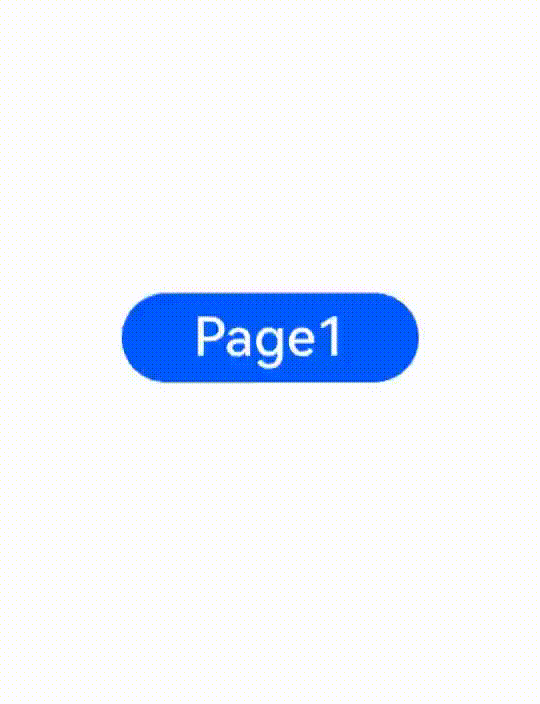
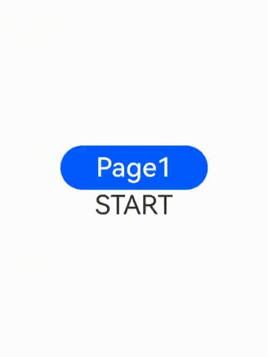
### Example 2
Customization method 1: Configure the various entrance and exit translation effects provided, with the system language layout mode set to right-to-left (RTL).
```ts
// index.ets
import { router } from '@kit.ArkUI'
@Entry
@Component
struct PageTransitionExample {
@State scale1: number = 1
@State opacity1: number = 1
build() {
Column() {
Button("Page 1").onClick(()=>{
router.pushUrl({
url:"pages/page1"
})
})
.width(200)
.height(60)
.fontSize(36)
Text("START")
.fontSize(36)
.textAlign(TextAlign.Center)
}.scale({ x: this.scale1 }).opacity(this.opacity1).height("100%").width("100%").justifyContent(FlexAlign.Center)
}
// Use the default effects provided by the system, such as translation, scaling, and opacity.
pageTransition() {
// Set the entrance animation.
PageTransitionEnter({ duration: 200 })
.slide(SlideEffect.START)
// Set the exit animation.
PageTransitionExit({ delay: 100 })
.slide(SlideEffect.START) //Left
}
}
```
```ts
// page1.ets
import { router } from '@kit.ArkUI'
@Entry
@Component
struct PageTransitionExample {
@State scale1: number = 1
@State opacity1: number = 1
build() {
Column() {
Button("Page 2").onClick(()=>{
router.pushUrl({
url:"pages/Index"
})
})
.width(200)
.height(60)
.fontSize(36)
Text("END")
.fontSize(36)
.textAlign(TextAlign.Center)
}.scale({ x: this.scale1 }).opacity(this.opacity1).height("100%").width("100%").justifyContent(FlexAlign.Center)
}
// Use the default effects provided by the system, such as translation, scaling, and opacity.
pageTransition() {
PageTransitionEnter({ duration: 200 })
.slide(SlideEffect.END) //Right
PageTransitionExit({ delay:100 })
.slide(SlideEffect.END) //Right
}
}
```
Customization method 2: Use the system's default entrance and exit effects, with the system language layout mode set to right-to-left (RTL).
```ts
// index.ets
import { router } from '@kit.ArkUI'
@Entry
@Component
struct PageTransitionExample {
@State scale1: number = 1
@State opacity1: number = 1
build() {
Column() {
Button("Page 1").onClick(()=>{
router.pushUrl({
url:"pages/page1"
})
})
.width(200)
.height(60)
.fontSize(36)
}.scale({ x: this.scale1 }).opacity(this.opacity1).height("100%").width("100%").justifyContent(FlexAlign.Center)
}
}
```
```ts
// page1.ets
import { router } from '@kit.ArkUI'
@Entry
@Component
struct PageTransitionExample {
@State scale1: number = 1
@State opacity1: number = 1
build() {
Column() {
Button("Page 2").onClick(()=>{
router.pushUrl({
url:"pages/Index"
})
})
.width(200)
.height(60)
.fontSize(36)
}.scale({ x: this.scale1 }).opacity(this.opacity1).height("100%").width("100%").justifyContent(FlexAlign.Center)
}
}
```