1// Copyright 2015 The Chromium Authors. All rights reserved. 2// Use of this source code is governed by a BSD-style license that can be 3// found in the LICENSE file. 4 5import 'dart:ui' as ui; 6 7import 'package:flutter/cupertino.dart'; 8import 'package:flutter/rendering.dart'; 9import 'package:flutter/widgets.dart'; 10 11import 'arc.dart'; 12import 'colors.dart'; 13import 'floating_action_button.dart'; 14import 'icons.dart'; 15import 'material_localizations.dart'; 16import 'page.dart'; 17import 'theme.dart'; 18 19/// [MaterialApp] uses this [TextStyle] as its [DefaultTextStyle] to encourage 20/// developers to be intentional about their [DefaultTextStyle]. 21/// 22/// In Material Design, most [Text] widgets are contained in [Material] widgets, 23/// which sets a specific [DefaultTextStyle]. If you're seeing text that uses 24/// this text style, consider putting your text in a [Material] widget (or 25/// another widget that sets a [DefaultTextStyle]). 26const TextStyle _errorTextStyle = TextStyle( 27 color: Color(0xD0FF0000), 28 fontFamily: 'monospace', 29 fontSize: 48.0, 30 fontWeight: FontWeight.w900, 31 decoration: TextDecoration.underline, 32 decorationColor: Color(0xFFFFFF00), 33 decorationStyle: TextDecorationStyle.double, 34 debugLabel: 'fallback style; consider putting your text in a Material', 35); 36 37/// Describes which theme will be used by [MaterialApp]. 38enum ThemeMode { 39 /// Use either the light or dark theme based on what the user has selected in 40 /// the system settings. 41 system, 42 43 /// Always use the light mode regardless of system preference. 44 light, 45 46 /// Always use the dark mode (if available) regardless of system preference. 47 dark, 48} 49 50/// An application that uses material design. 51/// 52/// A convenience widget that wraps a number of widgets that are commonly 53/// required for material design applications. It builds upon a [WidgetsApp] by 54/// adding material-design specific functionality, such as [AnimatedTheme] and 55/// [GridPaper]. 56/// 57/// The [MaterialApp] configures the top-level [Navigator] to search for routes 58/// in the following order: 59/// 60/// 1. For the `/` route, the [home] property, if non-null, is used. 61/// 62/// 2. Otherwise, the [routes] table is used, if it has an entry for the route. 63/// 64/// 3. Otherwise, [onGenerateRoute] is called, if provided. It should return a 65/// non-null value for any _valid_ route not handled by [home] and [routes]. 66/// 67/// 4. Finally if all else fails [onUnknownRoute] is called. 68/// 69/// If a [Navigator] is created, at least one of these options must handle the 70/// `/` route, since it is used when an invalid [initialRoute] is specified on 71/// startup (e.g. by another application launching this one with an intent on 72/// Android; see [Window.defaultRouteName]). 73/// 74/// This widget also configures the observer of the top-level [Navigator] (if 75/// any) to perform [Hero] animations. 76/// 77/// If [home], [routes], [onGenerateRoute], and [onUnknownRoute] are all null, 78/// and [builder] is not null, then no [Navigator] is created. 79/// 80/// {@tool sample} 81/// This example shows how to create a [MaterialApp] that disables the "debug" 82/// banner with a [home] route that will be displayed when the app is launched. 83/// 84/// 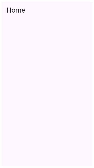 85/// 86/// ```dart 87/// MaterialApp( 88/// home: Scaffold( 89/// appBar: AppBar( 90/// title: const Text('Home'), 91/// ), 92/// ), 93/// debugShowCheckedModeBanner: false, 94/// ) 95/// ``` 96/// {@end-tool} 97/// 98/// {@tool sample} 99/// This example shows how to create a [MaterialApp] that uses the [routes] 100/// `Map` to define the "home" route and an "about" route. 101/// 102/// ```dart 103/// MaterialApp( 104/// routes: <String, WidgetBuilder>{ 105/// '/': (BuildContext context) { 106/// return Scaffold( 107/// appBar: AppBar( 108/// title: const Text('Home Route'), 109/// ), 110/// ); 111/// }, 112/// '/about': (BuildContext context) { 113/// return Scaffold( 114/// appBar: AppBar( 115/// title: const Text('About Route'), 116/// ), 117/// ); 118/// } 119/// }, 120/// ) 121/// ``` 122/// {@end-tool} 123/// 124/// {@tool sample} 125/// This example shows how to create a [MaterialApp] that defines a [theme] that 126/// will be used for material widgets in the app. 127/// 128/// 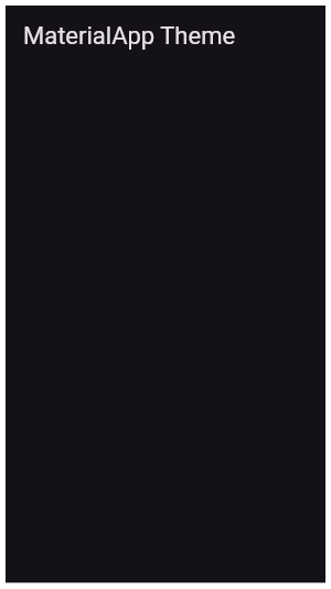 129/// 130/// ```dart 131/// MaterialApp( 132/// theme: ThemeData( 133/// brightness: Brightness.dark, 134/// primaryColor: Colors.blueGrey 135/// ), 136/// home: Scaffold( 137/// appBar: AppBar( 138/// title: const Text('MaterialApp Theme'), 139/// ), 140/// ), 141/// ) 142/// ``` 143/// {@end-tool} 144/// 145/// See also: 146/// 147/// * [Scaffold], which provides standard app elements like an [AppBar] and a [Drawer]. 148/// * [Navigator], which is used to manage the app's stack of pages. 149/// * [MaterialPageRoute], which defines an app page that transitions in a material-specific way. 150/// * [WidgetsApp], which defines the basic app elements but does not depend on the material library. 151/// * The Flutter Internationalization Tutorial, 152/// <https://flutter.dev/tutorials/internationalization/>. 153class MaterialApp extends StatefulWidget { 154 /// Creates a MaterialApp. 155 /// 156 /// At least one of [home], [routes], [onGenerateRoute], or [builder] must be 157 /// non-null. If only [routes] is given, it must include an entry for the 158 /// [Navigator.defaultRouteName] (`/`), since that is the route used when the 159 /// application is launched with an intent that specifies an otherwise 160 /// unsupported route. 161 /// 162 /// This class creates an instance of [WidgetsApp]. 163 /// 164 /// The boolean arguments, [routes], and [navigatorObservers], must not be null. 165 const MaterialApp({ 166 Key key, 167 this.navigatorKey, 168 this.home, 169 this.routes = const <String, WidgetBuilder>{}, 170 this.initialRoute, 171 this.onGenerateRoute, 172 this.onUnknownRoute, 173 this.navigatorObservers = const <NavigatorObserver>[], 174 this.builder, 175 this.title = '', 176 this.onGenerateTitle, 177 this.color, 178 this.theme, 179 this.darkTheme, 180 this.themeMode = ThemeMode.system, 181 this.locale, 182 this.localizationsDelegates, 183 this.localeListResolutionCallback, 184 this.localeResolutionCallback, 185 this.supportedLocales = const <Locale>[Locale('en', 'US')], 186 this.debugShowMaterialGrid = false, 187 this.showPerformanceOverlay = false, 188 this.checkerboardRasterCacheImages = false, 189 this.checkerboardOffscreenLayers = false, 190 this.showSemanticsDebugger = false, 191 this.debugShowCheckedModeBanner = true, 192 }) : assert(routes != null), 193 assert(navigatorObservers != null), 194 assert(title != null), 195 assert(debugShowMaterialGrid != null), 196 assert(showPerformanceOverlay != null), 197 assert(checkerboardRasterCacheImages != null), 198 assert(checkerboardOffscreenLayers != null), 199 assert(showSemanticsDebugger != null), 200 assert(debugShowCheckedModeBanner != null), 201 super(key: key); 202 203 /// {@macro flutter.widgets.widgetsApp.navigatorKey} 204 final GlobalKey<NavigatorState> navigatorKey; 205 206 /// {@macro flutter.widgets.widgetsApp.home} 207 final Widget home; 208 209 /// The application's top-level routing table. 210 /// 211 /// When a named route is pushed with [Navigator.pushNamed], the route name is 212 /// looked up in this map. If the name is present, the associated 213 /// [WidgetBuilder] is used to construct a [MaterialPageRoute] that performs 214 /// an appropriate transition, including [Hero] animations, to the new route. 215 /// 216 /// {@macro flutter.widgets.widgetsApp.routes} 217 final Map<String, WidgetBuilder> routes; 218 219 /// {@macro flutter.widgets.widgetsApp.initialRoute} 220 final String initialRoute; 221 222 /// {@macro flutter.widgets.widgetsApp.onGenerateRoute} 223 final RouteFactory onGenerateRoute; 224 225 /// {@macro flutter.widgets.widgetsApp.onUnknownRoute} 226 final RouteFactory onUnknownRoute; 227 228 /// {@macro flutter.widgets.widgetsApp.navigatorObservers} 229 final List<NavigatorObserver> navigatorObservers; 230 231 /// {@macro flutter.widgets.widgetsApp.builder} 232 /// 233 /// Material specific features such as [showDialog] and [showMenu], and widgets 234 /// such as [Tooltip], [PopupMenuButton], also require a [Navigator] to properly 235 /// function. 236 final TransitionBuilder builder; 237 238 /// {@macro flutter.widgets.widgetsApp.title} 239 /// 240 /// This value is passed unmodified to [WidgetsApp.title]. 241 final String title; 242 243 /// {@macro flutter.widgets.widgetsApp.onGenerateTitle} 244 /// 245 /// This value is passed unmodified to [WidgetsApp.onGenerateTitle]. 246 final GenerateAppTitle onGenerateTitle; 247 248 /// Default visual properties, like colors fonts and shapes, for this app's 249 /// material widgets. 250 /// 251 /// A second [darkTheme] [ThemeData] value, which is used to provide a dark 252 /// version of the user interface can also be specified. [themeMode] will 253 /// control which theme will be used if a [darkTheme] is provided. 254 /// 255 /// The default value of this property is the value of [ThemeData.light()]. 256 /// 257 /// See also: 258 /// 259 /// * [themeMode], which controls which theme to use. 260 /// * [MediaQueryData.platformBrightness], which indicates the platform's 261 /// desired brightness and is used to automatically toggle between [theme] 262 /// and [darkTheme] in [MaterialApp]. 263 /// * [ThemeData.brightness], which indicates the [Brightness] of a theme's 264 /// colors. 265 final ThemeData theme; 266 267 /// The [ThemeData] to use when a 'dark mode' is requested by the system. 268 /// 269 /// Some host platforms allow the users to select a system-wide 'dark mode', 270 /// or the application may want to offer the user the ability to choose a 271 /// dark theme just for this application. This is theme that will be used for 272 /// such cases. [themeMode] will control which theme will be used. 273 /// 274 /// This theme should have a [ThemeData.brightness] set to [Brightness.dark]. 275 /// 276 /// Uses [theme] instead when null. Defaults to the value of 277 /// [ThemeData.light()] when both [darkTheme] and [theme] are null. 278 /// 279 /// See also: 280 /// 281 /// * [themeMode], which controls which theme to use. 282 /// * [MediaQueryData.platformBrightness], which indicates the platform's 283 /// desired brightness and is used to automatically toggle between [theme] 284 /// and [darkTheme] in [MaterialApp]. 285 /// * [ThemeData.brightness], which is typically set to the value of 286 /// [MediaQueryData.platformBrightness]. 287 final ThemeData darkTheme; 288 289 /// Determines which theme will be used by the application if both [theme] 290 /// and [darkTheme] are provided. 291 /// 292 /// If set to [ThemeMode.system], the choice of which theme to use will 293 /// be based on the user's system preferences. If the [MediaQuery.platformBrightnessOf] 294 /// is [Brightness.light], [theme] will be used. If it is [Brightness.dark], 295 /// [darkTheme] will be used (unless it is [null], in which case [theme] 296 /// will be used. 297 /// 298 /// If set to [ThemeMode.light] the [theme] will always be used, 299 /// regardless of the user's system preference. 300 /// 301 /// If set to [ThemeMode.dark] the [darkTheme] will be used 302 /// regardless of the user's system preference. If [darkTheme] is [null] 303 /// then it will fallback to using [theme]. 304 /// 305 /// The default value is [ThemeMode.system]. 306 /// 307 /// See also: 308 /// 309 /// * [theme], which is used when a light mode is selected. 310 /// * [darkTheme], which is used when a dark mode is selected. 311 /// * [ThemeData.brightness], which indicates to various parts of the 312 /// system what kind of theme is being used. 313 final ThemeMode themeMode; 314 315 /// {@macro flutter.widgets.widgetsApp.color} 316 final Color color; 317 318 /// {@macro flutter.widgets.widgetsApp.locale} 319 final Locale locale; 320 321 /// {@macro flutter.widgets.widgetsApp.localizationsDelegates} 322 /// 323 /// Internationalized apps that require translations for one of the locales 324 /// listed in [GlobalMaterialLocalizations] should specify this parameter 325 /// and list the [supportedLocales] that the application can handle. 326 /// 327 /// ```dart 328 /// import 'package:flutter_localizations/flutter_localizations.dart'; 329 /// MaterialApp( 330 /// localizationsDelegates: [ 331 /// // ... app-specific localization delegate[s] here 332 /// GlobalMaterialLocalizations.delegate, 333 /// GlobalWidgetsLocalizations.delegate, 334 /// ], 335 /// supportedLocales: [ 336 /// const Locale('en', 'US'), // English 337 /// const Locale('he', 'IL'), // Hebrew 338 /// // ... other locales the app supports 339 /// ], 340 /// // ... 341 /// ) 342 /// ``` 343 /// 344 /// ## Adding localizations for a new locale 345 /// 346 /// The information that follows applies to the unusual case of an app 347 /// adding translations for a language not already supported by 348 /// [GlobalMaterialLocalizations]. 349 /// 350 /// Delegates that produce [WidgetsLocalizations] and [MaterialLocalizations] 351 /// are included automatically. Apps can provide their own versions of these 352 /// localizations by creating implementations of 353 /// [LocalizationsDelegate<WidgetsLocalizations>] or 354 /// [LocalizationsDelegate<MaterialLocalizations>] whose load methods return 355 /// custom versions of [WidgetsLocalizations] or [MaterialLocalizations]. 356 /// 357 /// For example: to add support to [MaterialLocalizations] for a 358 /// locale it doesn't already support, say `const Locale('foo', 'BR')`, 359 /// one could just extend [DefaultMaterialLocalizations]: 360 /// 361 /// ```dart 362 /// class FooLocalizations extends DefaultMaterialLocalizations { 363 /// FooLocalizations(Locale locale) : super(locale); 364 /// @override 365 /// String get okButtonLabel { 366 /// if (locale == const Locale('foo', 'BR')) 367 /// return 'foo'; 368 /// return super.okButtonLabel; 369 /// } 370 /// } 371 /// 372 /// ``` 373 /// 374 /// A `FooLocalizationsDelegate` is essentially just a method that constructs 375 /// a `FooLocalizations` object. We return a [SynchronousFuture] here because 376 /// no asynchronous work takes place upon "loading" the localizations object. 377 /// 378 /// ```dart 379 /// class FooLocalizationsDelegate extends LocalizationsDelegate<MaterialLocalizations> { 380 /// const FooLocalizationsDelegate(); 381 /// @override 382 /// Future<FooLocalizations> load(Locale locale) { 383 /// return SynchronousFuture(FooLocalizations(locale)); 384 /// } 385 /// @override 386 /// bool shouldReload(FooLocalizationsDelegate old) => false; 387 /// } 388 /// ``` 389 /// 390 /// Constructing a [MaterialApp] with a `FooLocalizationsDelegate` overrides 391 /// the automatically included delegate for [MaterialLocalizations] because 392 /// only the first delegate of each [LocalizationsDelegate.type] is used and 393 /// the automatically included delegates are added to the end of the app's 394 /// [localizationsDelegates] list. 395 /// 396 /// ```dart 397 /// MaterialApp( 398 /// localizationsDelegates: [ 399 /// const FooLocalizationsDelegate(), 400 /// ], 401 /// // ... 402 /// ) 403 /// ``` 404 /// See also: 405 /// 406 /// * [supportedLocales], which must be specified along with 407 /// [localizationsDelegates]. 408 /// * [GlobalMaterialLocalizations], a [localizationsDelegates] value 409 /// which provides material localizations for many languages. 410 /// * The Flutter Internationalization Tutorial, 411 /// <https://flutter.dev/tutorials/internationalization/>. 412 final Iterable<LocalizationsDelegate<dynamic>> localizationsDelegates; 413 414 /// {@macro flutter.widgets.widgetsApp.localeListResolutionCallback} 415 /// 416 /// This callback is passed along to the [WidgetsApp] built by this widget. 417 final LocaleListResolutionCallback localeListResolutionCallback; 418 419 /// {@macro flutter.widgets.widgetsApp.localeResolutionCallback} 420 /// 421 /// This callback is passed along to the [WidgetsApp] built by this widget. 422 final LocaleResolutionCallback localeResolutionCallback; 423 424 /// {@macro flutter.widgets.widgetsApp.supportedLocales} 425 /// 426 /// It is passed along unmodified to the [WidgetsApp] built by this widget. 427 /// 428 /// See also: 429 /// 430 /// * [localizationsDelegates], which must be specified for localized 431 /// applications. 432 /// * [GlobalMaterialLocalizations], a [localizationsDelegates] value 433 /// which provides material localizations for many languages. 434 /// * The Flutter Internationalization Tutorial, 435 /// <https://flutter.dev/tutorials/internationalization/>. 436 final Iterable<Locale> supportedLocales; 437 438 /// Turns on a performance overlay. 439 /// 440 /// See also: 441 /// 442 /// * <https://flutter.dev/debugging/#performanceoverlay> 443 final bool showPerformanceOverlay; 444 445 /// Turns on checkerboarding of raster cache images. 446 final bool checkerboardRasterCacheImages; 447 448 /// Turns on checkerboarding of layers rendered to offscreen bitmaps. 449 final bool checkerboardOffscreenLayers; 450 451 /// Turns on an overlay that shows the accessibility information 452 /// reported by the framework. 453 final bool showSemanticsDebugger; 454 455 /// {@macro flutter.widgets.widgetsApp.debugShowCheckedModeBanner} 456 final bool debugShowCheckedModeBanner; 457 458 /// Turns on a [GridPaper] overlay that paints a baseline grid 459 /// Material apps. 460 /// 461 /// Only available in checked mode. 462 /// 463 /// See also: 464 /// 465 /// * <https://material.io/design/layout/spacing-methods.html> 466 final bool debugShowMaterialGrid; 467 468 @override 469 _MaterialAppState createState() => _MaterialAppState(); 470} 471 472class _MaterialScrollBehavior extends ScrollBehavior { 473 @override 474 TargetPlatform getPlatform(BuildContext context) { 475 return Theme.of(context).platform; 476 } 477 478 @override 479 Widget buildViewportChrome(BuildContext context, Widget child, AxisDirection axisDirection) { 480 // When modifying this function, consider modifying the implementation in 481 // the base class as well. 482 switch (getPlatform(context)) { 483 case TargetPlatform.iOS: 484 return child; 485 case TargetPlatform.android: 486 case TargetPlatform.fuchsia: 487 return GlowingOverscrollIndicator( 488 child: child, 489 axisDirection: axisDirection, 490 color: Theme.of(context).accentColor, 491 ); 492 } 493 return null; 494 } 495} 496 497class _MaterialAppState extends State<MaterialApp> { 498 HeroController _heroController; 499 500 @override 501 void initState() { 502 super.initState(); 503 _heroController = HeroController(createRectTween: _createRectTween); 504 _updateNavigator(); 505 } 506 507 @override 508 void didUpdateWidget(MaterialApp oldWidget) { 509 super.didUpdateWidget(oldWidget); 510 if (widget.navigatorKey != oldWidget.navigatorKey) { 511 // If the Navigator changes, we have to create a new observer, because the 512 // old Navigator won't be disposed (and thus won't unregister with its 513 // observers) until after the new one has been created (because the 514 // Navigator has a GlobalKey). 515 _heroController = HeroController(createRectTween: _createRectTween); 516 } 517 _updateNavigator(); 518 } 519 520 List<NavigatorObserver> _navigatorObservers; 521 522 void _updateNavigator() { 523 if (widget.home != null || 524 widget.routes.isNotEmpty || 525 widget.onGenerateRoute != null || 526 widget.onUnknownRoute != null) { 527 _navigatorObservers = List<NavigatorObserver>.from(widget.navigatorObservers) 528 ..add(_heroController); 529 } else { 530 _navigatorObservers = const <NavigatorObserver>[]; 531 } 532 } 533 534 RectTween _createRectTween(Rect begin, Rect end) { 535 return MaterialRectArcTween(begin: begin, end: end); 536 } 537 538 // Combine the Localizations for Material with the ones contributed 539 // by the localizationsDelegates parameter, if any. Only the first delegate 540 // of a particular LocalizationsDelegate.type is loaded so the 541 // localizationsDelegate parameter can be used to override 542 // _MaterialLocalizationsDelegate. 543 Iterable<LocalizationsDelegate<dynamic>> get _localizationsDelegates sync* { 544 if (widget.localizationsDelegates != null) 545 yield* widget.localizationsDelegates; 546 yield DefaultMaterialLocalizations.delegate; 547 yield DefaultCupertinoLocalizations.delegate; 548 } 549 550 @override 551 Widget build(BuildContext context) { 552 Widget result = WidgetsApp( 553 key: GlobalObjectKey(this), 554 navigatorKey: widget.navigatorKey, 555 navigatorObservers: _navigatorObservers, 556 pageRouteBuilder: <T>(RouteSettings settings, WidgetBuilder builder) => 557 MaterialPageRoute<T>(settings: settings, builder: builder), 558 home: widget.home, 559 routes: widget.routes, 560 initialRoute: widget.initialRoute, 561 onGenerateRoute: widget.onGenerateRoute, 562 onUnknownRoute: widget.onUnknownRoute, 563 builder: (BuildContext context, Widget child) { 564 // Use a light theme, dark theme, or fallback theme. 565 final ThemeMode mode = widget.themeMode ?? ThemeMode.system; 566 ThemeData theme; 567 if (widget.darkTheme != null) { 568 final ui.Brightness platformBrightness = MediaQuery.platformBrightnessOf(context); 569 if (mode == ThemeMode.dark || 570 (mode == ThemeMode.system && platformBrightness == ui.Brightness.dark)) { 571 theme = widget.darkTheme; 572 } 573 } 574 theme ??= widget.theme ?? ThemeData.fallback(); 575 576 return AnimatedTheme( 577 data: theme, 578 isMaterialAppTheme: true, 579 child: widget.builder != null 580 ? Builder( 581 builder: (BuildContext context) { 582 // Why are we surrounding a builder with a builder? 583 // 584 // The widget.builder may contain code that invokes 585 // Theme.of(), which should return the theme we selected 586 // above in AnimatedTheme. However, if we invoke 587 // widget.builder() directly as the child of AnimatedTheme 588 // then there is no Context separating them, and the 589 // widget.builder() will not find the theme. Therefore, we 590 // surround widget.builder with yet another builder so that 591 // a context separates them and Theme.of() correctly 592 // resolves to the theme we passed to AnimatedTheme. 593 return widget.builder(context, child); 594 }, 595 ) 596 : child, 597 ); 598 }, 599 title: widget.title, 600 onGenerateTitle: widget.onGenerateTitle, 601 textStyle: _errorTextStyle, 602 // The color property is always pulled from the light theme, even if dark 603 // mode is activated. This was done to simplify the technical details 604 // of switching themes and it was deemed acceptable because this color 605 // property is only used on old Android OSes to color the app bar in 606 // Android's switcher UI. 607 // 608 // blue is the primary color of the default theme 609 color: widget.color ?? widget.theme?.primaryColor ?? Colors.blue, 610 locale: widget.locale, 611 localizationsDelegates: _localizationsDelegates, 612 localeResolutionCallback: widget.localeResolutionCallback, 613 localeListResolutionCallback: widget.localeListResolutionCallback, 614 supportedLocales: widget.supportedLocales, 615 showPerformanceOverlay: widget.showPerformanceOverlay, 616 checkerboardRasterCacheImages: widget.checkerboardRasterCacheImages, 617 checkerboardOffscreenLayers: widget.checkerboardOffscreenLayers, 618 showSemanticsDebugger: widget.showSemanticsDebugger, 619 debugShowCheckedModeBanner: widget.debugShowCheckedModeBanner, 620 inspectorSelectButtonBuilder: (BuildContext context, VoidCallback onPressed) { 621 return FloatingActionButton( 622 child: const Icon(Icons.search), 623 onPressed: onPressed, 624 mini: true, 625 ); 626 }, 627 ); 628 629 assert(() { 630 if (widget.debugShowMaterialGrid) { 631 result = GridPaper( 632 color: const Color(0xE0F9BBE0), 633 interval: 8.0, 634 divisions: 2, 635 subdivisions: 1, 636 child: result, 637 ); 638 } 639 return true; 640 }()); 641 642 return ScrollConfiguration( 643 behavior: _MaterialScrollBehavior(), 644 child: result, 645 ); 646 } 647} 648
)
)